INK REVIEW and COMPARISON: Yama-budo -vs- Black Swan in Australian Roses

 
-vs-

Back in January, I did a quickie review of Noodler’s Black Swan in Australian Roses (BSIAR) – I didn’t love it. I didn’t hate it.  A week or so ago, I received a larger sample of it along with a sample of Pilot Iroshizuku Yama-budo.

I’d heard so many wonderful things about about Yama-budo that I didn’t wait too long to ink my Pelikan M320 and take it for a spin.

And because I was inking pens, I inked a Lamy Al-Star with BSIAR and decided to compare and contrast it with Yama-budo.

In each of my pairs of writing, Yama-budo will be on top.

The color of each reminds me of grapes. I’d originally said that BSIAR was bordeaux in color and my first thought about Yama-budo was that it reminded me of melty grape sorbet. In looking at the colors right next to each other, I’m confident with each of those descriptions. Yama-budo looks fresh and BSIAR has a more aged look to it. Yama-budo is a bit brighter while BSIAR has a little muddiness to its darker color.

Shading? They both shade, but there seems to be more variation with Yama-budo. Yama-budo goes from an almost bright pink to a deeper purple color while BSIAR seems to remain various shades of the same color.

Saturation is about equal (and very good) with both inks.

I experienced no trouble writing with either ink. Flow was good, neither was excessively wet nor dry. Each is a good quality ink.

There’s no feathering, or bleed through with either. Yama-budo did have some ghosting on Clairefontaine paper, but just when dotting the letter i in a couple of places – so minor that I almost didn’t mention it.

Yama-budo was more likely to smear right out of the gate, but by the time 30 seconds had passed, things were just about even.

Again, Yama-budo on top and BSIAR under . . .

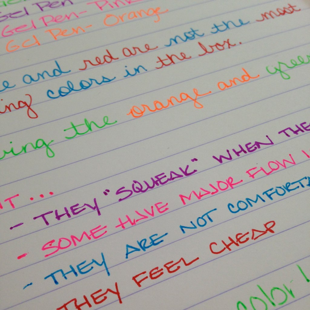
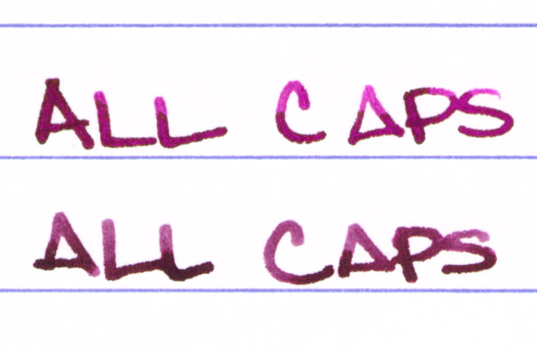
I regularly write in all caps…

Here’s the entire review sheet . . .

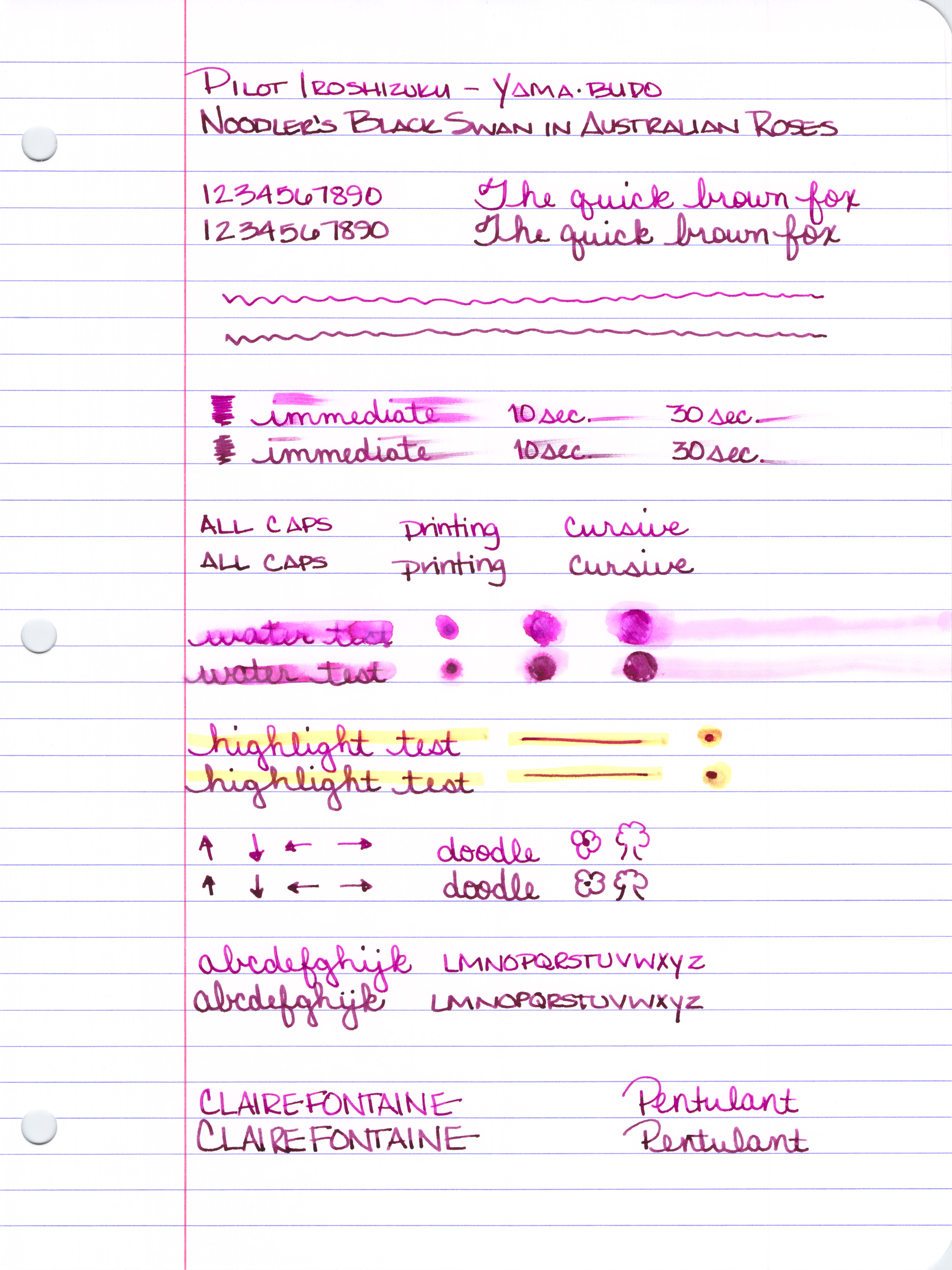
Click Here to see it full size (it’s huge).

So, what’s my bottom line?  I’ve ordered a full-sized bottle of Yama-budo. While the color difference isn’t huge, the brightness and amount of shading made all of the difference for me.

There are so many ink choices out there that it is the subtle things that make all of the difference between “just ok,” and “love it!”

Having said that, if you like the color of each of these inks and the brightness doesn’t matter that much to you (or maybe you even prefer the darker color?), save yourself the bucks and go with Black Swan in Australian Roses. Goulet Pens (no association except I spend so much of my paycheck there) sells BSIAR for less than half of what Yama-budo goes for.  ($12.50 -vs- $28, respectively)

What do you think?  Black Swan in Australian Roses or Yama-budo?  Neither? Both?

BALLPOINT PEN REVIEW: Poppin

I was at Staples a few weeks ago and picked up several items from a brand I’d never seen – Poppin. Last week, I reviewed the Poppin Gel Pens. Before that, I had a closer look at the Cahier Notebook.  I didn’t enjoy either those items.

And, here’s a surprise . . . I’m not wild about these ballpoint pens from Poppin either.

The pens are a dozen to a pack, the ink is black, the tips are medium (1 mm).  The barrel is solid purple and other than that, the style is exactly the same as the gel pens.  That is to say that the pens have that terrible “step down” grip that isn’t very comfortable for any sort of longer time spent writing.

Flow is good and there’s no terrible squeaking sound like with the gel pens. Surprisingly, the ballpoint practically skates across the page, providing no sense of feedback or friction. A bit odd for a ballpoint – and some people may enjoy that feeling – I did not.

I ended up putting the pen I used back in the package and gave them to a friend who loves purple.

So…that’s three failed items in the Poppin line for me. I’ll say again what a shame it is – the items are so pretty. If only they were also functional.

FOUNTAIN PEN REVIEW: Montblanc Heritage 1912

I’m in love.

Like any normal fountain pen lover, there are a great number of pens that I have my eyes on at any given time. When the Montblanc Heritage 1912 pen was released, I knew I was attracted to it and I knew right away that it would find its way to my wish list, but I didn’t know I’d end up with it!

I mean, seriously, look at this thing . . .

Yummy goodness, right?  (Side note – all of the pictures except the one directly above are my own. The one above is from the Montblanc website. You can tell because their picture is perfect and mine are not.)

I received this pen as a late Christmas gift from a friend. When I opened the wrapping and saw the box, I’m pretty sure I gasped. Or maybe squealed. Probably both.

About the Heritage 1912 . . . 

The design is inspired by the Montblanc Simplo Safety Filler – one of the first fountain pens. (Crazy, right?) The Simplo was small in size, had a retractable nib, was made of hard rubber, and had a rounded white-tipped cap. I actually held one of these at a pen show a long time ago.

The original Heritage 1912 was a limited edition of just 333 pieces and was made of titanium. It’s gorgeous, but has a scary (for most people) price tag.

This precious black resin version of the pen has similar qualities . . .

It’s a beauty. And then I wrote with it . . .

And I was in love. Big love.  (The ink is one of my favorites – Pilot Iroshizuku Fuyu-syogun.)

A Pragmatic Look . . . 

I’ll let someone else do all of the weights and measures. I’m more about how it looks, feels, and writes.

Design – love it. Very stylish, classic. I’ve always been attracted to retractable nibs. This pen has a sleekness to it that isn’t often found. There’s a thingy in the cap to prevent the user from ruining the nib if the cap is replaced without first retracting the nib.

Length – appears shorter than average, but is average when the nib is engaged

Weight – very comfortable

Width / Grip – nice – the smooth design makes this a very comfortable pen to hold. I can imagine that someone with sweaty (ok, moist) hands would have an issue because there is no real grip, but this works wonderfully for me

Fill System – unique piston fill

Nib – medium with a bit of bounce. It’s not flex, but it’s not like any other nib I’ve ever written with either. It’s a wonderful writing experience

Performance – oh my goodness, it writes wonderfully

Well, there is one issue with performance – the pen is not meant to be posted. Ironic given the picture above that I pulled from the Montblanc website, yes? Normally, this would be a deal breaker for me (I always post), but I love the pen and the writing experience so much that this is a complete non-issue.  When attempting to post, the cap is loose and the pen is unbalanced – I do not think anyone could post the cap and be happy with it even if it were possible to do so (which it’s not).

Practicality – the Heritage 1912 will be an everyday writer for me. I am not overly careful with my pens and I don’t flip out if a scratch appears. If I worked in an office, I probably would not take it with me because it would be too expensive to replace and I’d cry if it became lost/stolen. For me, the pen is very practical.

However, there are some reports that the pen scratches easily and that the cap rubs and causes “rings” to appear on the body of the pen. My guess is that the resin itself isn’t anymore likely to scratch than other MB pens, but that there is long expanse of resin and that scratches are more noticeable. If this kind of thing is going to bother you, you may disagree with my assessment on practicality.

Some Bonus Pics . . .

Yummy yum yum!

I also want to toot my own horn a little. I love Instagram and am happy to have so many friends over there – more than 400 now, which isn’t a lot to some people, but feels like bunches to me.  A few days before I started posting pictures of the Heritage 1912 fountain pen, this came up on my news feed . . .

Wooo!  Maybe they follow everyone – I don’t know, I don’t want to know – haha. But Montblanc is following me on Instagram and I feel pretty giddy about it.  I’m pretty sure this means that you should also be following me there.  I’m Pentulant on Instagram.

And, finally, it’s clear that I love this pen, but you should read as much about it before you run out and get one of your own. It’s not quite the same as buying a Pilot Metropolitan (which I also love!).

I’ve put together the following resource list.

Have a great week, everyone!

xo

Montblanc Heritage 1912 Resource List

See the Heritage 1912 Limited Edition of 333 pieces

Pictures of the Montblanc Simplo and a comparison

A good write-up from Luxurious Magazine

FPN members discuss scratching

A MB produced video

FOUND AROUND FRIDAY

Montblanc Heritage 1912 Fountain Pen

It’s Friday and that means another installment of what I’ve been reading lately.

But first – the above picture is my fancy new pen. A full blown review is coming Monday – be sure to check back. Spoiler: I’m in love.

On to some long overdue link love . . .

FP Quest lists Five Favorite Modern Fountain Pens

FP Geeks were talking an awful lot about Nakaya.  Here, here, and here.  (Temptation is running high, folks!)

I’ve been trying brush pens with little success. (OMG, it’s ugly.) I came across this blog post over on Jet Pens and have decided that maybe I need better tools. Different tools. We’ll see.

Brian Goulet interviewed Nathan Tardif of Noodler’s Pens. It’s informative, entertaining, and . . . interesting.

I’m in love with My Supply Room. Maybe not these pens – wrestlers? Really?

No Pen Intended reviews Da Vinci stone paper – a Kickstarter project.

Finally, those who have been reading here for awhile (hi, honey) know that I love me some Instagram. It’s fast, easy, and fun – and you need to not only follow me, but also follow this great group of visual bloggers . . .

MyCoffeePot 

Kataish

Pensomnia

ALittleBitGeorgie

HeyMatthew

KristinNohe

GourmetPens

Have a great weekend!

GEL PEN REVIEW: Poppin

I hope everyone had a happy Easter.  I was off to New York for a few days – had a great time. I wasn’t blogging during my time away, but I was definitely posting over on Instagram.

Today, we’re taking a look at Poppin Gel Pens. You may remember that just before Easter, I reviewed their Cahier Journal.

These gel pens are definitely pretty, pretty . . .

Average in size.

Some of the colors are pretty terrific . . .

Poppin, even.  (ha.)

But . . .

There are some issues . . .
– some of the pens have a terrible squeaky sound to them when they write – I’ve never heard this sound coming from a pen – crazy
– some of the pens just wouldn’t write – even after lots of scribbling
– the grip isn’t really a grip – it’s more of a steep drop off and it hurts to hold for any length of time

Bottom Line:

Even though some of the colors are wonderful (look at the purple! the orange! that green!), these gel pens from Poppin are not keepers. I could probably live with the squeak and even with the terrible grip – but the flow issues?  No. That’s a deal breaker.

The real shame is that this is the second Poppin product that caught my eye and then didn’t live up to expectations. It’s too bad because the items look great.

Third time’s the charm? Stay tuned!

PAPER REVIEW: POPPIN CAHIER NOTEBOOK

I was in Staples last week and there was a beautiful display of Poppin products. I’d never heard of this brand and decided to pick up a few items.

Today, I’m taking a closer look at the small notebook. Here are some specs for you . . .

  • 192 pages
  • 3.5″ x 5.5″
  • Lined paper
  • Elastic band closure
  • Ribbon marker
  • Pocket in back
  • $6 at Staples
Let’s take a closer look . . . 
As advertised, the cover is soft. It’s vinyl. It’s stinky. Not a good start, I’m afraid. Almost reminds me of my gran’s tablecloth from the 70s. (Yes, I’m old.)
This was a bit of a surprise – a happy surprise for me, but I imagine it wouldn’t be so happy for everyone – the paper isn’t simply lined as indicated on the outside labeling – it’s set up in a bit of a journal entry / checklist style. I’m loving this . . . 
And..surprise!…there’s a thin ribbon marker. (The book doesn’t lay flat – it’s being held open so I could get the picture.)
A not-so-good picture, but it does have a pocket in the back – much like Moleskin.
But the important question – how is the paper? The book is quite thin for 192 pages, but the paper feels silky smooth. Cautiously optimistic is how I was feeling.
(Oh..the paper is bright white – these last few pictures were taken later in the day and I’m not a photographer.)
Not bad!  Very little feathering. 
Lots and lots of show-through / ghosting. I personally have an issue with that, but know that many people don’t mind some show-through.
Final Thoughts
At just six bucks, there are some pretty sweet things about this notebook. Features like the pocket, elastic band, and ribbon marker make the product seem like a quality item. However, all of that is discounted by the super tacky and stinky vinyl cover. 
I have a zillion notebooks and can’t imagine that this one will work its way to the front of the line anytime soon.
Have you tried any of the Poppin items? With Moleskin paper being criticized so much lately, have you found a suitable replacement?

FOUND AROUND FRIDAY

Hope you all have had a good week.  Here’s what I’ve been reading over the last couple of weeks . . .

Ed Jelley checked out Field Notes Shelterwood – I don’t have mine yet.

Good Pens reviewed Ohto Graphic Liner – I think I want one, or two, no more than five.

The Well-Appointed Desk gave us a closer look at J Herbin Rose Cyclamen. Do you like it?

Do you want one of these? Or two? No more than five? I’m undecided. Maybe the red?

Jotters from My Supply Room make me swoon!

People seem to love the FriXion Gel Pens. No Pen Intended is among those people. Maybe I’ll give them a try.

Fountain Pen Quest reviewed an Esterbrook. I have mixed feelings about Esties – more on that another day.

Guerrilla artists in Ohio are coooool.

Will you be getting any (all?) of the Pilot Metallic Vanishing Point Fountain Pens? I like the blue – and maybe the green – purple is always a hit around here, too.

Oh yeah, and last but not least, I ordered one of these. BOOM!