INK REVIEW: Noodler’s Blue Eel

Turns out that some of my extra-big-huge-ginormous images have been crashing some mobile device readers. Oops, sorry about that. Going forward, I’ll use smaller images here and link to the bigger image if there’s something worth seeing in detail.  Like this….
Click to See Extra-Large Hugnormous Gigantic Image

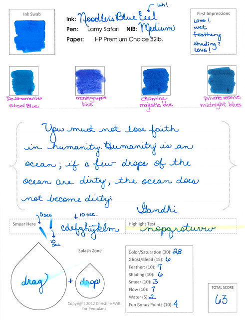
It also turns out that I’m not loving my new review form as much as I enjoyed Noodler’s Blue Eel ink. Here’s the thing – I sincerely like this ink – and yet it ranks only a 63 on my scale. In school – that would be a scary grade – but here, it means that it’s better than average.

So. I need to make some tweaks to my ranking system. Of course, I have four or five other reviews lined up so we’ll need to somehow make it through those before moving on to another form. It’s a good thing only Mr. Pentulant reads this blog – otherwise, I could be causing mass confusion with my fickle-pickle switcharoo.

Anyway! Stay tuned, but for now…the review!

Adore the color and saturation. It’s perfect for a girl like me. Nice and bright. Would write all day with this one (if I could ever settle on just one color, that is).

Feathering? Not sure why the heck I gave it a 7 on my scale.  Look at this and help me decide what I was thinking . . .

. . . yeah, I don’t know either. It’s a feathery mess of a an ink.
But at least it doesn’t smear . . .
OK, yeah. It smears, too. This was after writing normally and then waiting (at least) ten seconds to test. Some of you might be thinking it’s my paper choice, but this is the paper I’ve used for all of my other current ink reviews. Noodler’s Blue Eel is a slippery wet son-of-a-gun.
And . . .
And . . .

So. Is the fact that it’s a slippery wet son-of-a-gun a bad thing? Well, like so many other things in life, it depends.  On this paper, with this pen – it was not horrible, but I am definitely not rushing out to buy the full-size bottle of this ink.  But…this ink was made to be a slippery wet son-of-a-gun. In fact, all of the Eel series of inks from Noodler’s are. 
The Eel series was apparently formulated with piston-fill pens in mind. The idea is that the pistons like a little bit of lubrication to keep things moving. If left unlubed (it’s a word, trust me), the movement will not be as smooth over time.  I don’t know anything about this. I read it here. What I do know is that it’s unlikely that any of the piston-fill pens I have were ever filled with a lubricating ink and they are (or at least seem to be) just fine. In fact, Richard Binder has this to say:
Lubrication, as used here, does not refer to the addition of special substances for the ostensible purpose of lubricating the pen’s piston or other filler parts.

He’s not talking specifically about Noodler’s (or at least he doesn’t say that outright).

So. Bottom line:  This is one of those ymmv things. If you like a wet son-of-a-gun ink and believe that your piston-fill pens need lubrication – this is totally the ink for you.

It’s not the ink for me, however, because I need other things more than I need lube.

Now..it’s see what kind of spam comments I get as a result of using the word “lubrication” in my posts. Fun times ahead!

INK REVIEW: Noodler’s Turquoise Eel

Noodler’s Turquoise Eel

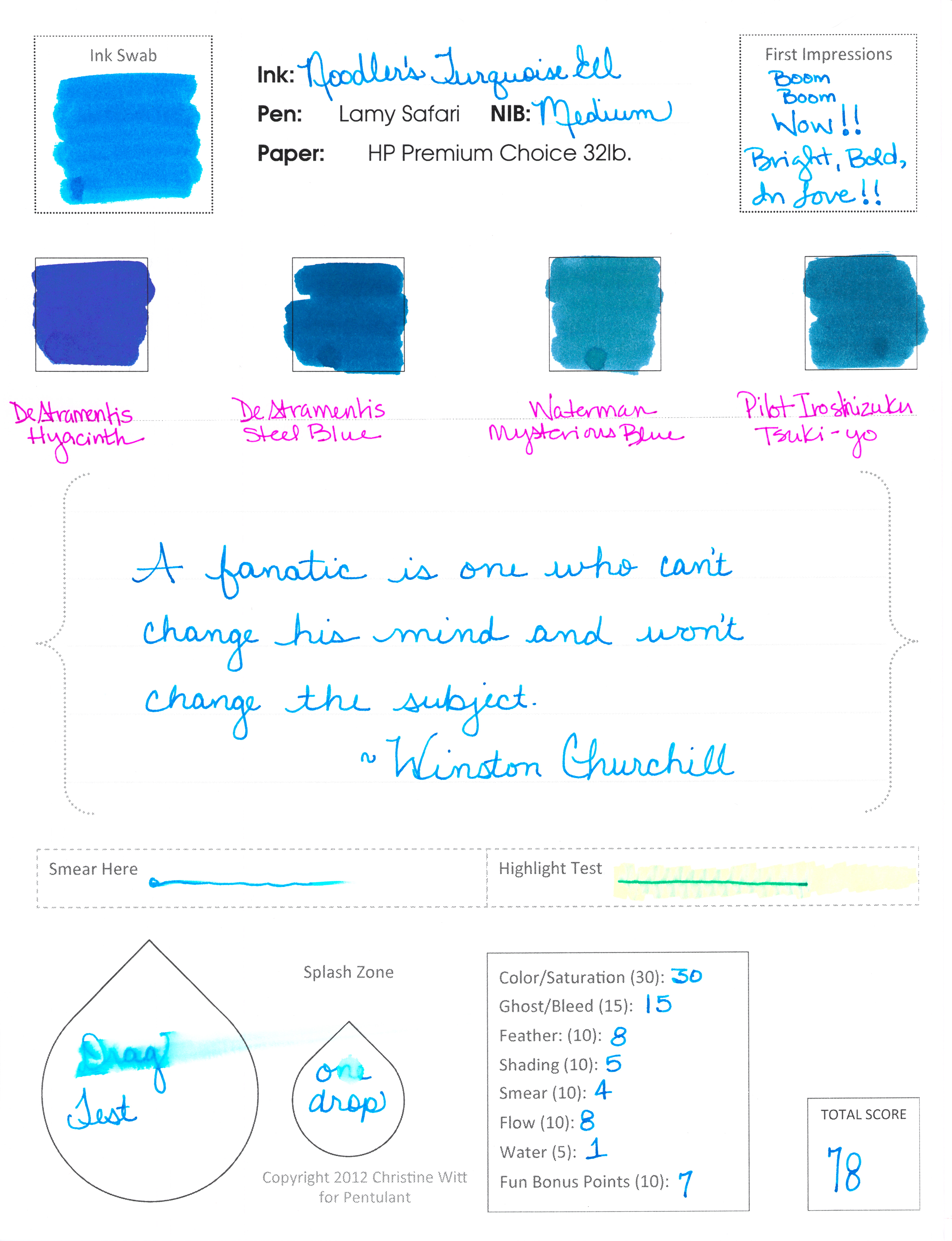
Now. This is what I’m talkin’ about!
Some real, in-yo-face, color.

And, bonus! It writes like a dream.

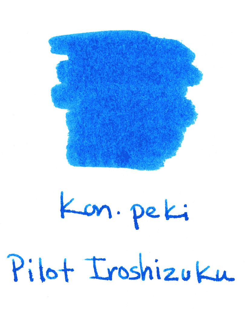
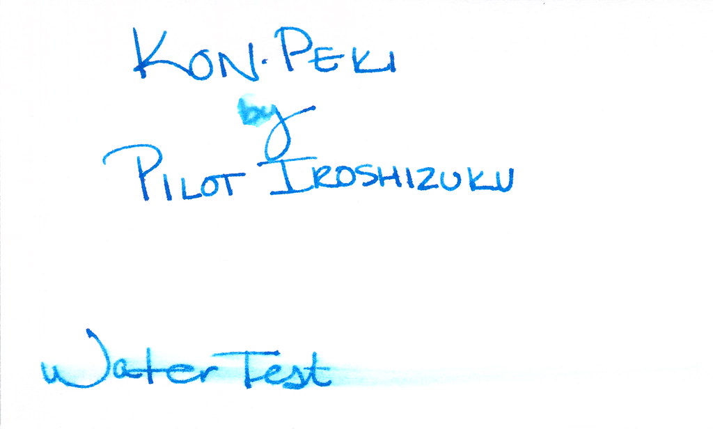
Noodler’s Turquoise Eel rivals Pilot Iroshizuku Kon-peki in every way. It has great color and saturation. It writes beautifully – flow from the pen is just right.

Smear factor isn’t bad.  Not much shading. Is there a turquoise that shades wonderfully? Guess I’ll have to try them all and find out!

Back to the ink . . .

. . . I really don’t have anything negative to say – if I don’t talk about the water test – ha! It’s a great well-behaved ink that I would consider purchasing if I didn’t already own a couple of other turquoise inks. (I test from sample vials, but you probably knew that already.)

A bunch of side notes…

…this is my first review with my new form. Totally excited. Let me know what you think?

…my ink reviews all fall into broad color categories (new this year). This one ended up with the blues because it’s more blue than green. Maybe I need a turquoise – but then I’d need a teal – and sometimes it’s hard to decide. I’ll just keep doing the best I can.

…omg, did you notice the first Compare Square? De Atramentis Hyacinth. I’m excited about reviewing that one sometime soon. Pretttttty.

…Waterman Mysterious Blue felt watery compared to the other inks on this page. Wonder how that will translate in a pen when I get around to testing it.

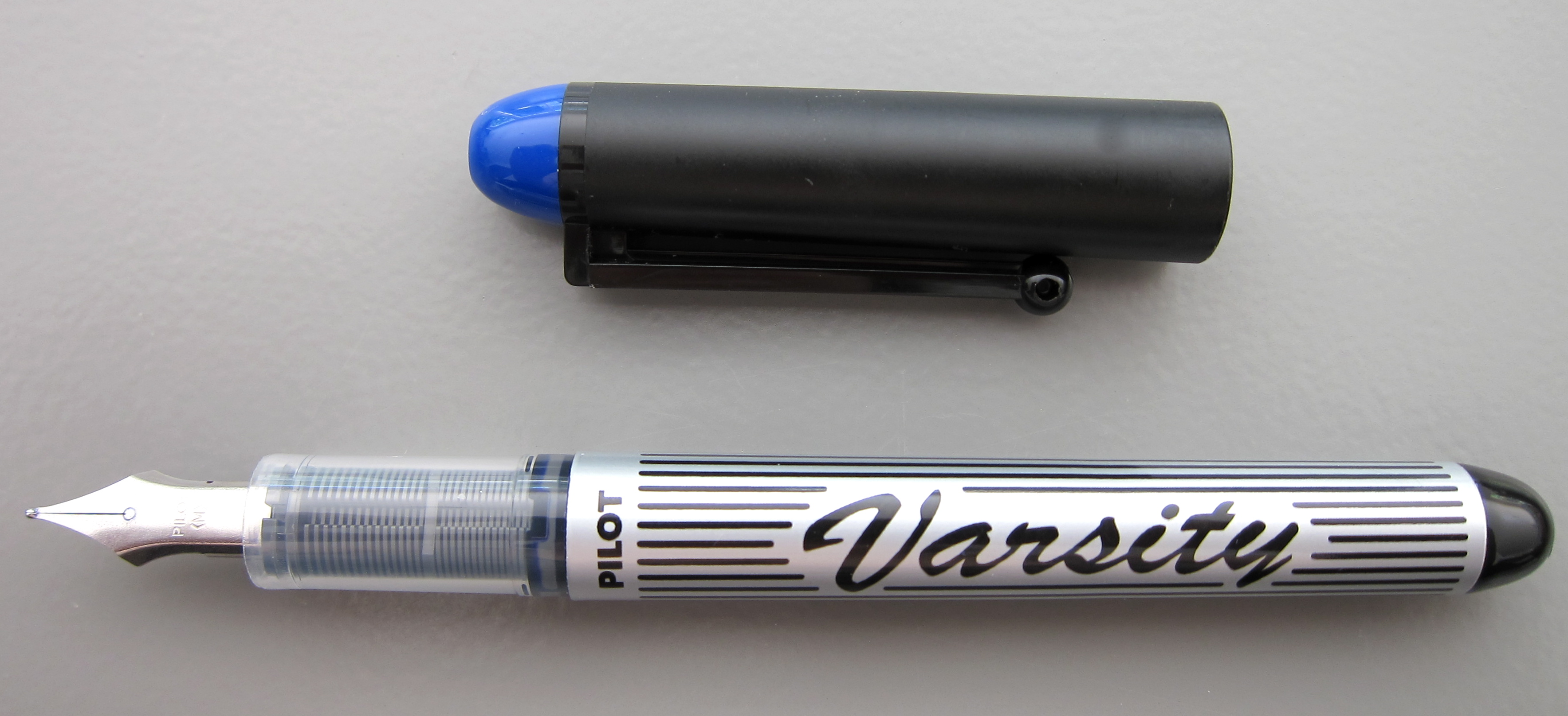
PEN REVIEW: Pilot Varsity All Colors

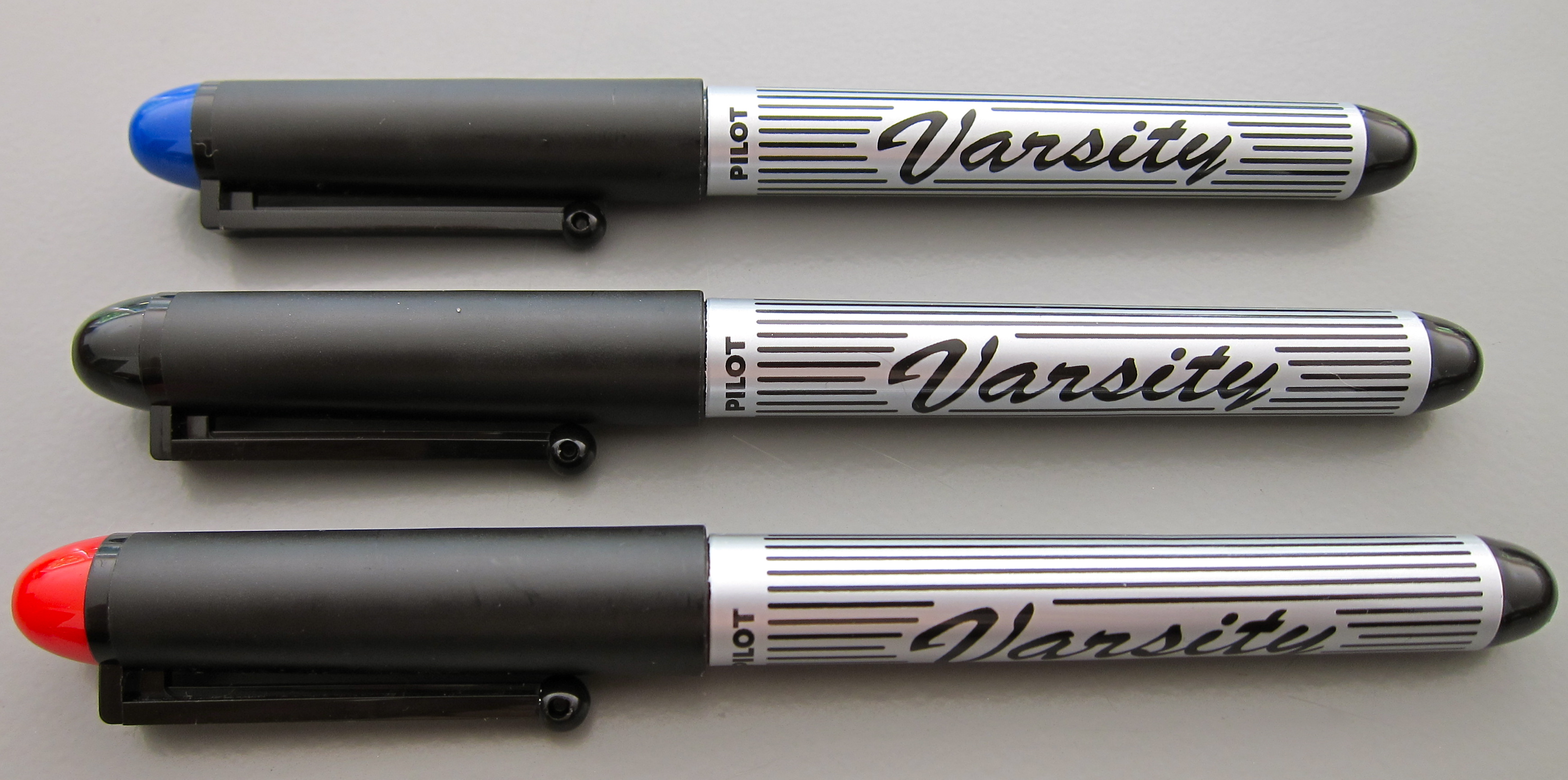
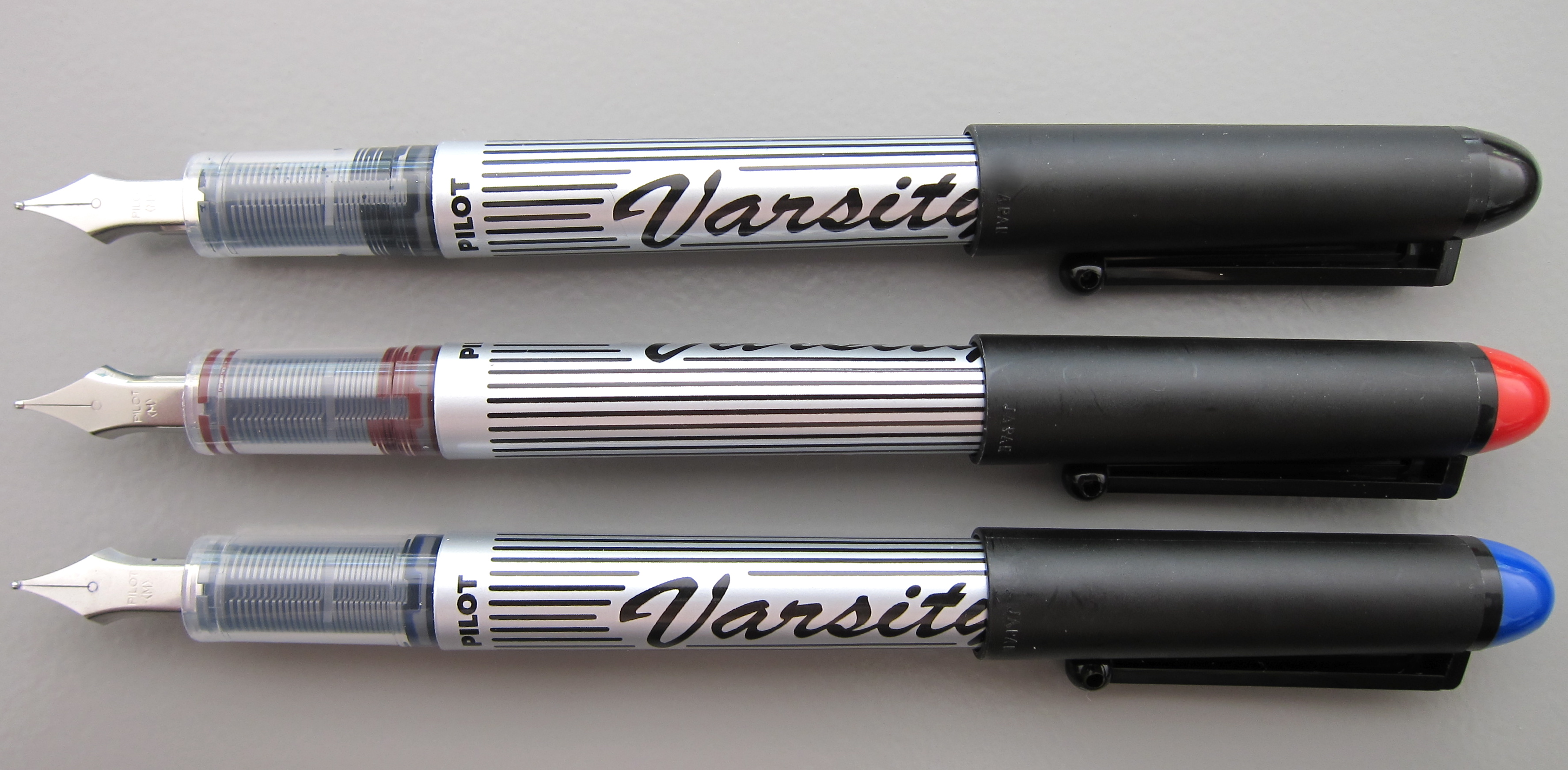
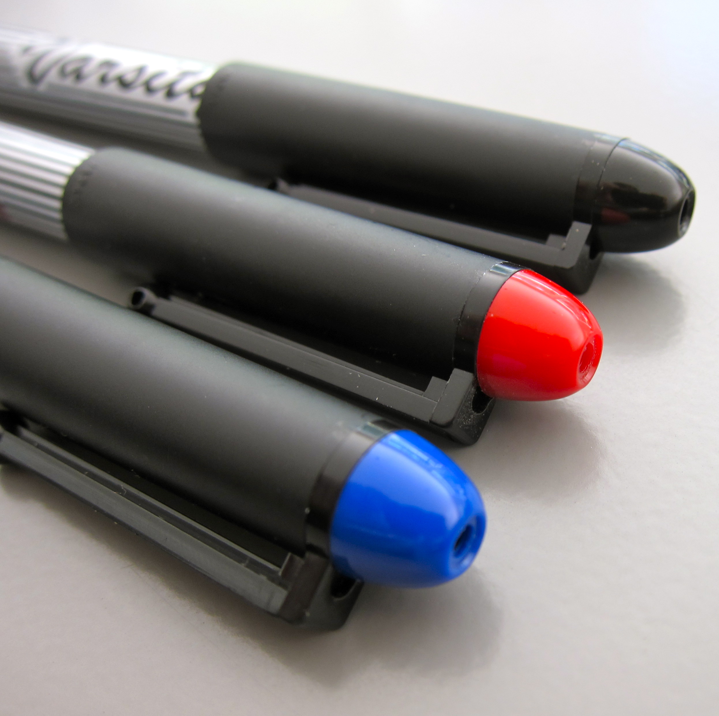
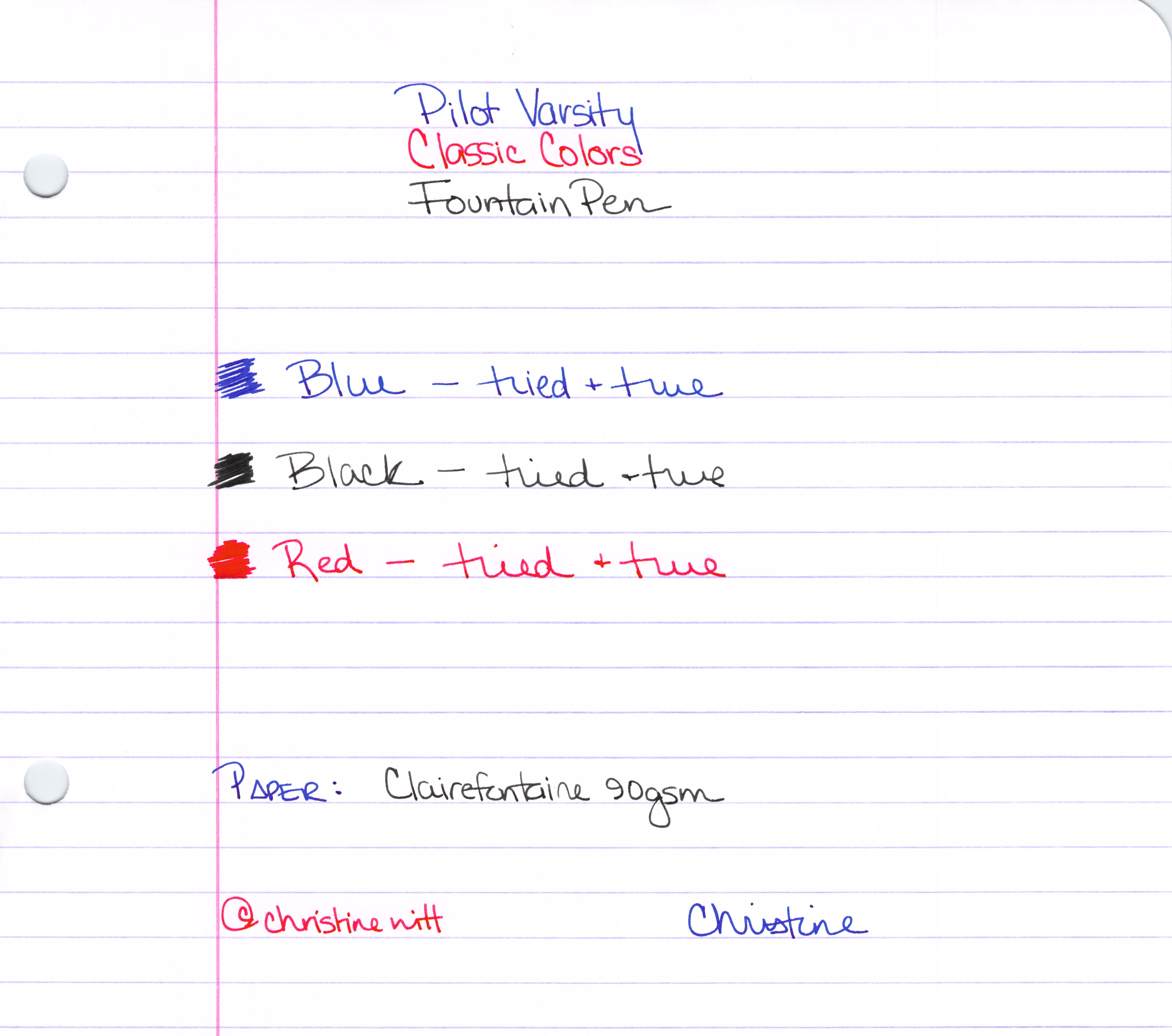
We’ve already looked at the blue – and now here are the remaining colors of the Varsity Pilot fountain pens.

The Classics
Some people worry that something is wrong with the pen when they see the ink down in the section (the part of the pen between the barrel and the nib). This is perfectly normal and is a result of the ink moving through the feed system into the nib. In most pens, this part of the pen is opaque – but if you could see, you would see – this is perfectly normal.

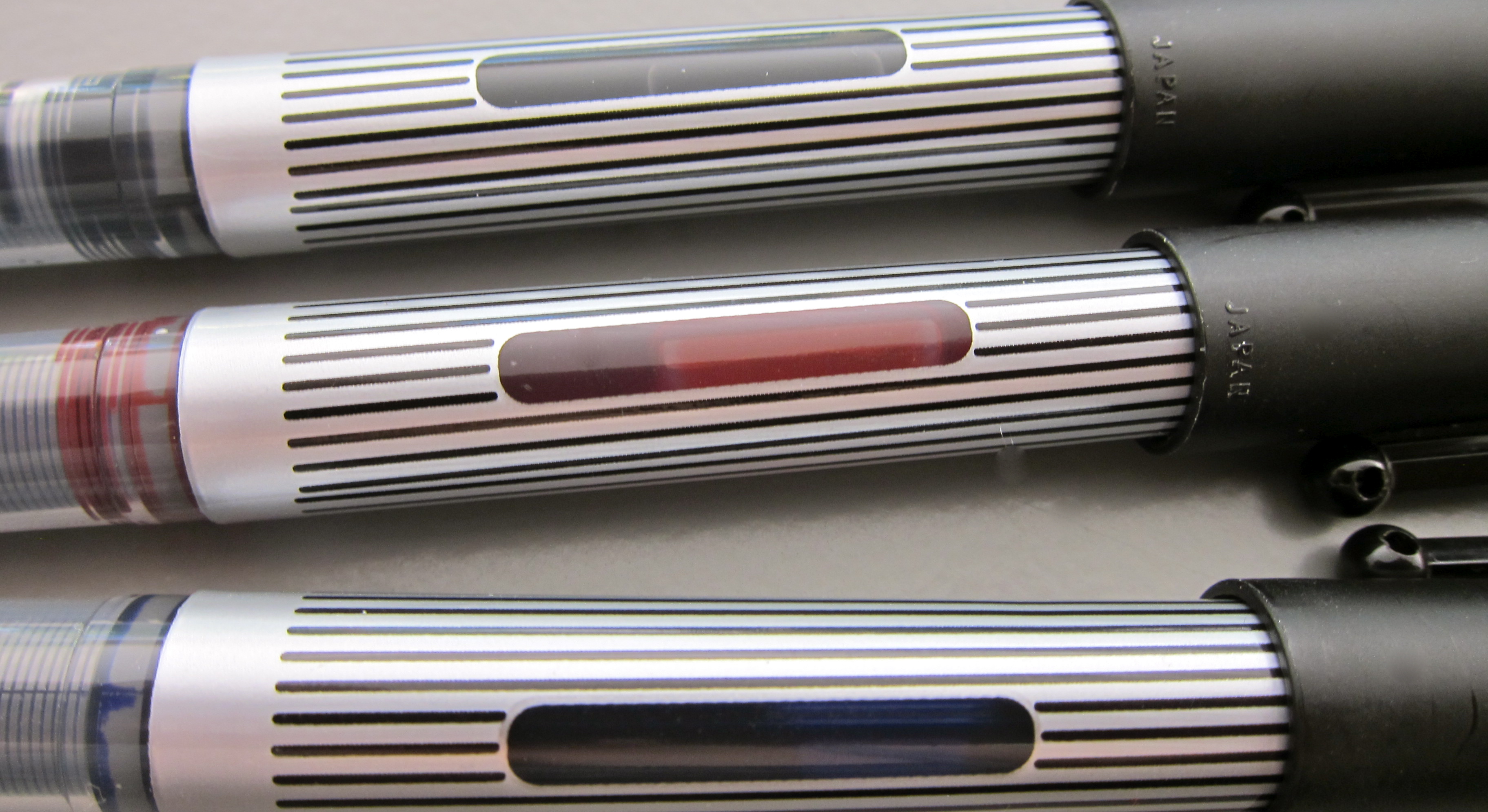
Handy Ink Window

The Whole Enchilada
Bottom Line? In a pinch, these get the job done. The colors are fun.

PEN REVIEW: Pilot Varsity Blue

Nearly everyone who has been attracted to fountain pens has given one these a try. Some people even convert their empties to eyedropper pens and use them forever.

I always think it’s interesting when someone recommends a cheapie pen to someone interested in trying a fountain pen for the first time.

I think handing them something fancy pants would be the better choice. Let the new use experience the best right from the start. But isn’t a brave fountain pen user who is willing to hand over their luxury pen to a newbie?

My assessment….it writes. It’s not smooth. The ink is well-saturated. As you’ll see in coming weeks, I have managed to Collect Them All.  I’ll be giving them away. Probably to a newbie..haha.

Sound off below. Have you tried the Pilot Varsity?

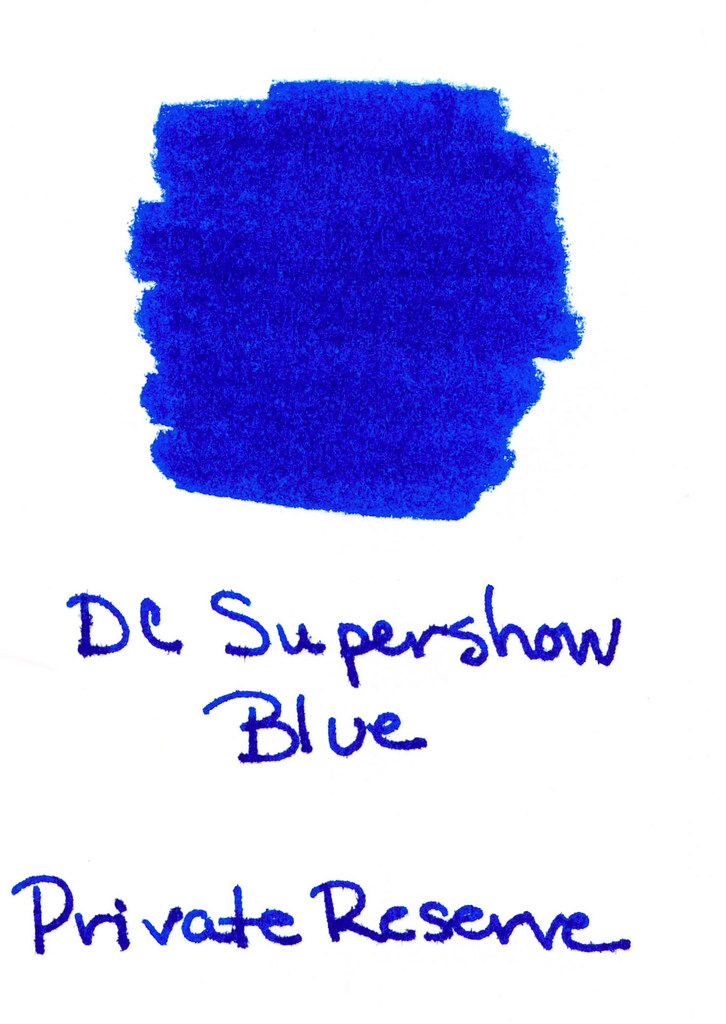
INK REVIEW: Private Reserve – DC Supershow Blue

Woo Woo!
I love you!
DC Supershow
Blue!
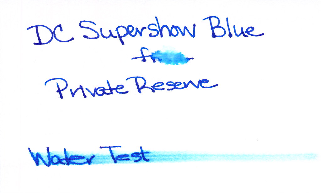
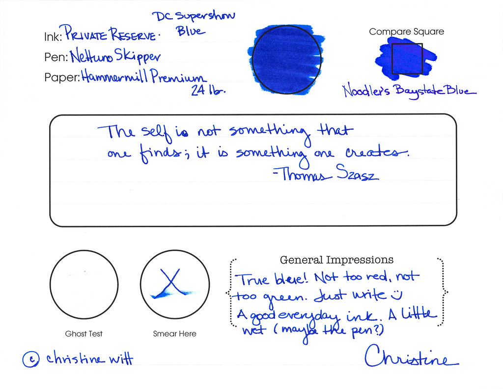
Look at that color! Super-saturated. In yo face, blue!  Private Reserve did a great job with DC Supershow Blue.
But..it’s not perfect, is it?  Look at the water test. Check out, especially, where “from” should be written. That is where a droplet of water was placed and allowed to sit. Fail. And the smear? It definitely smeared, oh yeah. But this is a blue, not a black – we can’t expect perfection, right?

This is a blue I could fall in love with. I get all blue from this color – I don’t see purple like I did with Noodler’s Baystate Blue.

This is a blue I could fall in love with. I want to fall in love. I want to. I neeeed to fall in love with this blue. Except – it’s feathery. And it’s wet. And it smears like cheap peanut butter (what does that even mean!).

I want to love it, but I cant. Not yet, anyway. I’m going to give this another go. In a different pen. Maybe something with a super fine nib to slow it down just a bit. Maybe on a different paper.
What Others Say…
Goulet Pens where it’s available for $8.75
Stay Tuned….Later today, I’m going to be talking about the Edison Nouveau LE Encore!

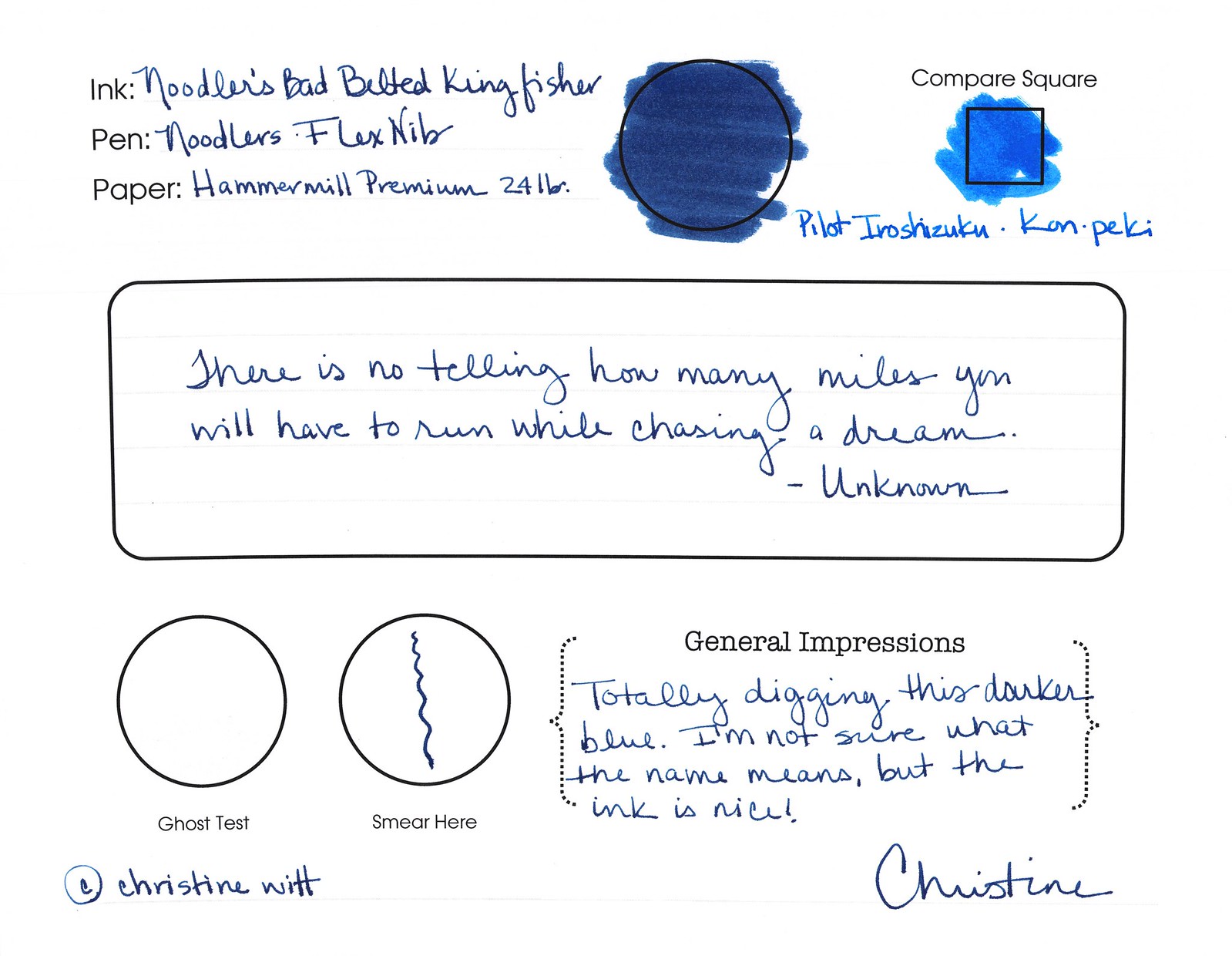
INK REVIEW: Noodler’s Bad Belted Kingfisher

HAPPY HALLOWEEN!!  Now on to the review….Noodler’s Bad Belted Kingfisher.
Crazy name!  Do you know what it means? I have no idea
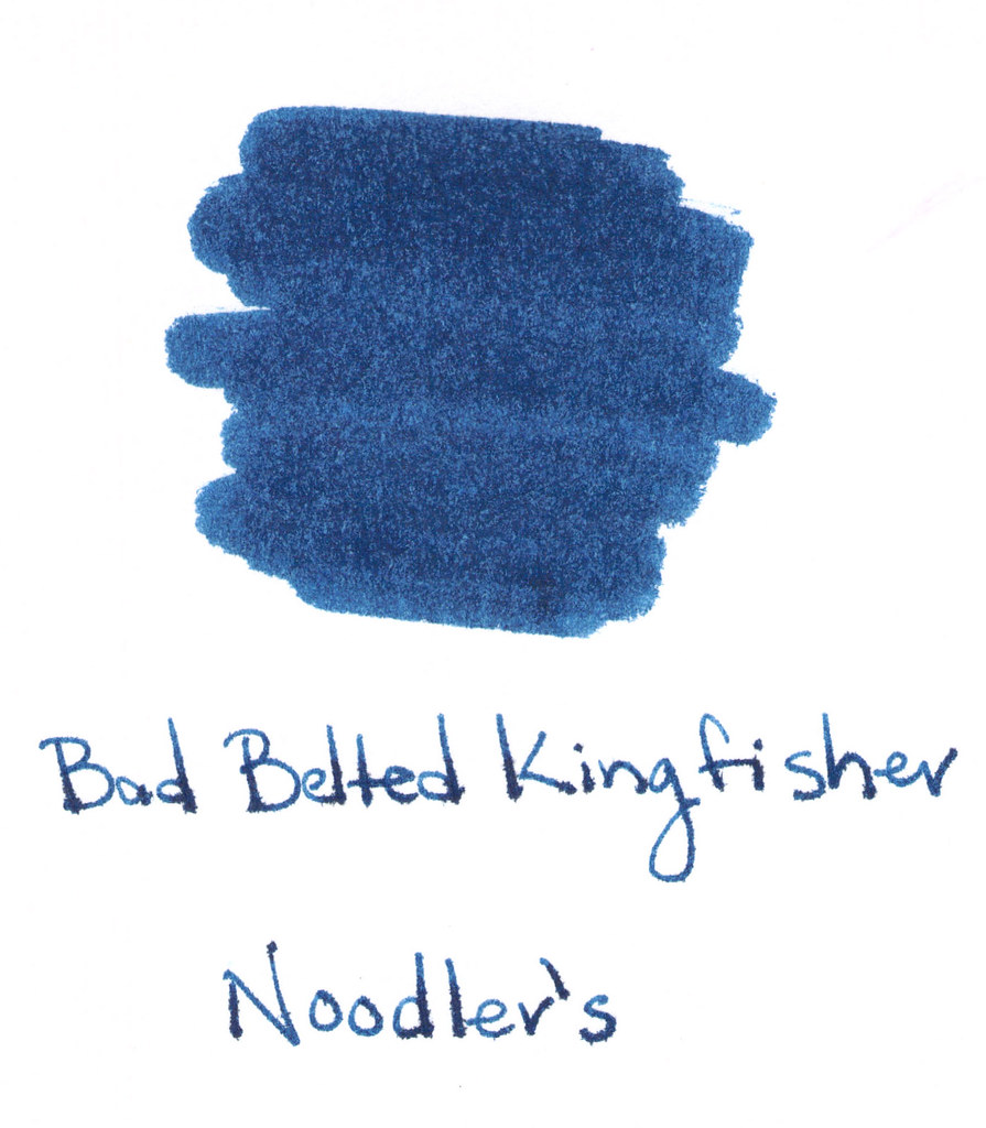
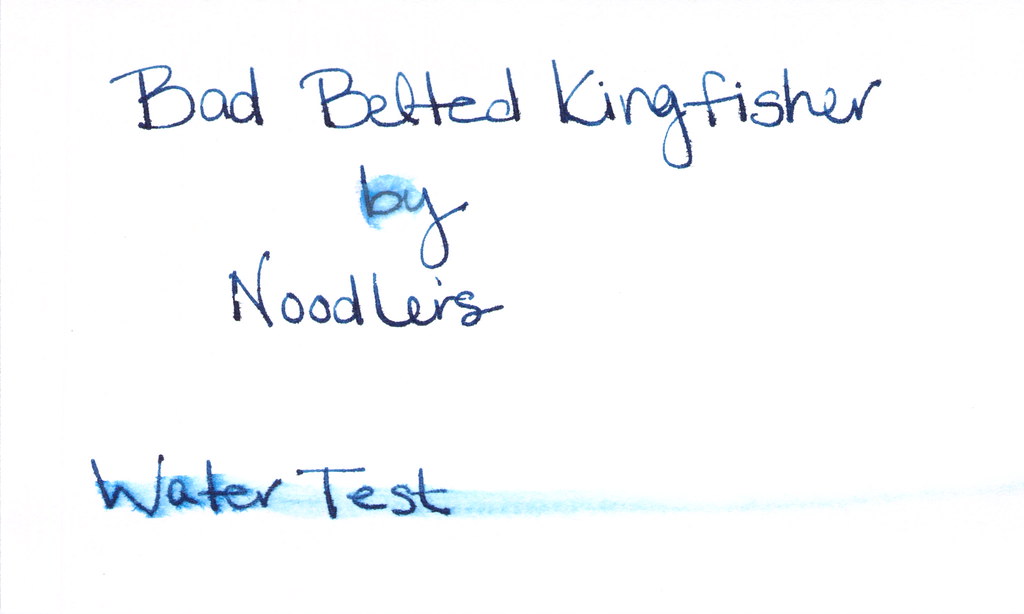
I like the color quite a bit – a dark steely tealy, yes? Still close enough to blue to be used in a professional setting, but not stodgy at all.
But look at the horrible feathering on the swab above. Granted – this was written on a cheap-o index card, but I do all of my swabs on the same cheap-o cards and none (at least to date) stand out quite like this.  
Even on the Hammermill paper, it’s still feathering. 


I used Noodler’s Flex Nib pen. I believe this was my first (maybe second) time using this pen and, I have to be honest, it was not a good experience. Flow from the pen was good, but it just wasn’t what I expected (more on that another time, though).

Oh no..the water test. Yikes! No bueno, hm?   
Love the color. Do not love the performance.  Given that there are so many inks out there that are pretty, pretty and perform well, I won’t buy a full-sized bottle of this one.
So, tell me – have you tried Noodler’s Bad Belted Kingfisher? Do you love it? What does its name mean!
Oh! And November 2 is Fountain Pen Day!  Can’t wait!!

INK REVIEW: Noodler’s Baystate Blue

The (in)famous Baystate Blue from Noodler’s.
I usually don’t read a lot about inks before I try them out for myself, but for anyone even a little into pens and ink, it’s impossible to avoid reading about Baystate Blue.
First impressions:  It’s pretty, for sure, but it looks a bit purple to me. SATURATED.  
Because of everything I read (staining pens, difficult to clean, beware, BEWARE!!), I decided to wimp-out and use a glass dip pen for my testing.  I don’t think this was the best decision. You can see the feathering above, yes?   I’m definitely going to be brave and retest it in a pen. I want to be fair. 
Of course, I plan to use a pen I like, but don’t love. A pen that is inexpensive enough to replace. 
Here’s what I know…
..no smearing
..ugly feathering on the cheapie index card (above)
..no ghosting or bleeding
..no shading
..COLOR!!
I looooove color. Look at the swabs above and below – that’s some color! Love the saturation.
Oh..and clean-up? Well, it was a bit of a mess (though not the biggest mess I’ve ever made with ink. I wiped the dip pen first to remove any of the wet ink and then rinsed. Unfortunately, I wasn’t mindful about the flow of water and it came rushing out, sending little droplets of water/ink all over the (white) sink. I used a little shampoo and it came right out. Not a huge deal, but I was a bit surprised. I also used shampoo (it was handy) on the glass dip pen – it cleaned right up.
Click to Enlarge Images

I am not even going to ask for your thoughts on this one! I know everyone has an opinion.

INK REVIEW: Pelikan Edelstein – Topaz

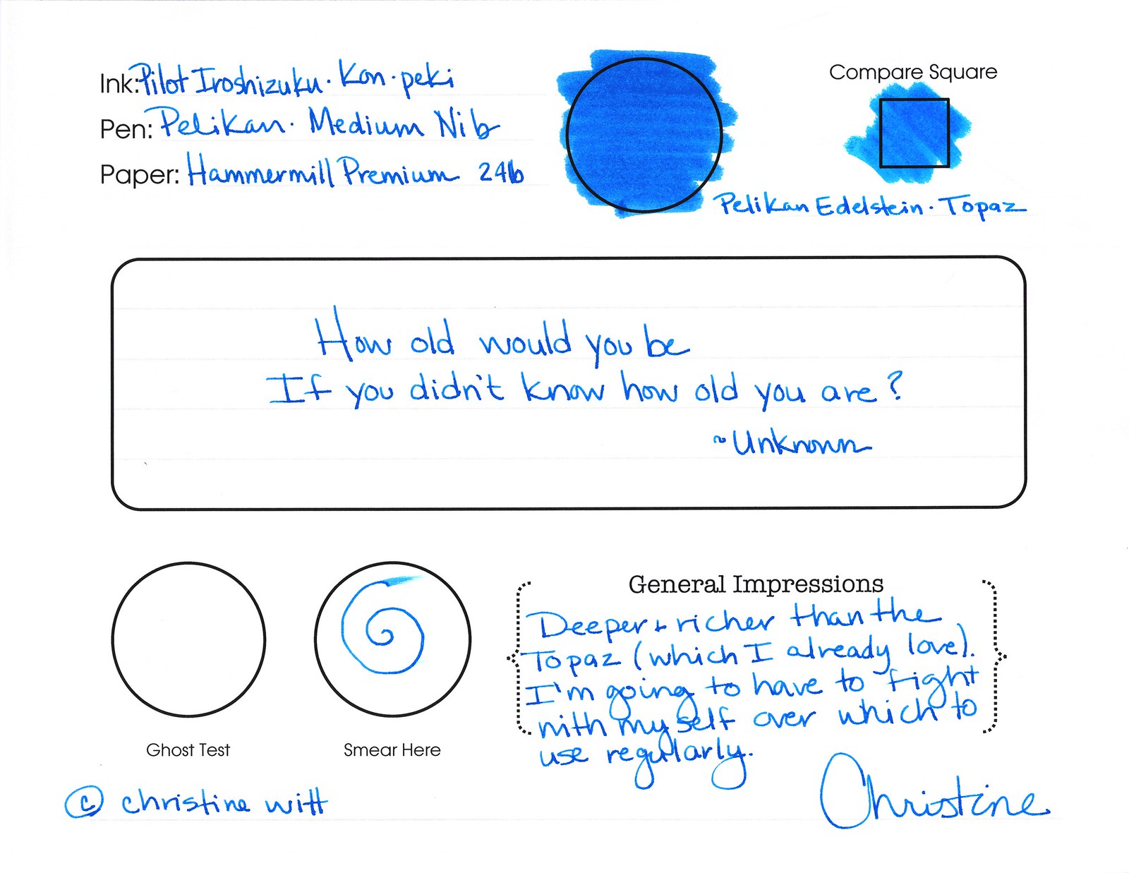
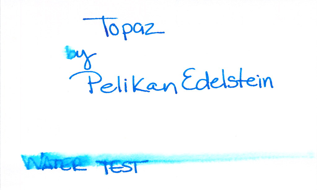
Aggggh…let’s start with the ugly, shall we?  The water test for Topaz from Pelikan Edelstein did not go well. But, dude, that color. That color!

Moving past the water test – I looooove the bright saturated nature of this ink. Look at how it compares to Pilot Iroshizuku’s Syo ro in the Compare Square. BIF! Bam! Boom! That’s what I need: COLOR!

Topaz almost passes the smear test – just a little wet – when not near water, that is.

You know what else I love about this ink? The name of the ink perfectly matches the color. Topaz!

Oh. So. Pretty.

Whereas so many other inks seem a bit flat, Topaz has a certain glossiness, a beautiful sheen that lasts well after the ink has dried.

As always, click to enlarge images

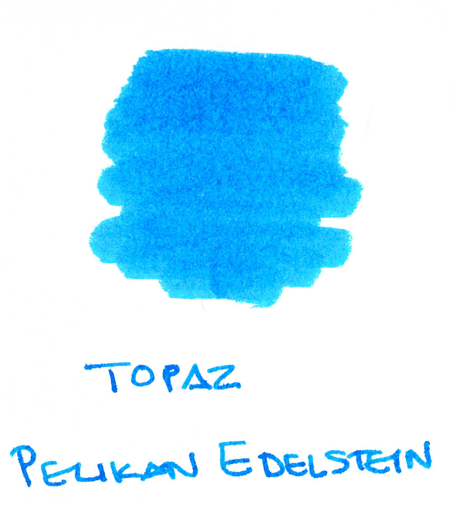
Check out a close-up of the color . . .

Tiny bit feathering only visible with some magnification (at least to my old eyes). Minimal shading.

This one is a winner in my big book of inks!

What are others saying?
Fountain Pen Network (very in-depth review!)
Art Brown has for $20,
Jet Pens for $21, 
and 
Goulet for $25.   
I’m getting it!