INK REVIEW: DE ATRAMENTIS ANTIQUE PINK

De Atramentis Antique Pink

I’m not the biggest fan of pink inks. I found one that I love (Diamine Flamingo Pink), but otherwise, they are mostly a curiosity for me.

When I think of Antique Pink, the color that comes to mind is perhaps something like a ballet slipper pink. When De Atramentis thinks of Antique Pink, they think of something that is a bit more purple than I’d expect…

De Atramentis Antique Pink Writing Sample

With that out of the way, this ink is nice. It’s ok. It writes well in the pen, looks good on the paper. There is no bleeding or feathering. Smear times are decent. (I used a Rhodia Dot Pad for this review.)

If you’re looking for a pink fountain pen ink that leans a bit toward the purple, this color could be the one for you.

There is even some shading – always nice.  (I was using the Pilot Falcon for this review – the pen flexes a bit and that could account for some of the shading here, but there is potential.)

So…here’s my bottom line:  it’s ok.

 Pink inks – love ’em or hate ’em?

What are you writing with this week?

INK REVIEW: De Atramentis Sahara Grey

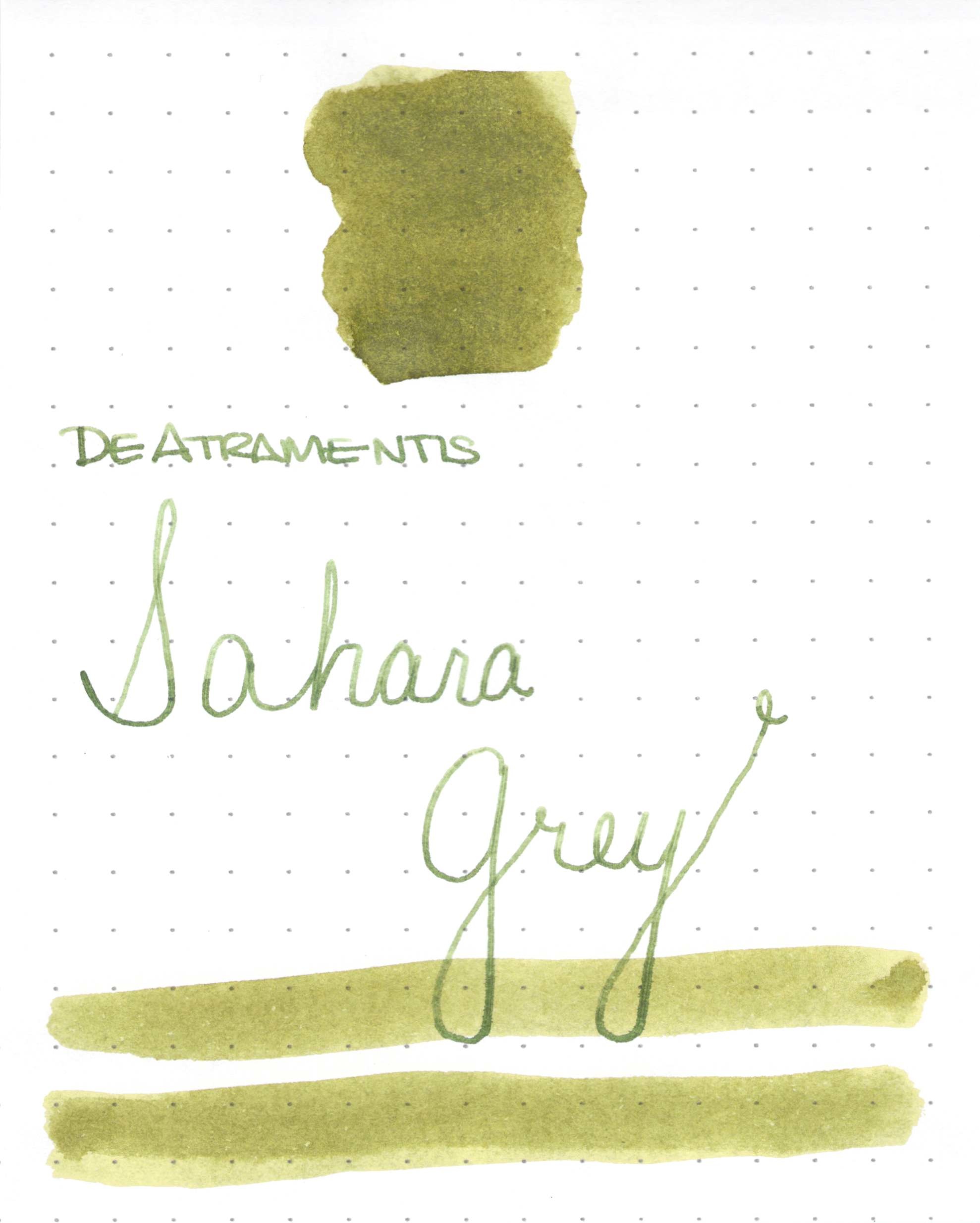
DeAtramentis Sahara Grey Ink Swab

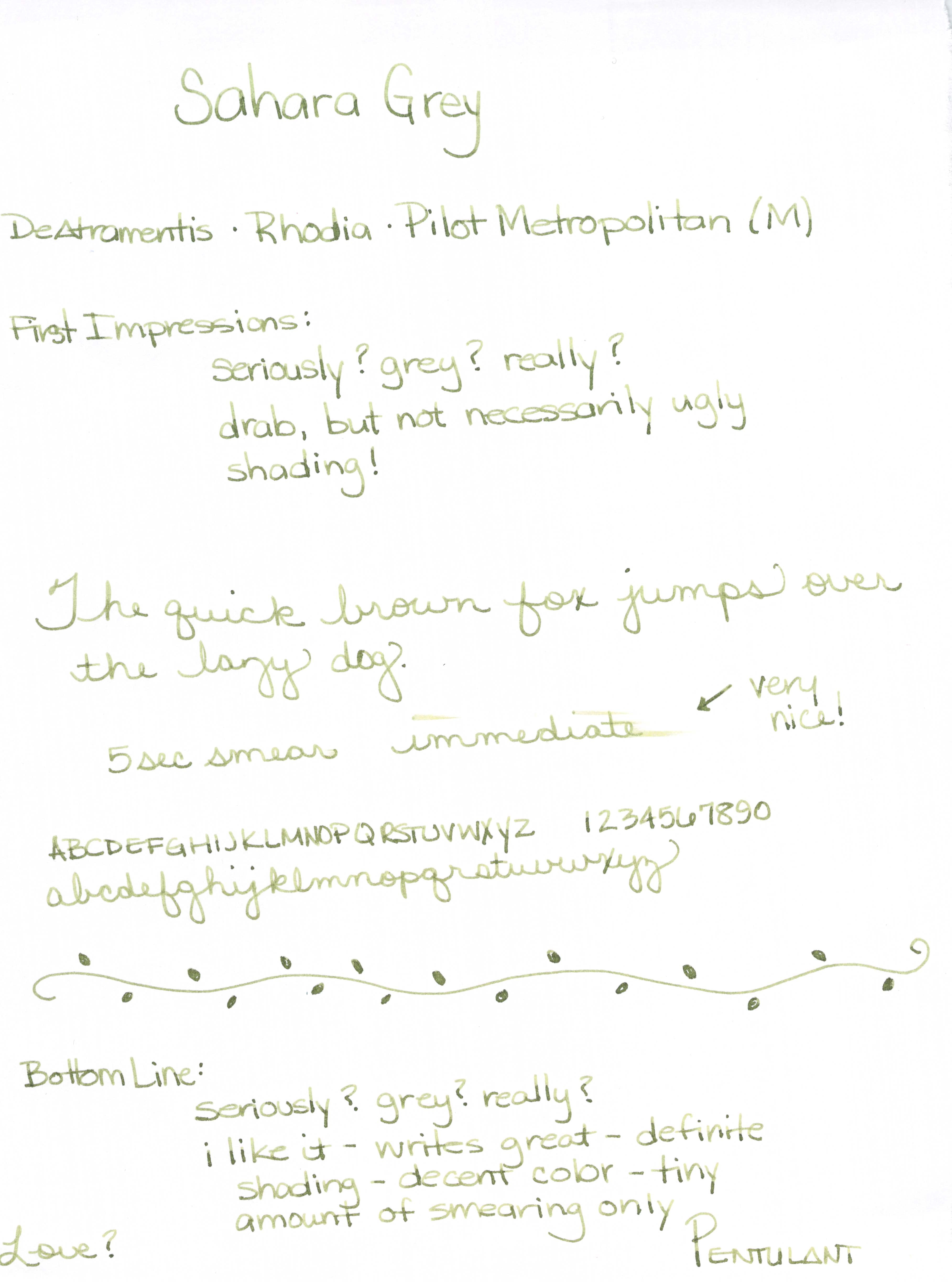
DeAtramentis Sahara Grey Ink Review

Those of you who have been reading here for more than a week know that ink names is one of my biggest pet peeves. Seriously, they could have just left it at Sahara and been ok, right?
If you’re looking for a great shading olive or drab green, this color may be the one for you.
It wrote great in the Pilot Metropolitan I was using for testing. (If you’re looking for fantastic inexpensive pen, the Metropolitan is one I’d definitely recommend.)
No starting issues, no flow problems, and (bonus!) lots of great shading.
I also want to show you this . . .
I couldn’t believe how little it smeared (I was using Rhodia paper). 
Bottom line? If you love the color, you’ll probably love this ink. It really is a winner.
As for me, I’m not a fan of the color – a little too Army for me. What do you think?
DeAtramentis Sahara GreyInk Swab & Review
Click For Full-Size Image
DeAtramentis Sahara Grey
Ink Review

INK REVIEW: De Atramentis Alexander Hamilton

I had no idea Alexander Hamilton was so sexy. 

I’m clueless as to why this ink from De Atramentis was named Alexander Hamilton, but I love it just the same.

Let’s have a closer look….

beautiful shading
deep rich purple

The full review…

Alexander Hamilton is well-behaved in the pen. Perhaps a bit wet with the broad nib, but I can work around that.  In fact, I tried the same ink one other time and loved it then, too.

The color is darker than a traditional (perhaps the better term would be royal) purple and I think this makes it suitable for use in almost any setting. Of course, I work from home and no one but the dogs are judging the ink colors in my notebook.

I love it!  If you’re at all into purples, you should consider Alexander Hamilton from De Atramentis.  Again, look at that shading!

I used a sample for this test, but I’m definitely adding a full bottle to my wish list.

What about you? Love purple? Hate it? What is on your wish list?

Oh! Almost forgot…in case you’re curious.

QUICK LOOK WEDNESDAY – Six Pretty Colors

Sometimes, I want to play with my pens, inks, and papers, but can think of nothing to write.

The first step is to write the name of the ink and the name of the pen (see above). I just noticed that each ink is from a different manufacturer – nice.

Apparently, the last resort is to write things that I overhear from the television (see below).

It was actually quite a bit of fun – watching and scribbling, changing pens and writing a bit more. I love the way the entire sheet of paper looks – each color is pretty amazing on its own, yes?

Let’s take a closer look . . .

Above – DeAtramentis Alexander Hamilton. I love this purple. It’s so rich and deep in color – nice saturation. I don’t see this ink discussed much on the various forums, but I think this is a purple that could be used anywhere.  (more on that another day)

Below – Private Reserve Spearmint. One of my favorite green inks. It looks a bit dark here to my eye, but it is usually quite cheery.

Do you have a guess as to which show I was watching at the time?

Below – Montblanc Hitchcock. A gorgeous blood red ink if I ever did see one. Some really pretty shading in there, too. I have to confess, I have a quite a lot of this in my cabinet. Shall I keep it forever? Use it as if I’ll never run out? Or maybe even sell some?

Below – Noodler’s Habanero. A favorite. That shading. The brightness of the color. Need I say more? Mm..wait, I already did right here.
 

By the way, the above quote is the one that seems like the one that would tell the secret of what I was watching. Have you guessed it yet?

Above – Pilot Iroshizuku Fuyu-syogun. I wonder if I only could have one ink, if this would be it. Check out my big review here. It is crazy CrAzY to think that I, lover of bright and beautiful colors, would be so taken with a gray ink, but there you go.

Above – Diamine Majestic Blue.  Easy to see why it’s one of my favorites, yes?  So pretty.

And, so, there we have it – six pretty colors. All so different from one another and yet all so wonderful.

Which show was I watching?  Downton Abbey, of course!  Have you seen it? Highly recommended.

QUICK LOOK WEDNESDAY: Four Fab Blues

Time for this week’s Quick Look Wednesday!

I like all of these inks for different reasons.

De Atramentis Indigo Blue – a straight-forward blue that could be used in any setting

Diamine Eau de Nil – (does this mean River Water?) a bit of green, but not quite enough to call it turquoise

Private Reserve Ebony Blue – maybe my least favorite because it looks more like a green-black in my swabs. Have any of you tried writing with this one?

Noodler’s Ottman Azure – boom! Pure blue saturation with this one.

So, yeah, each of these are so different from the others and I like them all.  Which is your pick?

QUICK LOOK WEDNESDAY: Four Green Inks

It’s Quick Look Wednesday!  Today, we have four very different shades of green.

 De Atramentis Bamboo Green
 Private Reserve Sherwood Green

 De Atramentis Black Edition Green
 De Atramentis Patina Green
Do you have a favorite?  I’m digging Sherwood Green. Nice clear color.
My least favorite is De Atramentis Black Edition Green. It just looks too muddied to me. But check out the review here.  It looks much better, yes?  The difference may be explained by the fact that my quick looks are just swabs and this is a handwritten review.
As for green inks? I love them. More than I thought I would. They are fun without being too loud (like some kind of crazy pink inks!)
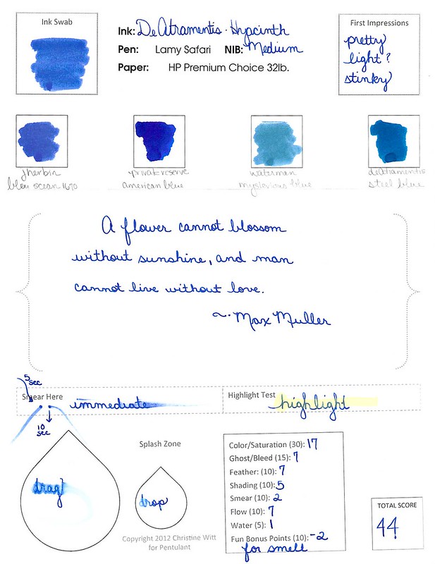
INK REVIEW: De Atramentis Hyacinth

I’ll just blurt it out:  I don’t love this ink.  I don’t even like it.
The color is nice enough, I suppose.

It’s a smeary hot mess, though.  (Can’t believe I missed dotting an i – that’s not like me!)

One of the worst things, though, about De Atramentis Hyacinth?  It stinks. I don’t mind a lightly perfumed ink, but this is just too much for me. It’s a sickening sweet smell that tends to linger.

INK DROP: May 2013

Seriously? I’m probably the last person to comment on the May Ink Drop color from Goulet Pen Shop.

I’ve been just a little busy. There was the wedding. And then the baby! (Not ours – bummer.)

But here they are…

Noodler’s 54th Massachusetts
De Atramentis Ocher Yellow
Roher & Klingner Alt-Goldrun
Roher & Klingner Alt-Bordeaux
De Atramentis Mint Turquoise

They look so different on different papers, yes? Four passes on the Clairfontaine Triomphe paper to get close to the same look on the Brush Dance paper.  (Disclaimer: I’m the president of Brush Dance and maybe just a little slanted in that direction, but really? We have great paper.)

As for the inks? I’m not IN LOVE with any of them.  Each of them falls squarely into that “not a color” area for me. Alt-Goldrun is so popular – I want to write with it very soon.

What do you think? Love ’em? Hate ’em?

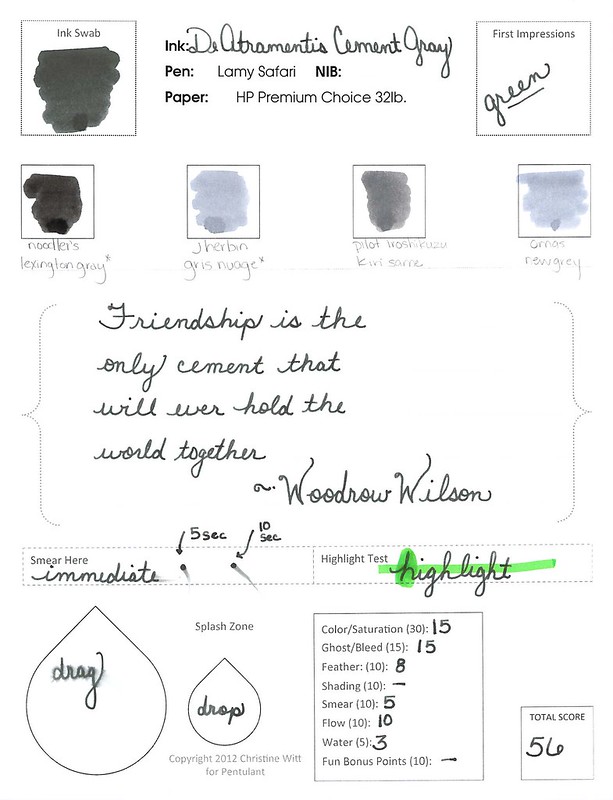
INK REVIEW: De Atramentis Cement Gray

I like gray inks. Always looking for that perfect shade. It’s been a long time since I’ve added an ink to my Fifty Shades of Grey line-up or talked about the spelling of gray -vs- grey. Too long if you ask me!

Unfortunately, I’m not wild about Cement Gray from De Atramentis. (Thank goodness it doesn’t stink like cement, though!)

The problem seems to be that there’s a lot of green in the ink.

Admittedly, it’s difficult to see the green with my scans, but it’s there. It’s there so much that I pointed out to Mr. Pentulant that he might want to consider this ink as his dark-nearly-black-but-still-green choice. He tried it for a short while, but didn’t love it.

The green is most apparent when looked at along side other inks…

As usual, I wrote with this ink for about a week after the review. It wrote fine – a little hard-starting at times even in a medium nib Lamy Safari.

The problem (for me) was the color.  What do you think? See the green? Like it? Hate it?