INK DROP: April 2013

I received my Goulet Pens Ink Drop delivery a couple of days ago.

What a great group of colors, yes?

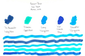
If I had to choose one that didn’t fit with the others, it would be the De Atramentis Indigo Blue – it’s a little dusky compared with the other clear clean colors, but I’d definitely write with it.

Between the two turquoise colors, I would choose the Lamy. Though the colors are very similar, the Lamy is definitely more saturated and I like that.

The Namiki blue has a bit of red in it – defnitely still blue, but leans more toward the purple end of things to my eye.

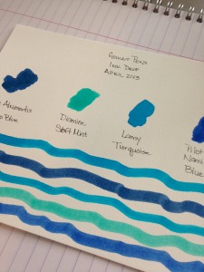
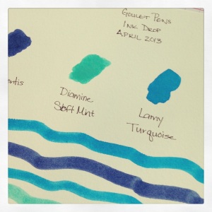
I’ve heard some great things about Diamine Soft Mint (which ended up a little funky in the scanned image above) and hope to have time to take a closer look at it in the very near future.  Here’s a picture from my iPhone – the color is a bit better here….

Kudos to the person at Goulet Pens who chose this assortment! Well done.

Oh..and here’s the image I posted over on Instagram. I’m @christinewitt there.

INK REVIEW: De Atramentis Sandalwood

Love this ink. Except….
Let me show and tell you about all of the positives first.

I love the color. Green with a touch of blue.  Definitely pretty.

It writes well. A little shading in there.

It scores well with me. I shouldn’t have given it Fun Bonus Points, but I was caught up in the moment.
So what’s the problem?  It stinks. It’s noticeable, but ok at first. Tolerable. Even kind of fun.
But dude. After a week of using DeAtramentis Sandalwood as my green of choice, I was so over it. Gross. I don’t mind the scent of sandalwood – Mr. Pentulant would even say that I’m a bit of a hippy who embraces the, ahem, earthy scents. But not this. It was just too much. There was a hint of a petroleum smell in the background – totally ruined it for me. Going on the Hated It list. Bummer.
No.
Darn.

INK REVIEW: Stipula Sapphron

Holy cow. 
I hate Stipula Sapphron.

It shades like a son-of-a-gun. Sounds like I should love it, right? Or at least like it. But no, I hate it.

It’s not often that I say that. In fact, here are all of my posts with “hate” as a tag.  
In the sample vial, the ink looked like a pretty (though not saturated) orange. When I swabbed, I thought the ink looked a little on the yellow side, but was still pretty enough.  (See my first impressions on the handwritten review.)

Then I started writing with it. I was sure my pen must have been dirty. But at the same time, I knew it was a brand new pen and a brand new converter. No ink had ever touched either and both were cleaned prior to use. I twisted a bit of ink out onto another piece of paper – and it sat there looking like a bubble of yellowish mud!  When I smeared that mud around with a cotton swab – it looked like the Ink Swab in my review.
Ca-razy! I don’t get it.

You know what else I don’t get? I couldn’t find even one other review for this ink. Not on Fountain Pen Network, not on Goulet Pens, and even Google came up empty. It’s like I’m in the twilight zone over here.

Hard to believe I’m going pass by shading like this. But I am.

Pretty weird. That’s my first impression – and coincidentally – my bottom line for Stipula’s Sapphron. (By the way, I have no Stipula aversion – I own and love several of their fabulous pens. This ink is just weird.)

In fact, I wanted this to work badly enough that I tried it again another day. With another kind of paper.

Always looking on the bright side, however, Apache Sunset has been on my list of inks to review forever and I’m excited that it’s coming up sometime soon!  And that De Aramentis Gandhi? Isn’t that pretty? 
Time to ‘fess up! Do you have Sappron? Do you love it? Hate it?

INK REVIEW: De Atramentis Gold

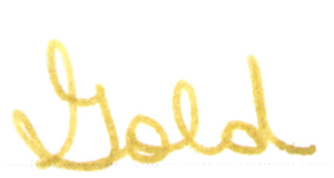
De Atramentis Gold is an interesting ink.
It’s not really gold, is it?
More of a brown-yellow.
Even green looking?
Something.
And there’s the trouble, hm?
We all know by now what I love.
Big bold colors. Lots of saturation.
So I don’t love this and I don’t think the name matches the color.
It wrote fine . . . 

I just didn’t love it.
Didn’t like it either.
I will say this, though, if one is seeking this exact color, it is well-behaved in the pen. It does just fine with the water test, there’s some of that wonderful shading we fountain pen users adore. 
This isn’t my (even close to) perfect ink – but maybe it strikes a chord with you?

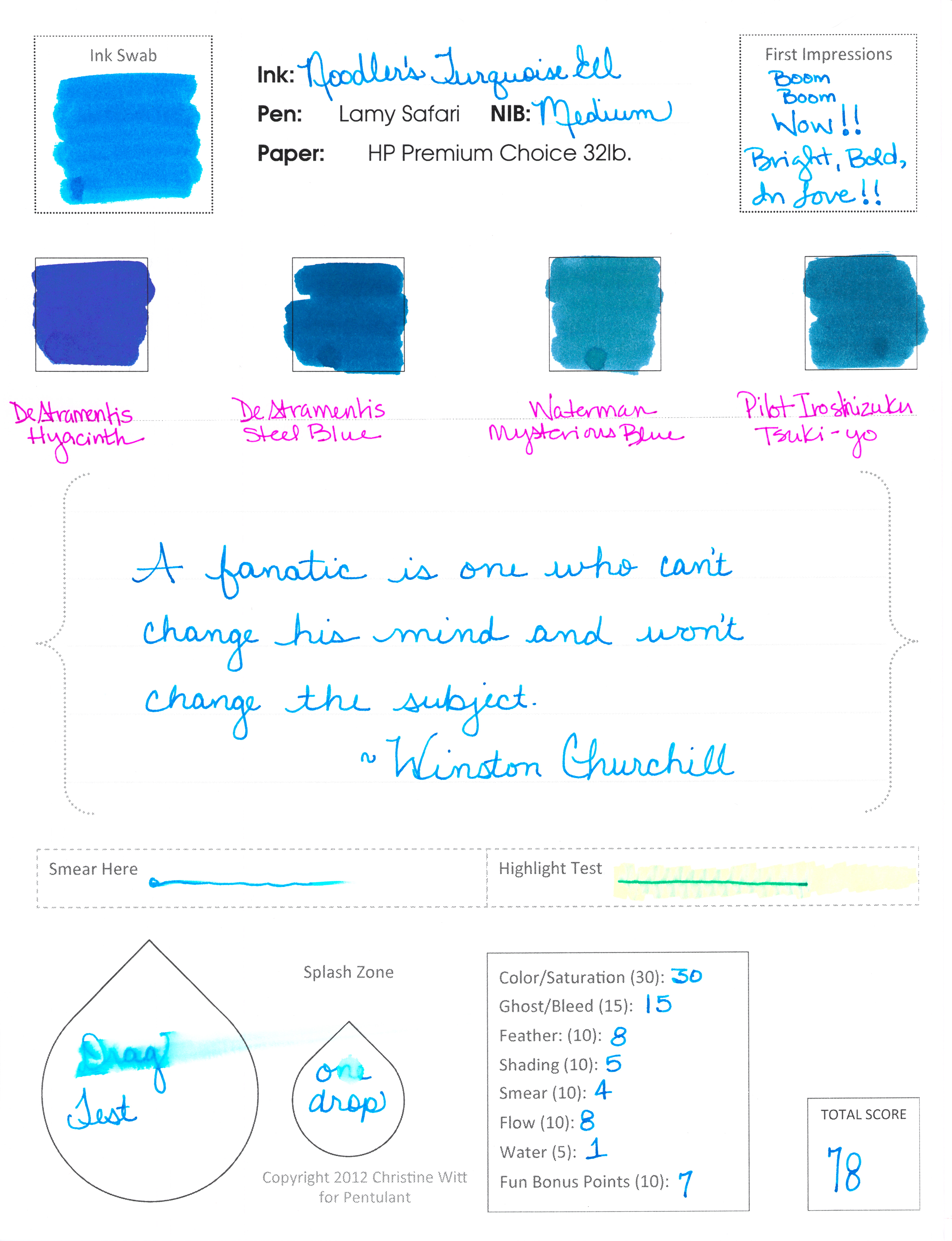
INK REVIEW: Noodler’s Turquoise Eel

Noodler’s Turquoise Eel

Now. This is what I’m talkin’ about!

Some real, in-yo-face, color.

And, bonus! It writes like a dream.

Noodler’s Turquoise Eel rivals Pilot Iroshizuku Kon-peki in every way. It has great color and saturation. It writes beautifully – flow from the pen is just right.

Smear factor isn’t bad.  Not much shading. Is there a turquoise that shades wonderfully? Guess I’ll have to try them all and find out!

Back to the ink . . .

. . . I really don’t have anything negative to say – if I don’t talk about the water test – ha! It’s a great well-behaved ink that I would consider purchasing if I didn’t already own a couple of other turquoise inks. (I test from sample vials, but you probably knew that already.)

A bunch of side notes…

…this is my first review with my new form. Totally excited. Let me know what you think?

…my ink reviews all fall into broad color categories (new this year). This one ended up with the blues because it’s more blue than green. Maybe I need a turquoise – but then I’d need a teal – and sometimes it’s hard to decide. I’ll just keep doing the best I can.

…omg, did you notice the first Compare Square? De Atramentis Hyacinth. I’m excited about reviewing that one sometime soon. Pretttttty.

…Waterman Mysterious Blue felt watery compared to the other inks on this page. Wonder how that will translate in a pen when I get around to testing it.

INK PREVIEW: Oops.

Pffft.

I’d completed the review of Montblanc’s Winter Glow and then went to my stash – grabbed four red inks out of my red inks sample bag – and above is the result.

Dude. Those aren’t red. Maybeeeeeee Rouge Caroubier is close – but even it is more of a pinky color.

Heaven only knows why I didn’t stop after the first – or the second – OR THE THIRD – but I kept right on going.

So..what you have here is a mess. But at least you can see the swab of Winter Glow and a bit of writing. It’s darker than I thought it would be coming out of the pen.

I’ll get a proper review of Winter Glow done soon.

After I try sorting my samples by color one more time 😉

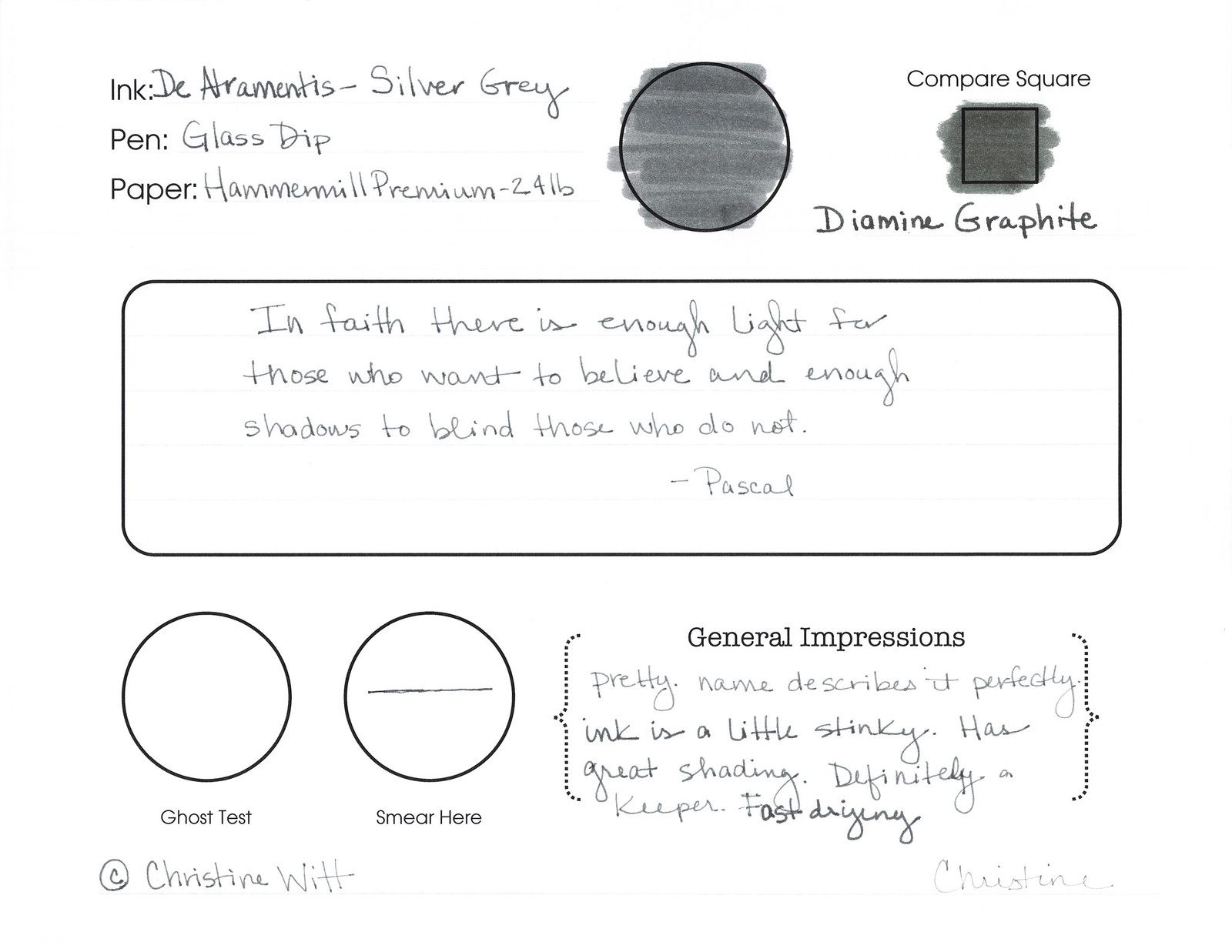
INK REVIEW: De Atramentis – Silver Grey

Really quick review for today…

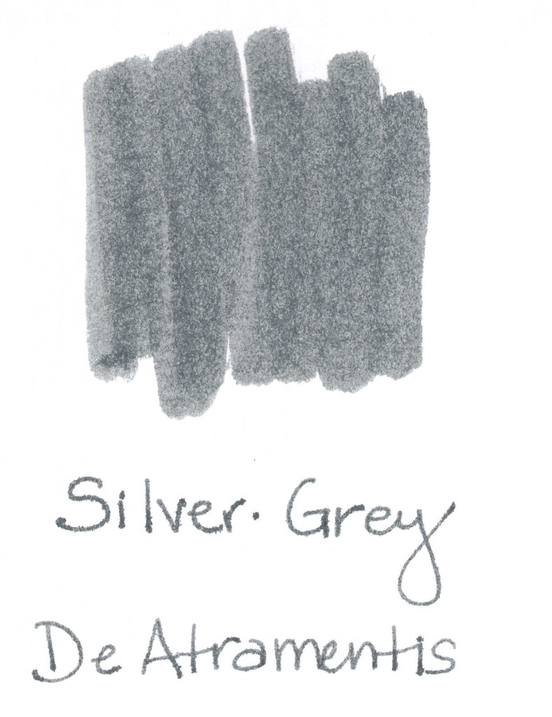
Silver-Grey from DeAtramentis is one of my favorites from my Fifty Shades of Grey (Gray) post.

What I love…
..the name of the color matches the color of the ink!
..it’s a true gray – I don’t see any blue or red or green undertones
..no smear, no bleed, no nonsense

What I didn’t love so much…
..it smells a little funky (not like mold funk, but a definitely chemical / petroleum (?) smell. Something.
..maybe a little too fast-drying

I wrote with a glass dip pen for this test and you can see that things are a bit thin. I don’t think this is a necessarily a fair test of the ink for shading and ghosting.  I’ll need to retest at some point.  Maybe I’ll do a single post with all of the inks I’ve promised to retest at some point. It would be a doozy!
Have a great week, everyone!  xo