INK REVIEW: Sailor Jentle Yama-dori

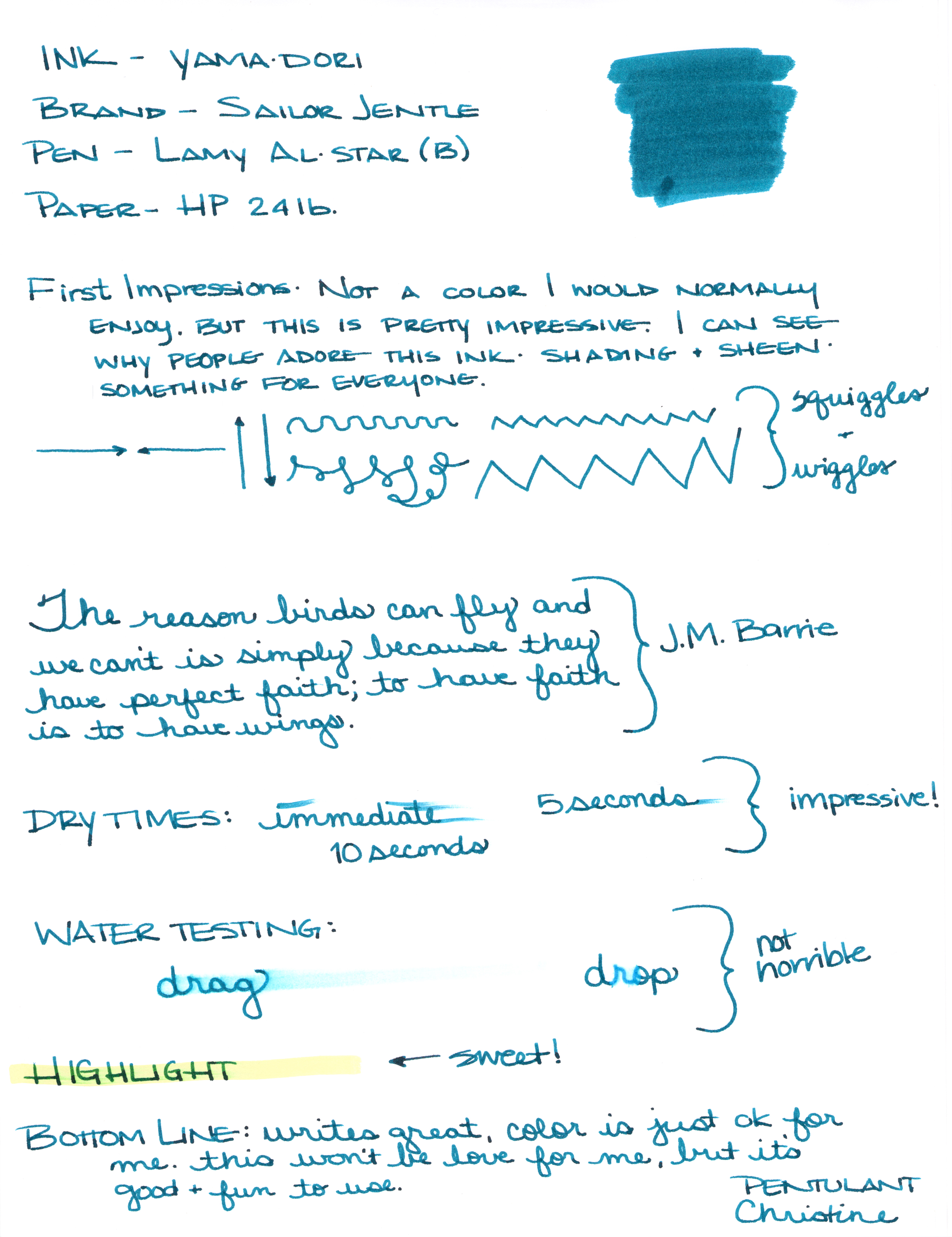
Sailor Jentle Yama-dori Fountain Pen Ink Review


I generally try to avoid reading much about inks before I have the opportunity to try them for myself. I want my opinion to definitely be my own and not influenced by others as much as possible.

That was impossible with Yama-dori. This ink has superstar status over on Fountain Pen Network. Even before the ink was re-released, there was chatter about how amazing it is – it sheens, it shades, it’s perfect! Gotta get me some of that!

I got mine from JetPens with pennies from my own piggy bank. It’s listed at $20 there. Looks like it can be had for a buck or two less at some other online stores.

There are things I really like about Yama-dori. It sheens, it shades, it flows really well. It passed the smear and highlight tests with flying colors.

Yama-dori is my E.T. of inks. Let me explain . . .

Waaaay back when the movie E.T. (you know, the Extra-Terristrial) came out in theaters, it was the Must See movie. OMG, gotta see it. What, you haven’t seen it?  You don’t know what you’re missing!  Best. Movie. Ever.

The build-up was just so much that there was practically no way the E.T. was going to meet my expectations. And it didn’t. I mean, it was ok.

And that’s kind of where I am with Yama-dori. It’s good. It’s nice. I like it. But am I coco-crazy-go-nutters for it?  Nah.

I’ll be back tomorrow (a rare Tuesday post!) with more show and tell on Yama-dori.  (How is that for a tease?)

In the meantime, check out the full review (click here for the full-size image – it’s huge), and tell me what you think.  Do you love Yama-dori?  Do you have an E.T. ink?

PEN REVIEW: Kaweco AL Sport Grey

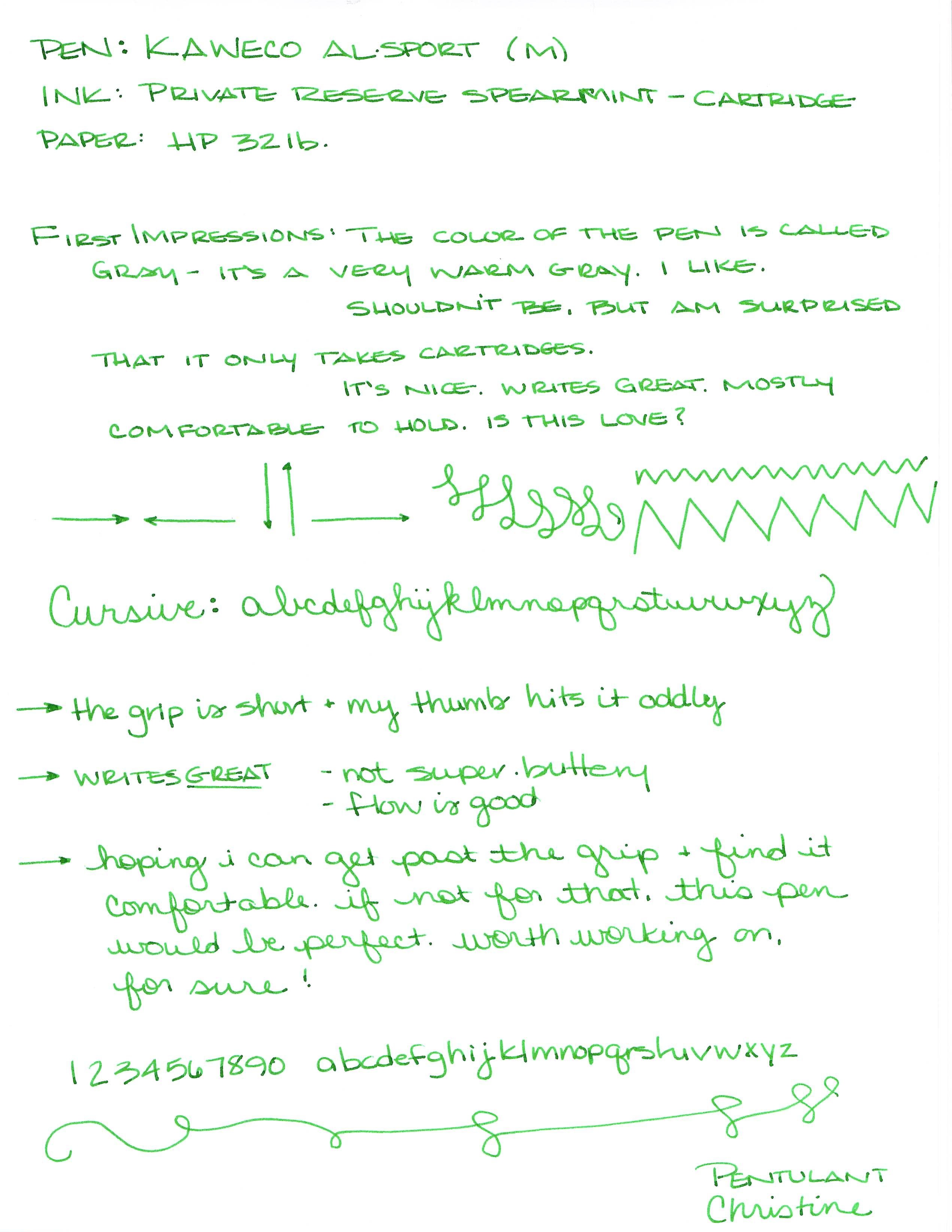
Kaweco AL Sport Grey Fountain Pen Review

I’m usually not into the weights and measures of my fountain pens, but I can’t help it this time. Capped, this great-looking pen measures right around four inches – the perfect size for pockets or smaller bags. When posted, the Kaweco gains over an inch to just about 5.25 inches.  Perfect.

The AL Sport weighs in at a solid 22g. For comparison, the Kaweco Ice Sport weighs just 10g.

I love the look of this pen – classic Kaweco design, sleek, simple, smart.

The color of is simply called grey. It’s a very warm grey – leaning well into red. Lot of depth of color for what is basically a flat finish. I can’t help but think that if you wanted to match this pen to an ink, you should try Pilot Iroshizuku’s Kiri-same.

Unfortunately, this pen only accepts short international cartridges. Fortunately, some short international converters may work with the pen. Unfortunately, I don’t know which those are – I am hoping someone will post with suggestions.

A great solid pen.

But how does it write?

I loaded up my medium-nibbed AL Sport with a Private Reserve Spearmint cartridge and got to writing . . . .

My early (and only) concern was that the section (grip area) is quite short and my thumb was hitting  (and rubbing against) it oddly. Honestly, I wasn’t sure it was going to work out.

After writing with it for awhile, putting it down for a day or two, and then going back to it, there were no issues with the section/grip. Whew.  Perfectly comfortable, but something to be aware of because that section does seem short.

My bottom line . . . At around $80 (I got mine from Goulet Pens with my own saved pennies), it’s a bit more expensive than some of the other Kaweco fountain pens, but the quality is there. Definitely recommended. In fact, I’m already looking for the Stonewashed version of this same pen – stay tuned!

xoxox

GIVE AWAY: Pilot Iroshizuku Shin-Ryoku

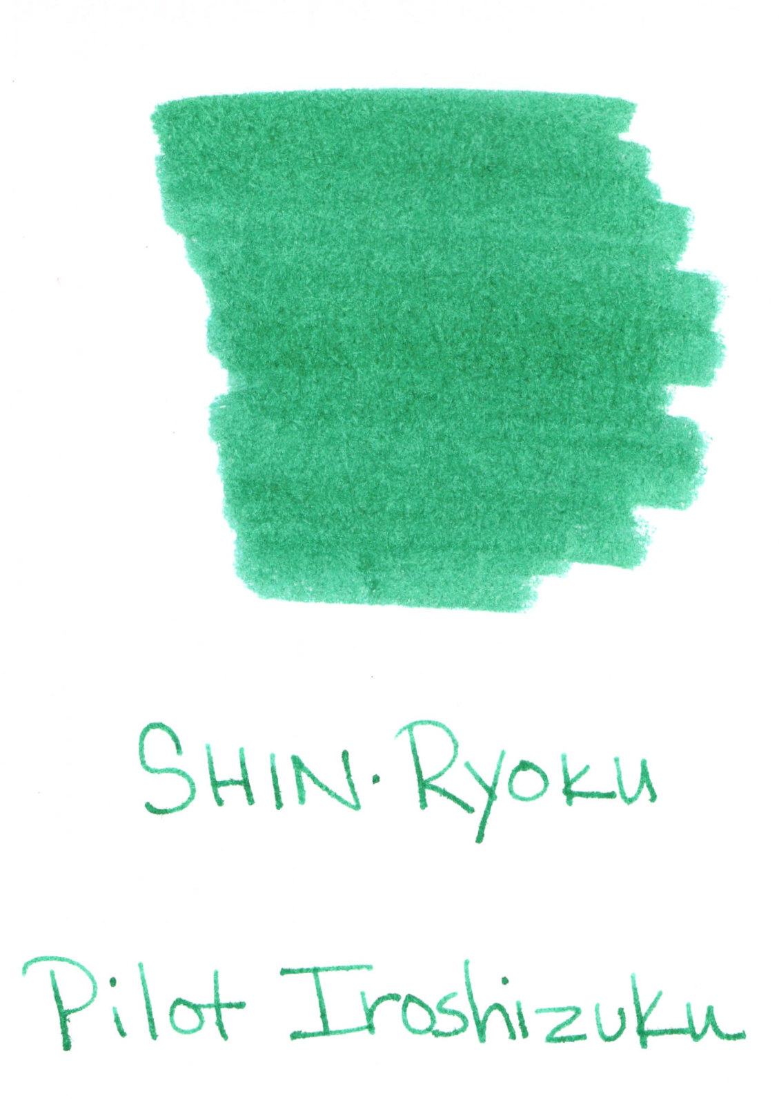
It’s true!  I’m giving away a mostly unused bottle of Pilot Iroshizuku Shin-ryoku.

Bottom Line:  Leave a comment below to be entered to win. Do it before next Thursday, February 20. And, omg, please please leave a way for me to contact you – you know, in case you win.

Details: About 100 years ago (more like May of last year), when I was on my honeymoon, I was shocked to see the Paradise Pens in Las Vegas was closing. They had a deal on inks and I bought a few – mostly on speculation – including this one.

Got it home, inked a pen (I never ever dip right into the bottle, no contamination here) and realized that, omg, I don’t like this ink. I stuffed it into my ink cabinet and haven’t bothered with it since then.

In fact, how funny is it that my very first ink giveaway (implies there are more to come, hm?) also happens to be the very first ink I ever reviewed?  (That review was from a sample.)

I don’t have the box or the fancy hang tag, but the bottle and its contents are in good shape. There are maybe 3 ml missing from the bottle, but probably not even that much.

So! If you’d like to enter to win, just leave a comment below before next Thursday (the 20th) and I’ll announce a winner (chosen randomly, of course).  Hopefully, I’ll get my act together enough to ship the ink pretty quickly after that.

Fun, right?

No enter to win! Do it!

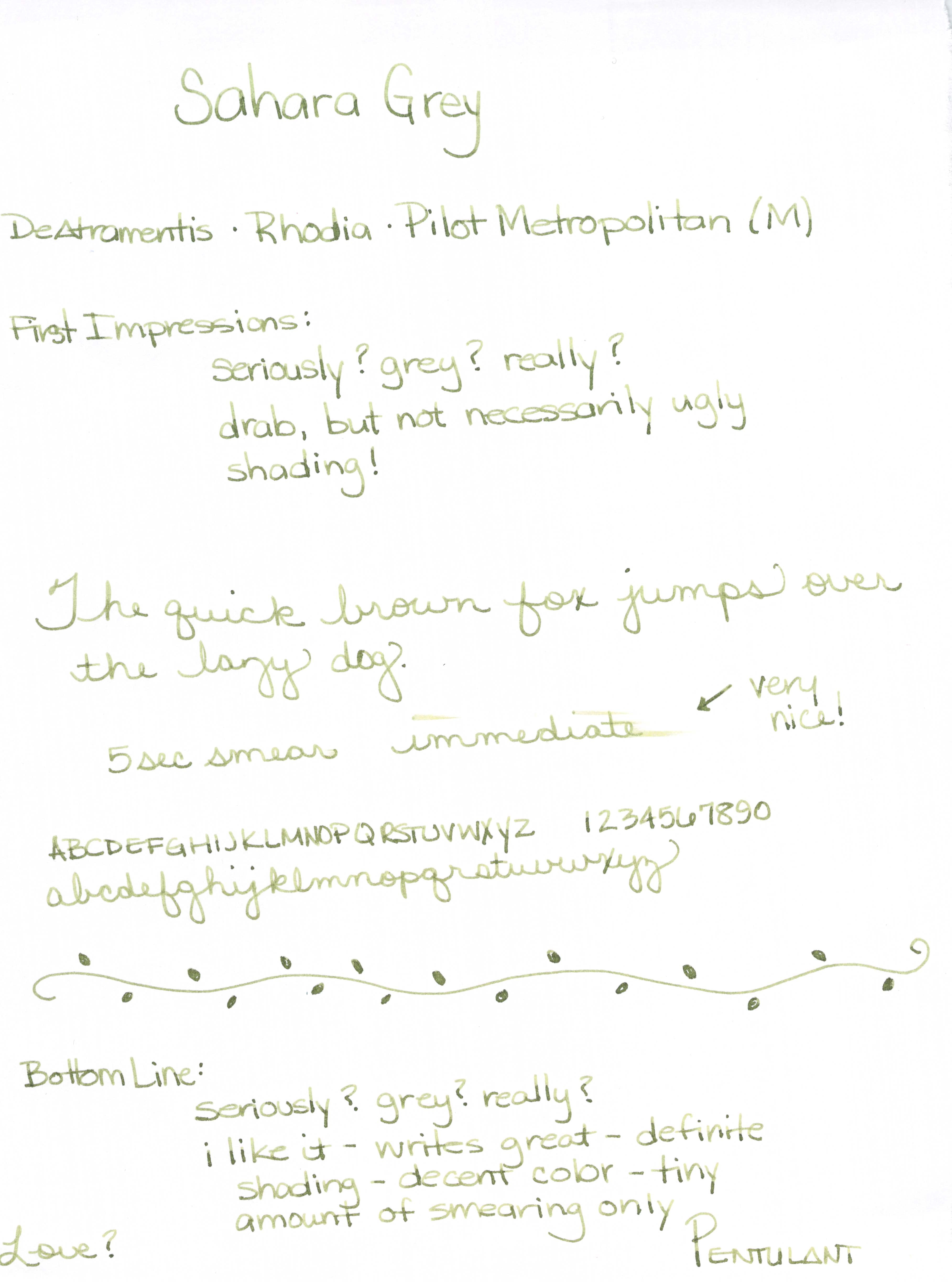
INK REVIEW: De Atramentis Sahara Grey

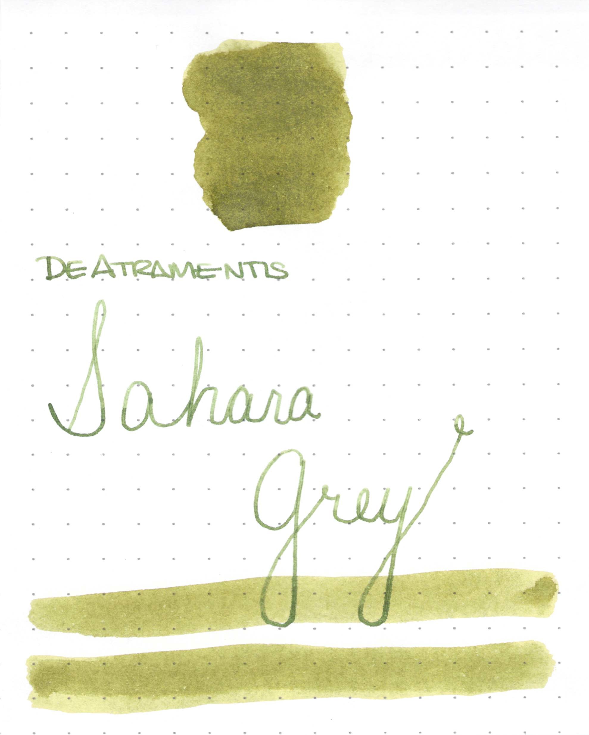
DeAtramentis Sahara Grey Ink Swab

DeAtramentis Sahara Grey Ink Review

Those of you who have been reading here for more than a week know that ink names is one of my biggest pet peeves. Seriously, they could have just left it at Sahara and been ok, right?
If you’re looking for a great shading olive or drab green, this color may be the one for you.
It wrote great in the Pilot Metropolitan I was using for testing. (If you’re looking for fantastic inexpensive pen, the Metropolitan is one I’d definitely recommend.)
No starting issues, no flow problems, and (bonus!) lots of great shading.
I also want to show you this . . .
I couldn’t believe how little it smeared (I was using Rhodia paper). 
Bottom line? If you love the color, you’ll probably love this ink. It really is a winner.
As for me, I’m not a fan of the color – a little too Army for me. What do you think?
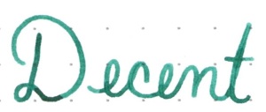
DeAtramentis Sahara GreyInk Swab & Review
Click For Full-Size Image
DeAtramentis Sahara Grey
Ink Review

INK REVIEW: Noodler’s Gruene Cactus Eel

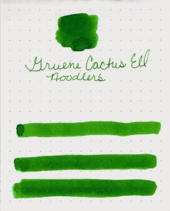
Noodler’s Gruene Cactus Eel
The color of this fountain pen ink reminds me of (now-discontinued) Amazon from Caran D’Ache. That is to say, I love this green.  No red, no blue, no yellow – just green.
As an aside, I checked a couple of weeks ago – you can still find the old Caran D’Ache inks in some places if you look around for them. I ended up not buying Amazon – at the time, I wasn’t able to commit to a green 100%, and since that time, I’ve fallen for several other greens and won’t miss Amazon.
Anyway…back to Gruene Cactus Eel.

All of the inks in Noodler’s “eel” line are lubricated. As in, “slippery as an….”  Have you seen the PDF that Noodler’s and Goulet Pens published?  It shows Noodler’s inks and their special properties. Looks like it was last updated more than a year ago, but here you go.

So, what are lubricated fountain pen inks? They are specially formulated inks that could apparently help your pistons (pens and converters) gliding smoothly. These inks may also flow better from the pen due to the lubrication.  I tried to find out exactly what component makes an ink lubricated, but came up (ahem) dry.

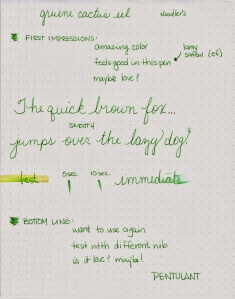
Flow was good from this ink in the Lamy Safari with an Extra Fine Nib. Was it better than some other inks? I really don’t think so.

The one big issue that became more annoying the more I used the ink as that it took forever to dry. Even with the extra fine nib. Forever.

So..even though it has amazing color and it writes beautifully, I can’t imagine using this ink on a regular basis because of the dry time.   Check it out below….

I’m not out completely on this or other lubricated inks. If I had a pen with flow issues, I’d probably try a lubricated ink before giving up on the pen.

But what about you? Have you tried lubed up inks? Love/Hate? Or maybe you have a favorite green ink you’d like to tell me all about?

INK REVIEW: Private Reserve DC Supershow Green

Private Reserve DC Supershow Green Ink Swab

First, forgive the swab – not sure why it’s a bit blurry.

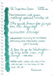
Second, this ink isn’t green. It’s teal. More toward the green side of teal, but still – it’s teal.

Private Reserve DC Supershow Green Writing Sample

That aside, I don’t know what I was thinking when I wrote the following…..

Was I perhaps blinded by my pet peeve? I think maybe so.  Because looking at it now, DC Supershow Teal Green definitely has something special.  Look at all of that shading.  Now that the bitterness of the name not matching the color of the ink has subsided, even I can admit that there are some really great qualities about this ink.

What is my new bottom line?  The one I’m writing while keeping names out of it?  It’s a good ink. It writes well.  The color isn’t for me.

OK…this is a trend. Three Mondays in a row, I’ve not loved the ink. What is going on here?  I’m going to need to find something really terrific for next week!

INK REVIEW: Diamine Ultra Green

Diamine Ultra Green Swab

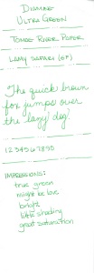
 With the demise of Caran D’ache Amazon Green, I have been on the lookout for another green that I can love as much.  Maybe Ultra Green from Diamine is it.

I tested Ultra Green on a variety of papers including famed Tomoe River Paper. While I have some issues with Tomoe River Paper (it crinkles like mad and needs to be treated gently for this reason), I also think it is fantastic to get a true read of the color of an ink. Rather than being absorbed into the paper, the ink seems to sit on top of the paper – there is never even a little bleed-through or feathering with Tomoe River Paper.
gorgeous color

I love the clear and crisp qualities that this ink has to offer. Great clean green with good saturation (so important to me) and even a little shading.

In some ways, maybe I like this ink even better than Amazon from Caran D’ache.  Look at the highlighting test and the smearing (well, the lack of smearing).

Diamine Ultra Green Writing Test on Strathmore Cotton Paper

I love the swab below. The variation of color . . .

Diamine Ultra Green Writing Test on Clairefontaine Paper

Yep! This might be my new green – might have to do more testing first, though, yes?

Diamine Ultra Green Writing Test on Tomoe River Paper

Do you have a favorite green? Tell me all about it!

INK PREVIEW: Sailor Jentle Epinard

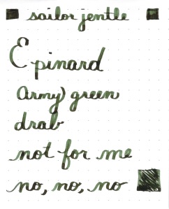
Oh man. I hate this ink. Lots of others love it – and I’ll admit that I have nothing against it other than the color.

Sailor Jentle Epinard is just not for me.

It even has some pretty nice shading.

If you can get past the color. Epinard.

But I can’t.

I used a TWSBI with a stub nib for this review. I’ve mentioned before and I’m saying again, I don’t think stubs are for me, but that has nothing to do with this ink. I just don’t like it.

In fact, I loaded up my pen, wrote a tiny bit with it and immediately rinsed it right out my pen. So glad I only had a sample and not the full bottle.

Love it, hate it?

QUICK LOOK WEDNESDAY – Six Pretty Colors

Sometimes, I want to play with my pens, inks, and papers, but can think of nothing to write.

The first step is to write the name of the ink and the name of the pen (see above). I just noticed that each ink is from a different manufacturer – nice.

Apparently, the last resort is to write things that I overhear from the television (see below).

It was actually quite a bit of fun – watching and scribbling, changing pens and writing a bit more. I love the way the entire sheet of paper looks – each color is pretty amazing on its own, yes?

Let’s take a closer look . . .

Above – DeAtramentis Alexander Hamilton. I love this purple. It’s so rich and deep in color – nice saturation. I don’t see this ink discussed much on the various forums, but I think this is a purple that could be used anywhere.  (more on that another day)

Below – Private Reserve Spearmint. One of my favorite green inks. It looks a bit dark here to my eye, but it is usually quite cheery.

Do you have a guess as to which show I was watching at the time?

Below – Montblanc Hitchcock. A gorgeous blood red ink if I ever did see one. Some really pretty shading in there, too. I have to confess, I have a quite a lot of this in my cabinet. Shall I keep it forever? Use it as if I’ll never run out? Or maybe even sell some?

Below – Noodler’s Habanero. A favorite. That shading. The brightness of the color. Need I say more? Mm..wait, I already did right here.
 

By the way, the above quote is the one that seems like the one that would tell the secret of what I was watching. Have you guessed it yet?

Above – Pilot Iroshizuku Fuyu-syogun. I wonder if I only could have one ink, if this would be it. Check out my big review here. It is crazy CrAzY to think that I, lover of bright and beautiful colors, would be so taken with a gray ink, but there you go.

Above – Diamine Majestic Blue.  Easy to see why it’s one of my favorites, yes?  So pretty.

And, so, there we have it – six pretty colors. All so different from one another and yet all so wonderful.

Which show was I watching?  Downton Abbey, of course!  Have you seen it? Highly recommended.

QUICK LOOK WEDNESDAY: Four Green Inks

It’s Quick Look Wednesday!  Today, we have four very different shades of green.

 De Atramentis Bamboo Green
 Private Reserve Sherwood Green

 De Atramentis Black Edition Green
 De Atramentis Patina Green
Do you have a favorite?  I’m digging Sherwood Green. Nice clear color.
My least favorite is De Atramentis Black Edition Green. It just looks too muddied to me. But check out the review here.  It looks much better, yes?  The difference may be explained by the fact that my quick looks are just swabs and this is a handwritten review.
As for green inks? I love them. More than I thought I would. They are fun without being too loud (like some kind of crazy pink inks!)