Tag Archives: grey
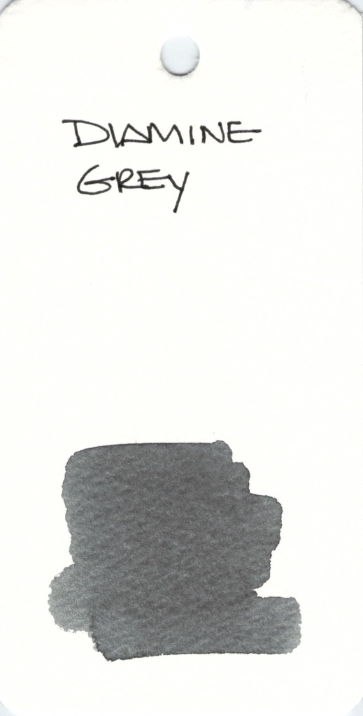
INK SWAB 219: Diamine Grey
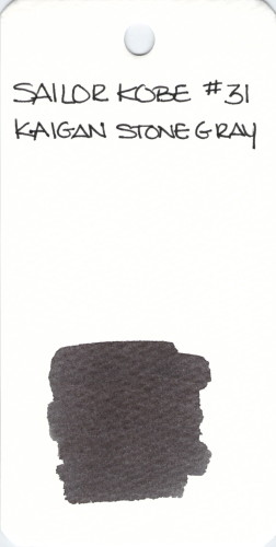
INK SWAB: 179/365 – Sailor Kobe Kaigan Stone Gray #31
INK SWAB: 135/365 – De Atramentis PI Tchaikovsky
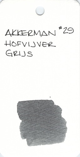
INK SWAB: 111/365 – PW Akkerman Hofvijver Grijs
Hofvijver Grijs is a nice middle-of-the-road gray (unless you prefer that it be grey) ink from PW Akkerman.
If you’ve been searching for a US source for Akkerman inks and their iconic bottles, check out Vanness Pen Shop. I’ve only ordered from here once, but had a good experience.
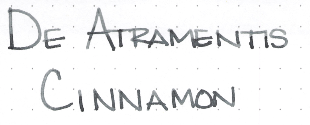
INK REVIEW: De Atramentis Cinnamon
It has been forever since I’ve added to my Fifty Shades of Grey collection!
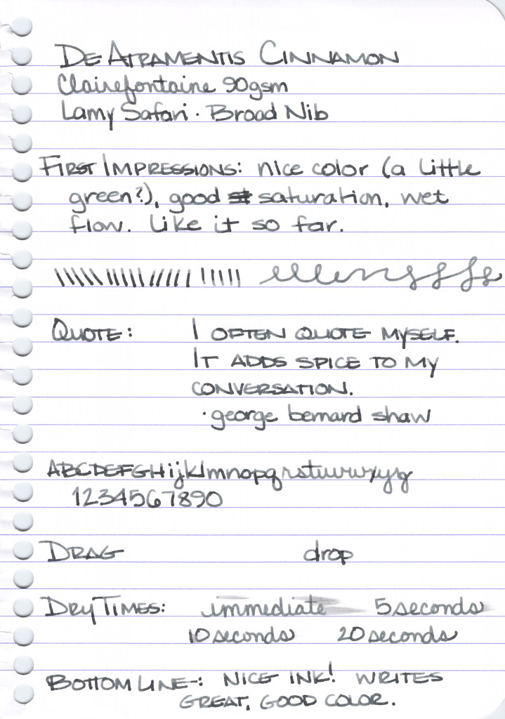
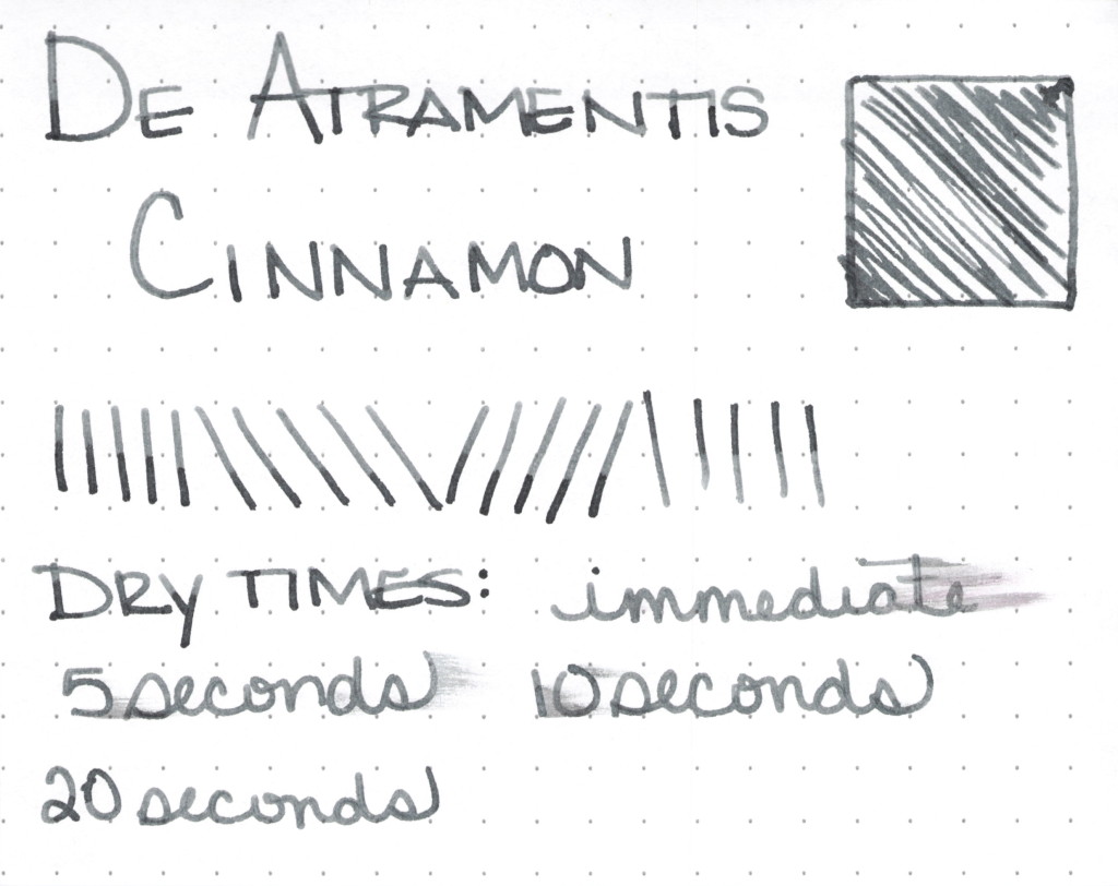
De Atramentis Cinnamon is from the scented line of De Atramentis inks for fountain pens. The scent is definitely cinnamon with no stinky undertones that I could detect. The ink is dark grey (or is it gray?) with a maybe a hint of green. I don’t see as much green in it as a I saw in De Atramentis Cement, and so I don’t think they are De Atramentis Twins, but they are definitely close, with Cinnamon being just a touch lighter.
The ink writes wonderfully. No hard starts, no feathering, show-through, or bleeding on either Clairefontaine or Rhodia paper.
Cinnamon won’t replace Pilot Iroshizuku Fuyu-syogun as my favorite gray ink, but I do like it quite a bit and find myself picking up the pen inked with it regularly.
I scanned the handwritten review before I remembered to complete the water test – oops. Having later completed the test, you will have to trust me when I say that it behaved wonderfully. Not perfectly, but definitely better than what I expected.
My bottom line is that this is an ink that many people will like. The color is good and the writing experience really couldn’t be better. Winner, winner!
Have you tried this one? What is your favorite gray? Or do you spell it grey? Have you seen the movie Fifty Shades of Grey? Or read the book?
INK SWAB: 50/365 – Pilot Iroshizuku
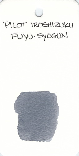
Pilot Iroshizuku Fuyu-syogun is one of my all-time very most favorite best inks ever.
See my passionate review here.
An amazing swab of it on Tomoe River Paper.
And that concludes my first fifty ink swabs! Only..uh…315 to go!
Side note – What are you thinking, Pringles? (Actually, I’ve had wasabi chips, they aren’t terrible.) (Side side note – I really cannot stay away from that website.)
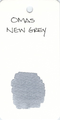
INK SWAB: 24/365 – Omas New Grey
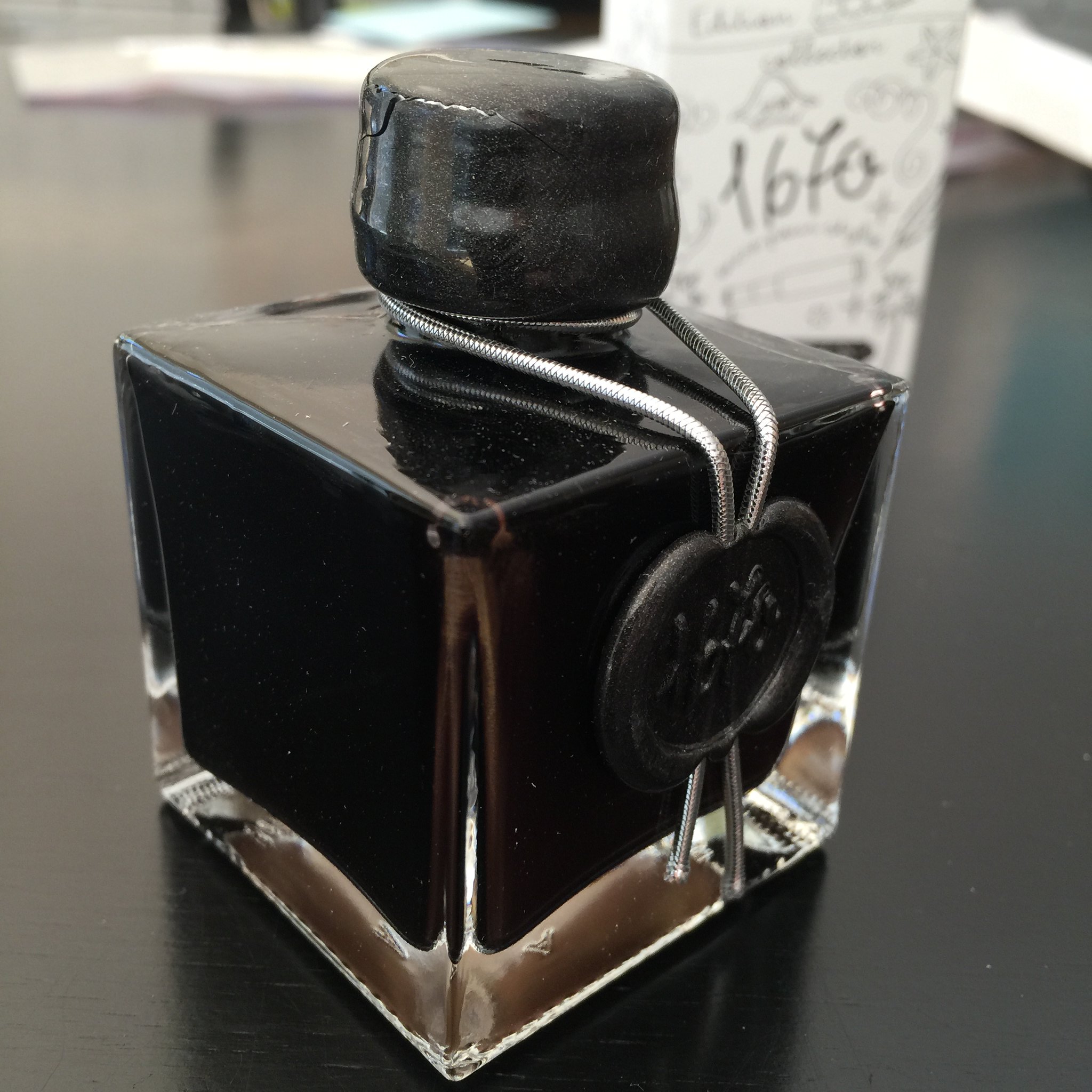
INK REVIEW: J Herbin Stormy Grey
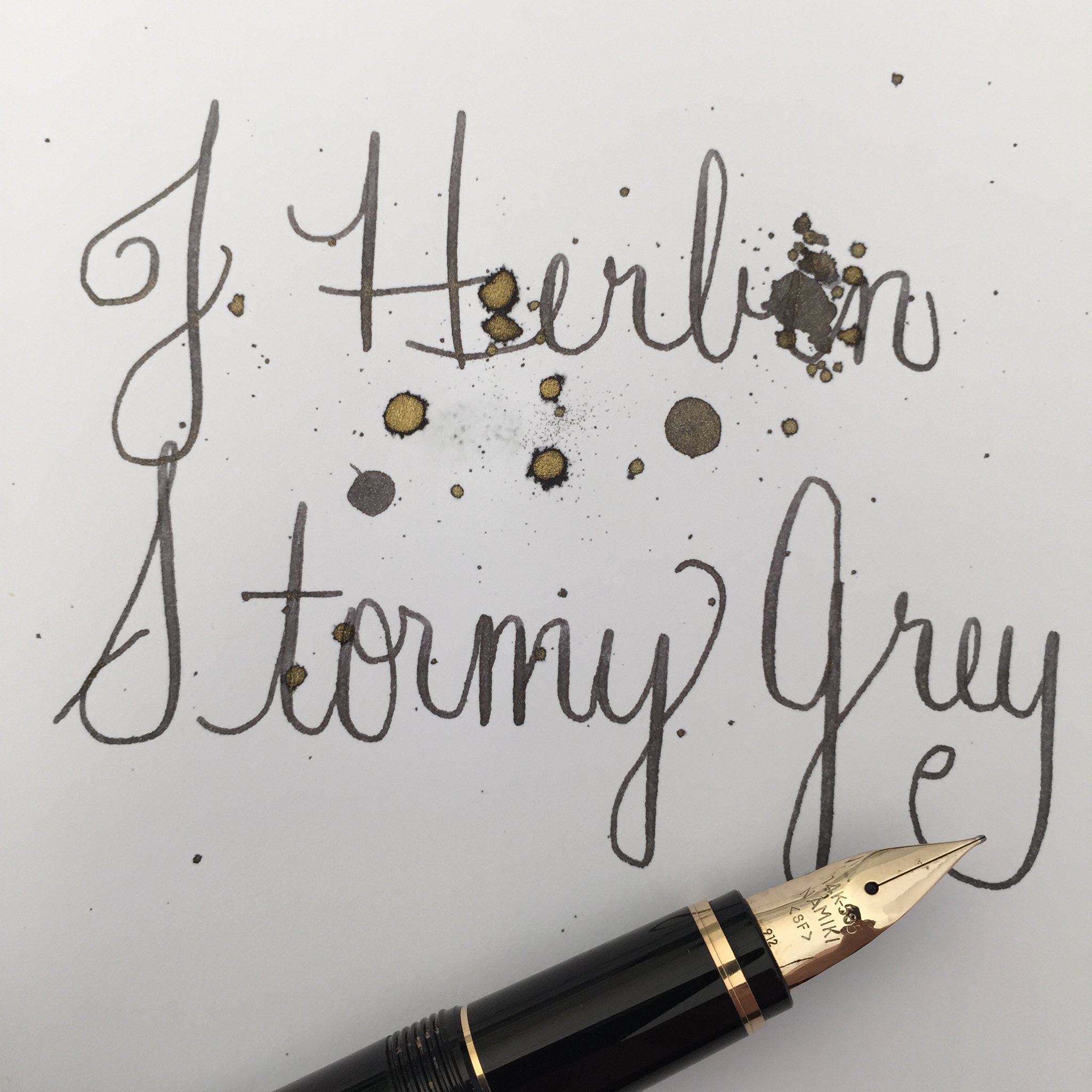 |
| Handwritten Review: J Herbin – Stormy Grey |
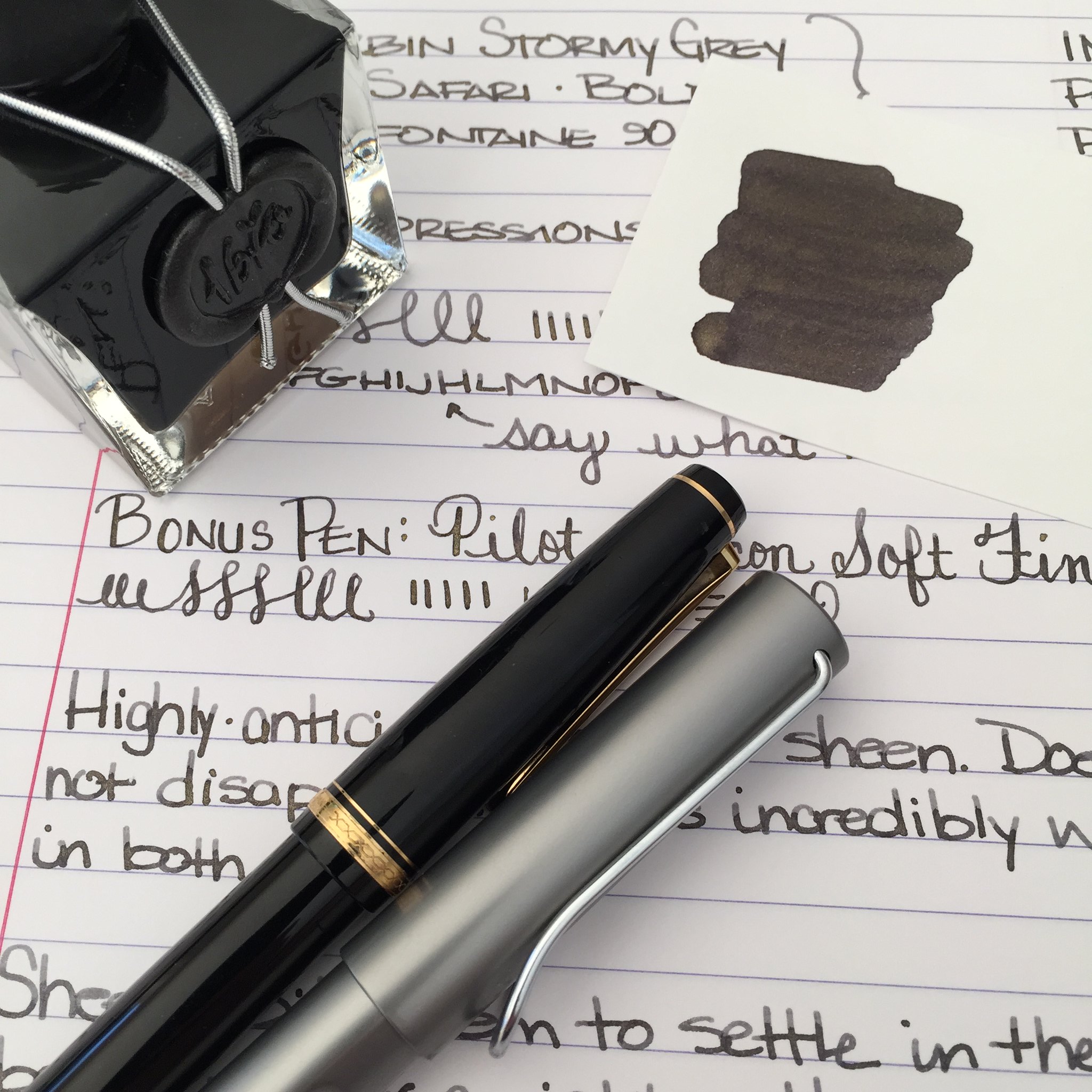
There has been so much chatter in the fountain pen community about J Herbin’s Stormy Grey ink. So much anticipation. It’s all about that gold sheen, baby.
When Goulet Pens finally announced that they had it in stock, it was sold out in under an hour – and I missed it. Arrrrgh.
I hurried over to Amazon to see if I could find it there – score! It’s the same price at both places – $26 for 50 ml.
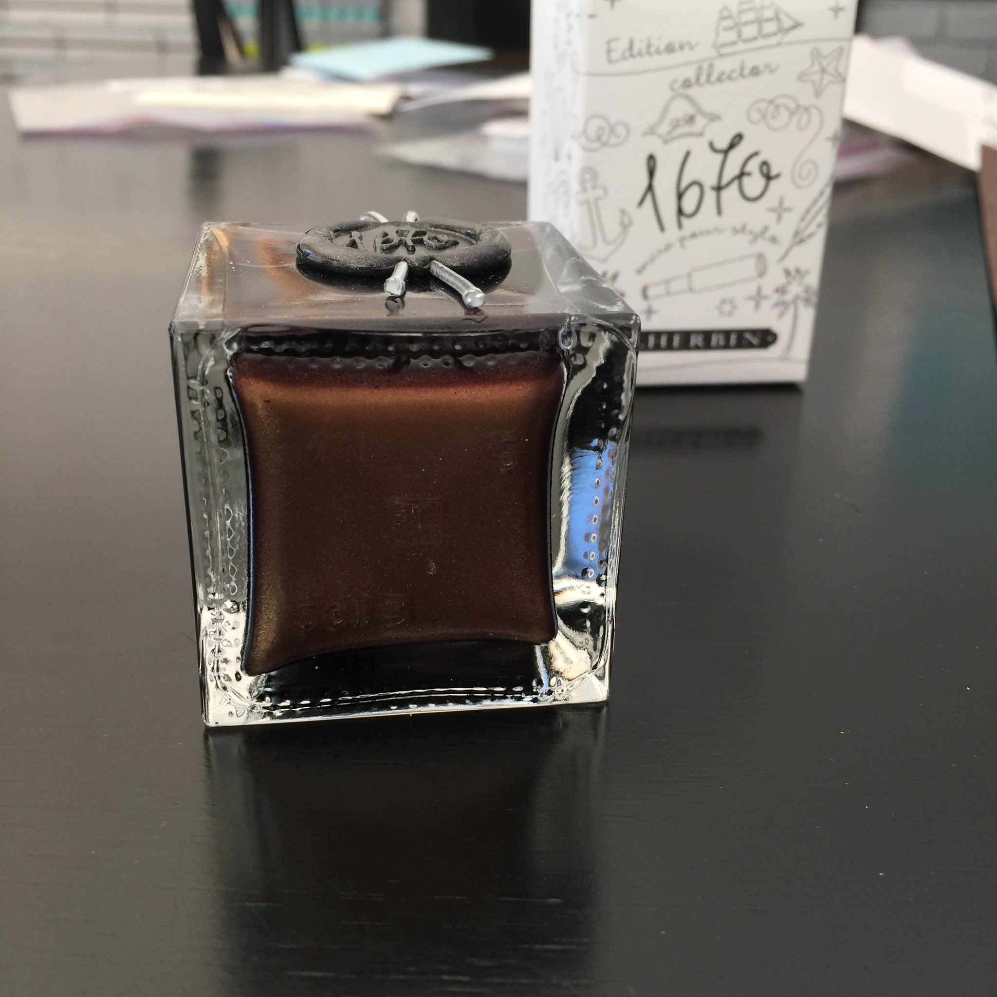
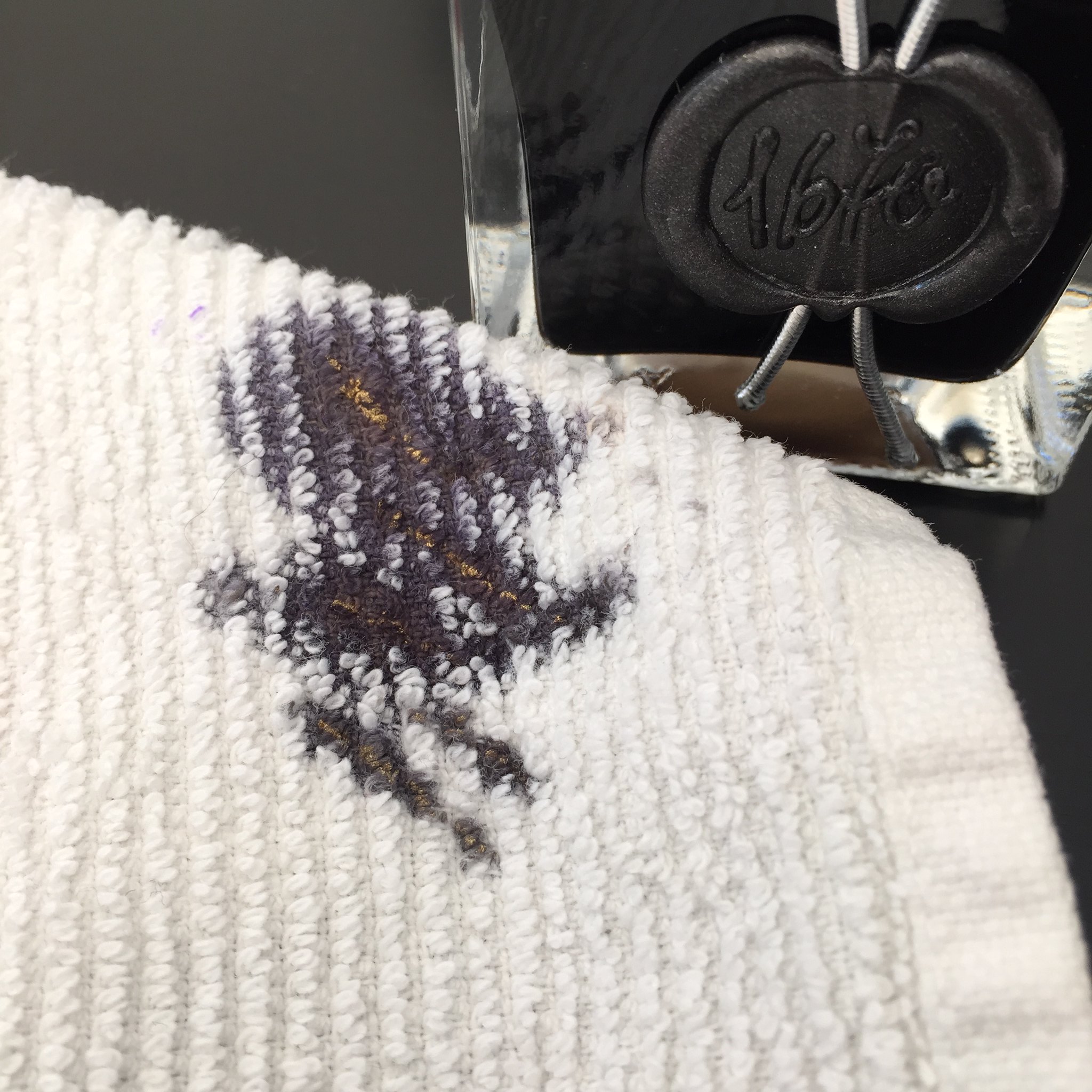
Above: Like the other J Herbin special editions, this bottle is extra special, sealed with wax, and quite lovely. Except that only the smallest pens could fit into the opening of the bottle. And my wax on the screw top is already cracked – whomp whomp.
Below: The sheeny bits came to a rest at the bottom of the bottle. You’ll want to shake well before using this ink.
Below: Sheen on the towel that I used to wipe my nib. Crazy, right?
All of that Stormy Grey sheen is just fine, but how does it write?
Looking for the sheeniest sheeny picture of them all? Check out my friend rubengamez’s feed on Instagram. It’s crazy good sheen!
https://instagram.com/p/uEbTlGBafn
QUICK LOOK WEDNESDAY – Six Pretty Colors
Sometimes, I want to play with my pens, inks, and papers, but can think of nothing to write.
The first step is to write the name of the ink and the name of the pen (see above). I just noticed that each ink is from a different manufacturer – nice.
Apparently, the last resort is to write things that I overhear from the television (see below).
It was actually quite a bit of fun – watching and scribbling, changing pens and writing a bit more. I love the way the entire sheet of paper looks – each color is pretty amazing on its own, yes?
Let’s take a closer look . . .
Above – DeAtramentis Alexander Hamilton. I love this purple. It’s so rich and deep in color – nice saturation. I don’t see this ink discussed much on the various forums, but I think this is a purple that could be used anywhere. (more on that another day)
Below – Private Reserve Spearmint. One of my favorite green inks. It looks a bit dark here to my eye, but it is usually quite cheery.
Do you have a guess as to which show I was watching at the time?
Below – Montblanc Hitchcock. A gorgeous blood red ink if I ever did see one. Some really pretty shading in there, too. I have to confess, I have a quite a lot of this in my cabinet. Shall I keep it forever? Use it as if I’ll never run out? Or maybe even sell some?
Below – Noodler’s Habanero. A favorite. That shading. The brightness of the color. Need I say more? Mm..wait, I already did right here.
By the way, the above quote is the one that seems like the one that would tell the secret of what I was watching. Have you guessed it yet?
Above – Pilot Iroshizuku Fuyu-syogun. I wonder if I only could have one ink, if this would be it. Check out my big review here. It is crazy CrAzY to think that I, lover of bright and beautiful colors, would be so taken with a gray ink, but there you go.
Above – Diamine Majestic Blue. Easy to see why it’s one of my favorites, yes? So pretty.
And, so, there we have it – six pretty colors. All so different from one another and yet all so wonderful.
Which show was I watching? Downton Abbey, of course! Have you seen it? Highly recommended.

