I have a bunnnnch of pens that I’ve been meaning to review here. The Franklin-Christoph Model 20 Marietta is one of those pens.
Franklin-Christoph is a brand that I respect. They truly stand behind the products they sell and they offer amazing customer service. I own a few of their pens and several pen cases. I’m definitely a satisfied customer.
Let’s have a look at the Model 20 . . .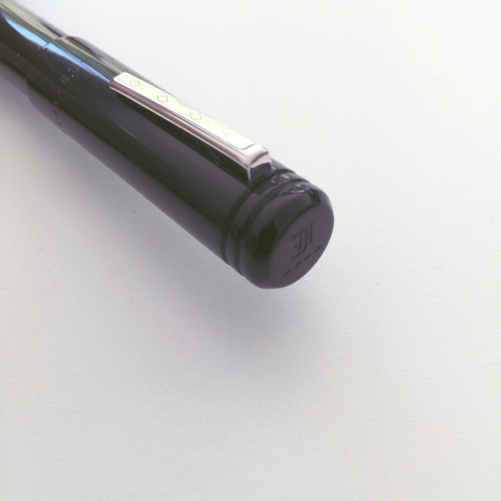
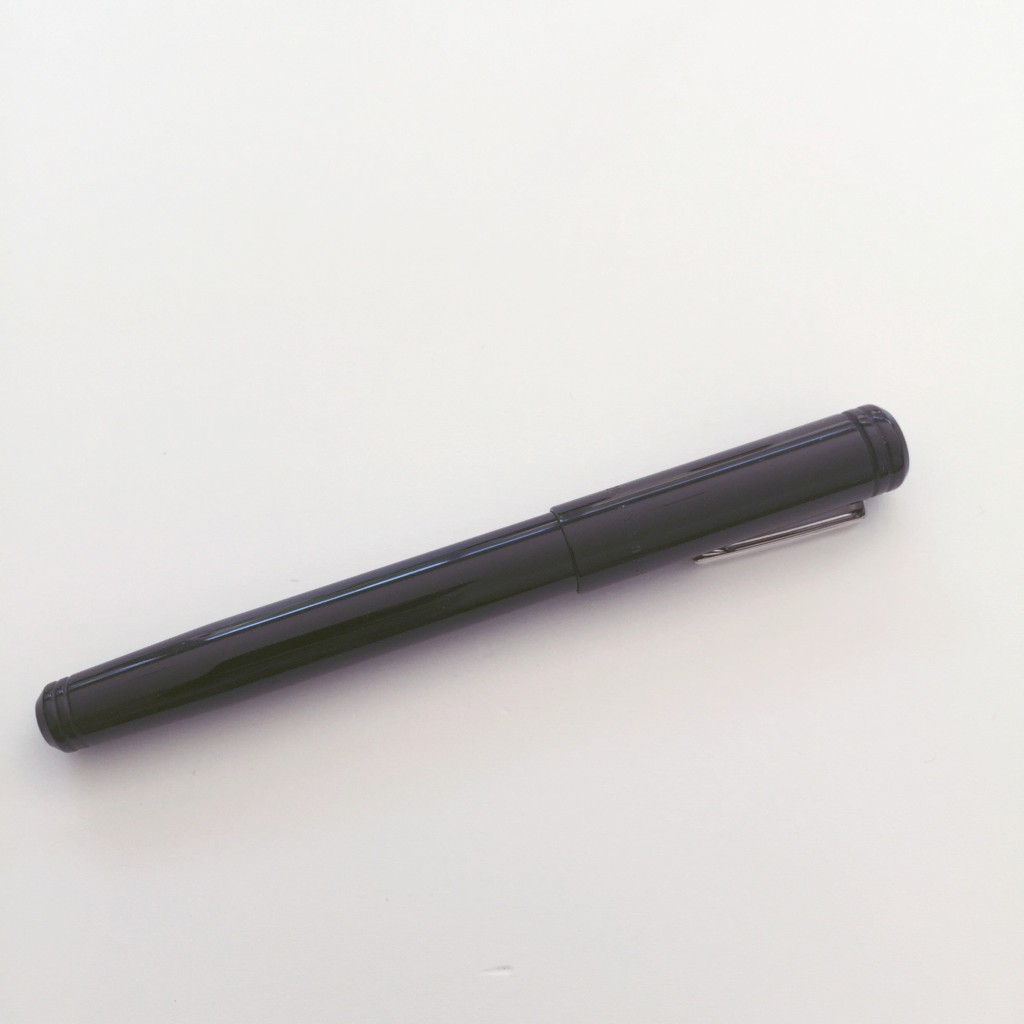
Such a simple and sleek design. The cap slips onto the body of the pen and posts nicely when writing.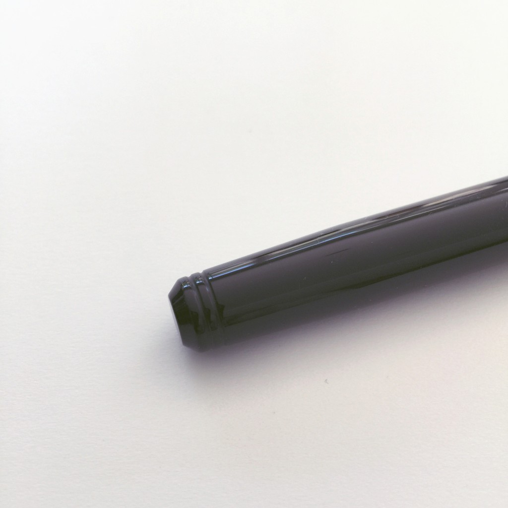
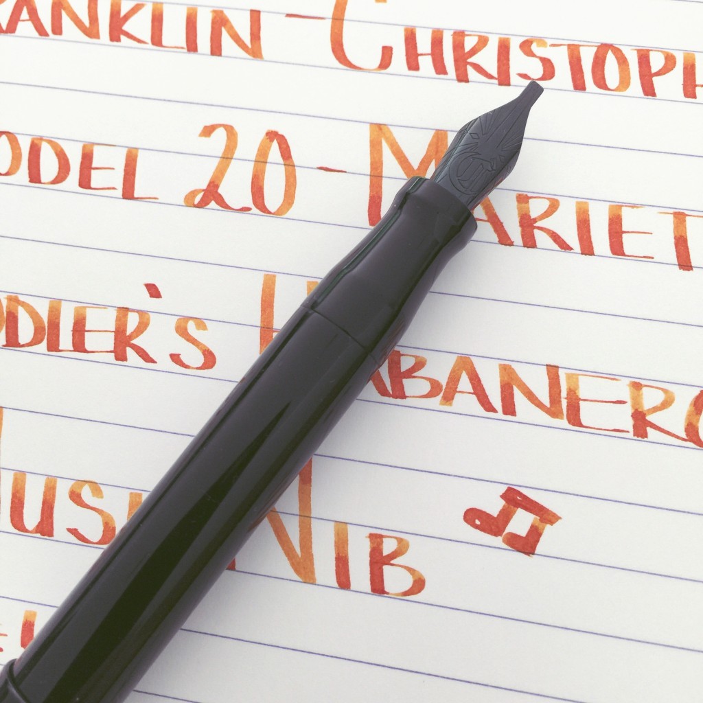
Oh, and I had mine sent with a music nib . . .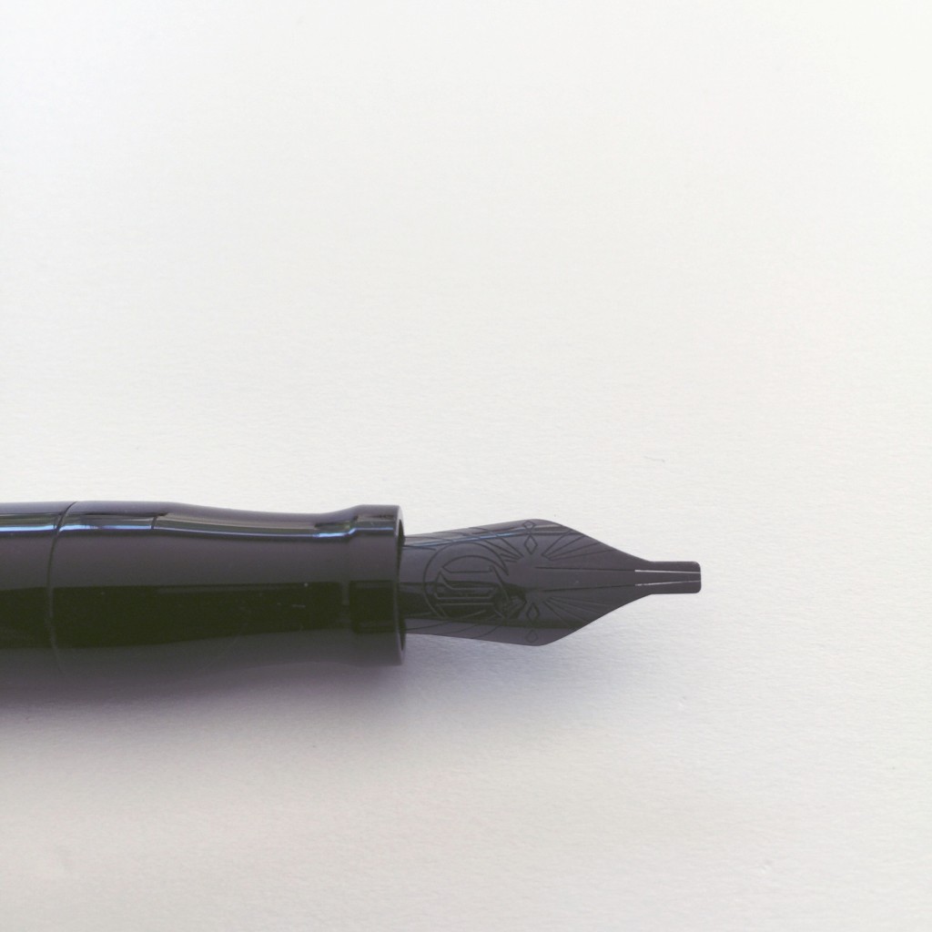
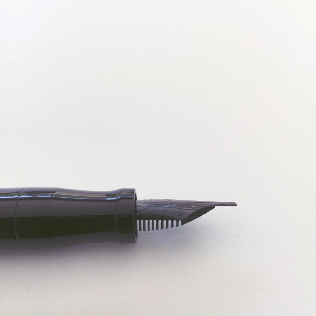
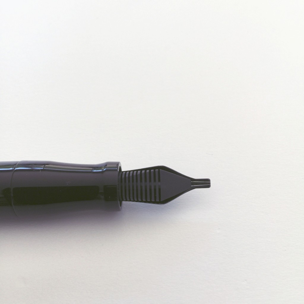
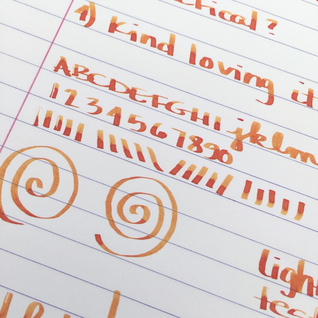
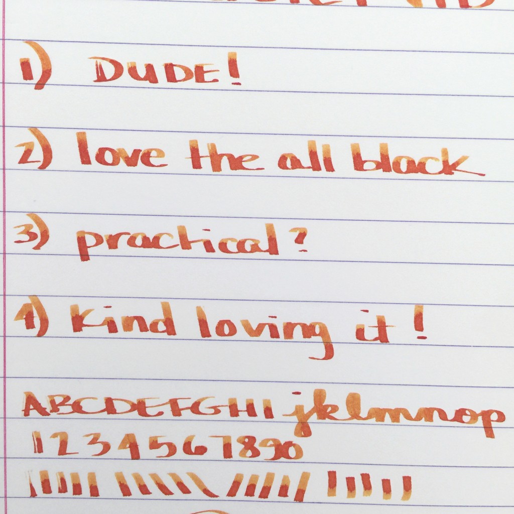
Like, OMG, that’s how it writes. I knew I wanted to use an ink known for shading and chose Noodler’s Habanero. 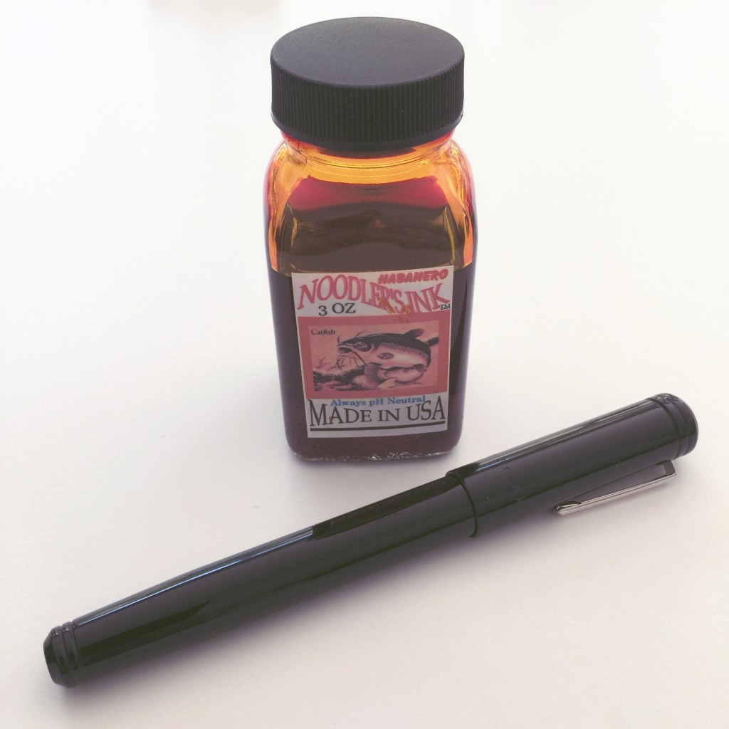
I’m not sure how practical this nib is. It’s so wide that my writing needs to be quite large for it to be legible. I’ve also noticed that unless I’m holding the pen just right, I end up with the the “streaks” that are visible below in the words “dude” (haha) and “the.” This is probably an issue specific to me – I notice that I tend to write more on an edge of a nib rather than on the direct center (is it just me?).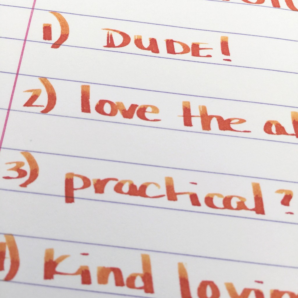
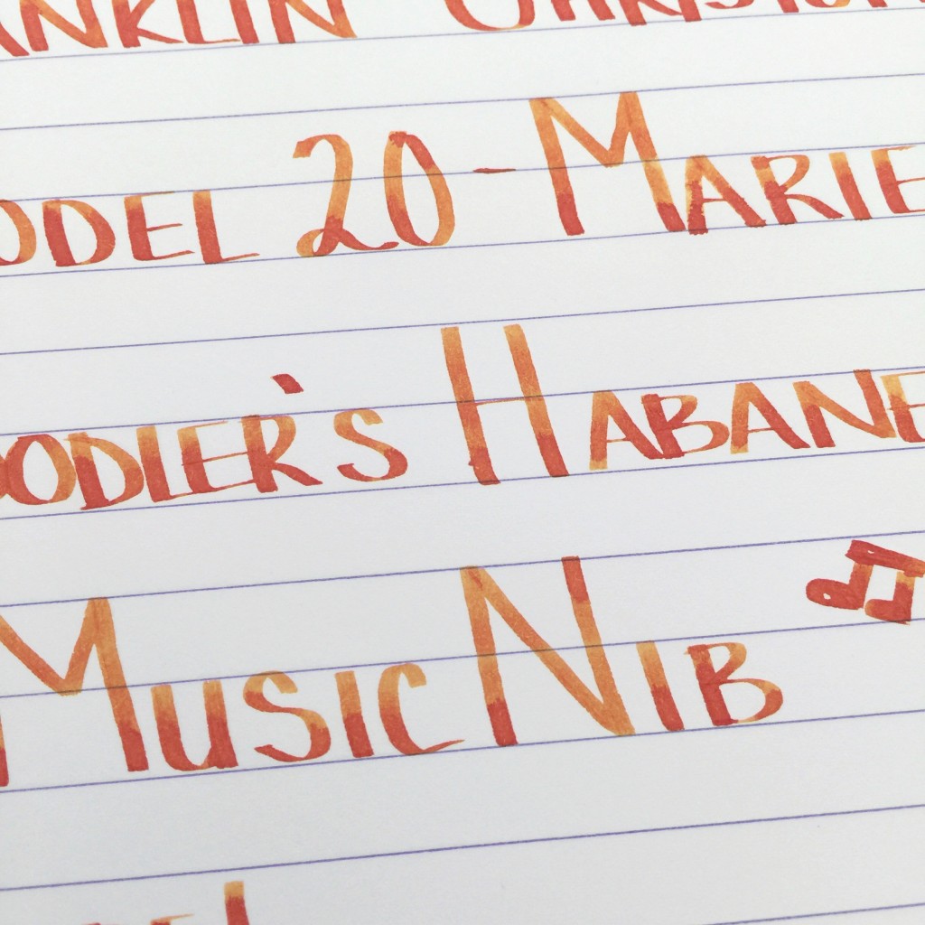
I also found that I was squeezing the heck out of the pen and perhaps pressing harder than I normally would. I lightened my grip and tried again . . .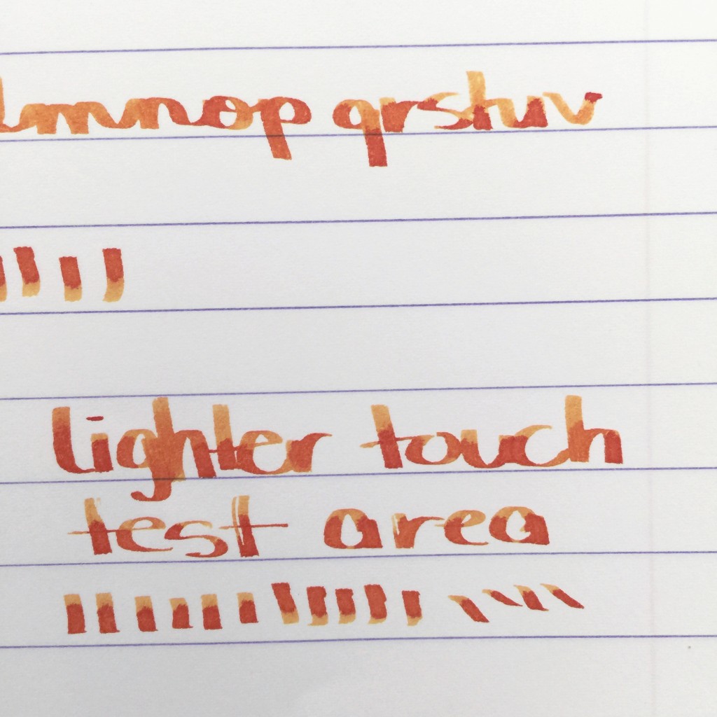 A light touch is definitely all that is needed.
Final Words: I’m really into this pen. I’d like to review it again with a “normal” nib at some point. The Model 20 writes wonderfully and looks great. It would be terrific in a professional setting with a different nib. Visit Franklin-Christoph for pricing and technical specs.

