INK REVIEW: Noodler’s Navajo Turquoise

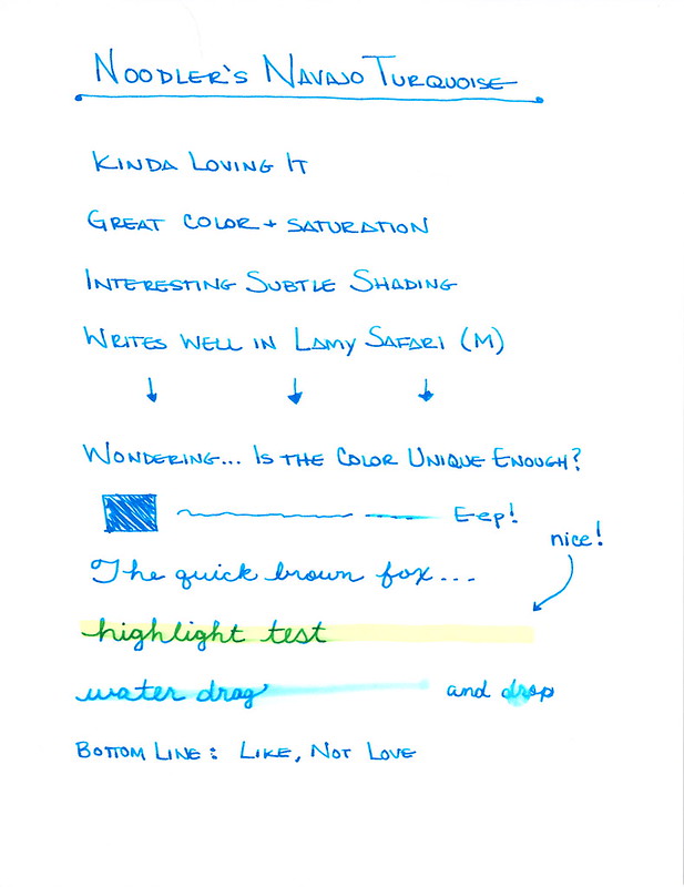
This is a tricky review for me because I can’t decide between..

Do I like it?
Do I love it?

I loved it at first – amazing color and saturation (the  two most important things to me in an ink). There is some fun shading. It wrote well in the Lamy Safari.

But then I started wondering…

It’s a bit smeary.  The water test as ungood (it’s a word).

So in the end – I didn’t buy a full bottle of Navajo Turquoise. I want to look at other turquoise inks and find THE one.

So let me ask you. Which is your favorite turquoise? Or maybe you love turquoise so much that you have many different bottles of various turquoise inks?  Tell, tell.

QUICK LOOK WEDNESDAY – Six Pretty Colors

Sometimes, I want to play with my pens, inks, and papers, but can think of nothing to write.

The first step is to write the name of the ink and the name of the pen (see above). I just noticed that each ink is from a different manufacturer – nice.

Apparently, the last resort is to write things that I overhear from the television (see below).

It was actually quite a bit of fun – watching and scribbling, changing pens and writing a bit more. I love the way the entire sheet of paper looks – each color is pretty amazing on its own, yes?

Let’s take a closer look . . .

Above – DeAtramentis Alexander Hamilton. I love this purple. It’s so rich and deep in color – nice saturation. I don’t see this ink discussed much on the various forums, but I think this is a purple that could be used anywhere.  (more on that another day)

Below – Private Reserve Spearmint. One of my favorite green inks. It looks a bit dark here to my eye, but it is usually quite cheery.

Do you have a guess as to which show I was watching at the time?

Below – Montblanc Hitchcock. A gorgeous blood red ink if I ever did see one. Some really pretty shading in there, too. I have to confess, I have a quite a lot of this in my cabinet. Shall I keep it forever? Use it as if I’ll never run out? Or maybe even sell some?

Below – Noodler’s Habanero. A favorite. That shading. The brightness of the color. Need I say more? Mm..wait, I already did right here.
 

By the way, the above quote is the one that seems like the one that would tell the secret of what I was watching. Have you guessed it yet?

Above – Pilot Iroshizuku Fuyu-syogun. I wonder if I only could have one ink, if this would be it. Check out my big review here. It is crazy CrAzY to think that I, lover of bright and beautiful colors, would be so taken with a gray ink, but there you go.

Above – Diamine Majestic Blue.  Easy to see why it’s one of my favorites, yes?  So pretty.

And, so, there we have it – six pretty colors. All so different from one another and yet all so wonderful.

Which show was I watching?  Downton Abbey, of course!  Have you seen it? Highly recommended.

QUICK LOOK WEDNESDAY: Four Fab Blues

Time for this week’s Quick Look Wednesday!

I like all of these inks for different reasons.

De Atramentis Indigo Blue – a straight-forward blue that could be used in any setting

Diamine Eau de Nil – (does this mean River Water?) a bit of green, but not quite enough to call it turquoise

Private Reserve Ebony Blue – maybe my least favorite because it looks more like a green-black in my swabs. Have any of you tried writing with this one?

Noodler’s Ottman Azure – boom! Pure blue saturation with this one.

So, yeah, each of these are so different from the others and I like them all.  Which is your pick?

Ink Review: Noodler’s Red

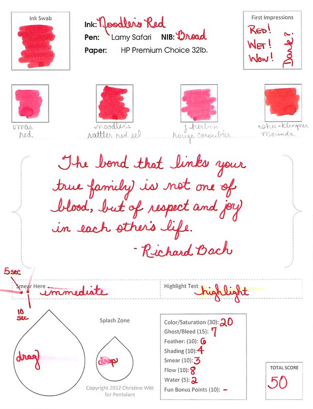
Woooo..this is some red!  Great color. Terrific saturation.

love this quote

It writes well, too. No bleeding or feathering.  It’s a bit on the wet side, but I was using a broad nib.

It’s definitely not water-resistant (not many reds are).

Noodler’s Red is a true red. Not too much blue or orange in the mix – just right. Look at the Compare Squares below and you can see what I mean. It’s perfectly red.

I don’t see a lot out on the Interwebs talking about Noodler’s Red. I think it’s because so many people are looking for a blood red rather than a true and bright red.  Which do you prefer?

INK DROP: May 2013

Seriously? I’m probably the last person to comment on the May Ink Drop color from Goulet Pen Shop.

I’ve been just a little busy. There was the wedding. And then the baby! (Not ours – bummer.)

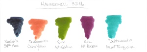
But here they are…

Noodler’s 54th Massachusetts
De Atramentis Ocher Yellow
Roher & Klingner Alt-Goldrun
Roher & Klingner Alt-Bordeaux
De Atramentis Mint Turquoise

They look so different on different papers, yes? Four passes on the Clairfontaine Triomphe paper to get close to the same look on the Brush Dance paper.  (Disclaimer: I’m the president of Brush Dance and maybe just a little slanted in that direction, but really? We have great paper.)

As for the inks? I’m not IN LOVE with any of them.  Each of them falls squarely into that “not a color” area for me. Alt-Goldrun is so popular – I want to write with it very soon.

What do you think? Love ’em? Hate ’em?

INK REVIEW: Noodler’s Blue Eel

Turns out that some of my extra-big-huge-ginormous images have been crashing some mobile device readers. Oops, sorry about that. Going forward, I’ll use smaller images here and link to the bigger image if there’s something worth seeing in detail.  Like this….

Click to See Extra-Large Hugnormous Gigantic Image

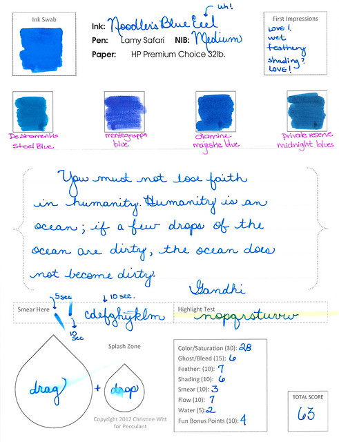
It also turns out that I’m not loving my new review form as much as I enjoyed Noodler’s Blue Eel ink. Here’s the thing – I sincerely like this ink – and yet it ranks only a 63 on my scale. In school – that would be a scary grade – but here, it means that it’s better than average.

So. I need to make some tweaks to my ranking system. Of course, I have four or five other reviews lined up so we’ll need to somehow make it through those before moving on to another form. It’s a good thing only Mr. Pentulant reads this blog – otherwise, I could be causing mass confusion with my fickle-pickle switcharoo.

Anyway! Stay tuned, but for now…the review!

Adore the color and saturation. It’s perfect for a girl like me. Nice and bright. Would write all day with this one (if I could ever settle on just one color, that is).

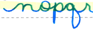
Feathering? Not sure why the heck I gave it a 7 on my scale.  Look at this and help me decide what I was thinking . . .

. . . yeah, I don’t know either. It’s a feathery mess of a an ink.
But at least it doesn’t smear . . .
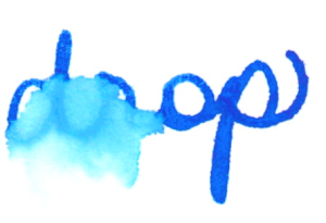
OK, yeah. It smears, too. This was after writing normally and then waiting (at least) ten seconds to test. Some of you might be thinking it’s my paper choice, but this is the paper I’ve used for all of my other current ink reviews. Noodler’s Blue Eel is a slippery wet son-of-a-gun.
And . . .
And . . .

So. Is the fact that it’s a slippery wet son-of-a-gun a bad thing? Well, like so many other things in life, it depends.  On this paper, with this pen – it was not horrible, but I am definitely not rushing out to buy the full-size bottle of this ink.  But…this ink was made to be a slippery wet son-of-a-gun. In fact, all of the Eel series of inks from Noodler’s are. 
The Eel series was apparently formulated with piston-fill pens in mind. The idea is that the pistons like a little bit of lubrication to keep things moving. If left unlubed (it’s a word, trust me), the movement will not be as smooth over time.  I don’t know anything about this. I read it here. What I do know is that it’s unlikely that any of the piston-fill pens I have were ever filled with a lubricating ink and they are (or at least seem to be) just fine. In fact, Richard Binder has this to say:
Lubrication, as used here, does not refer to the addition of special substances for the ostensible purpose of lubricating the pen’s piston or other filler parts.

He’s not talking specifically about Noodler’s (or at least he doesn’t say that outright).

So. Bottom line:  This is one of those ymmv things. If you like a wet son-of-a-gun ink and believe that your piston-fill pens need lubrication – this is totally the ink for you.

It’s not the ink for me, however, because I need other things more than I need lube.

Now..it’s see what kind of spam comments I get as a result of using the word “lubrication” in my posts. Fun times ahead!

INK REVIEW: Noodler’s Habanero

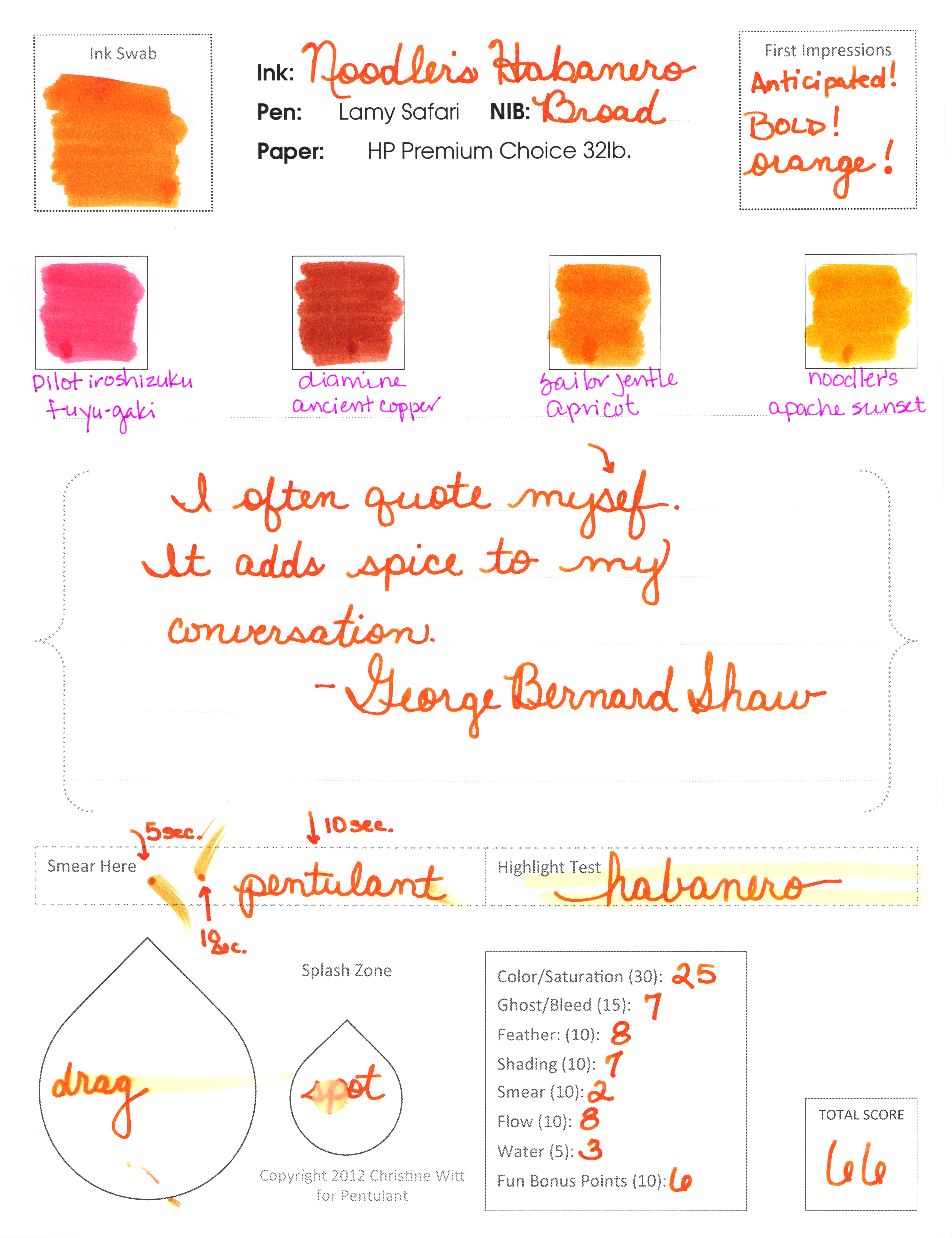
I don’t know why I’ve waited so long to fill a pen with Noodler’s Habanero. It’s one of a few inks that I know about before I test them and I had been really really excited about getting this for myself.
The swab above is a “cut” from the actual swab in the review below. I purposefully got the edge – because even with a darn cotton swab, it’s clear that this is a special ink.
                                           
Whoa, momma, look at that shading.  I’m so excited about this ink. I want to load up all of my pens with it and spend an entire day writing.
clicky to make bigger

I really do love Habanero.  Definitely getting a full-sized bottle of it.

Does my score reflect my love?  Sixty-six seems low…but when you consider that 50 is average – this is definitely above average.
It’s not a perfect ink, is it? Smeared lots, not water resistant. 
It sure is pretty, though. I’d say my love for Habanero rivals my love for Diamine Pumpkin. How many orange inks does one girl need? (Two – so far!)

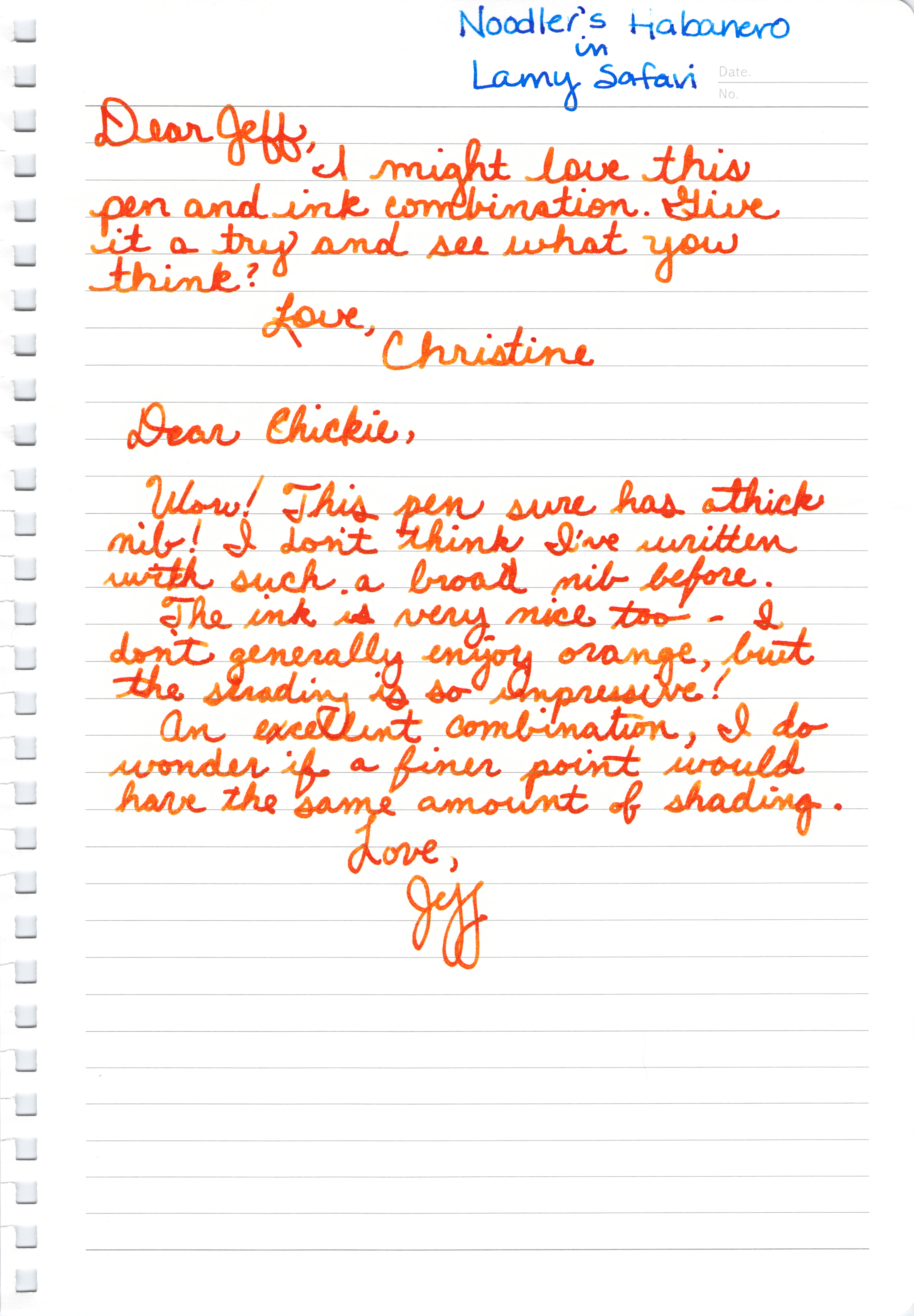
Mr. P likes it, too – though he seemed to be focused on the broad nib. He calls me Chickie – isn’t that sweet?

Let’s talk about spicy food in the comments. Love it or hate it? Me, I am a total spicy food wimp.

INK REVIEW: Stipula Sapphron

Holy cow. 
I hate Stipula Sapphron.

It shades like a son-of-a-gun. Sounds like I should love it, right? Or at least like it. But no, I hate it.

It’s not often that I say that. In fact, here are all of my posts with “hate” as a tag.  
In the sample vial, the ink looked like a pretty (though not saturated) orange. When I swabbed, I thought the ink looked a little on the yellow side, but was still pretty enough.  (See my first impressions on the handwritten review.)

Then I started writing with it. I was sure my pen must have been dirty. But at the same time, I knew it was a brand new pen and a brand new converter. No ink had ever touched either and both were cleaned prior to use. I twisted a bit of ink out onto another piece of paper – and it sat there looking like a bubble of yellowish mud!  When I smeared that mud around with a cotton swab – it looked like the Ink Swab in my review.
Ca-razy! I don’t get it.
You know what else I don’t get? I couldn’t find even one other review for this ink. Not on Fountain Pen Network, not on Goulet Pens, and even Google came up empty. It’s like I’m in the twilight zone over here.

Hard to believe I’m going pass by shading like this. But I am.

Pretty weird. That’s my first impression – and coincidentally – my bottom line for Stipula’s Sapphron. (By the way, I have no Stipula aversion – I own and love several of their fabulous pens. This ink is just weird.)

In fact, I wanted this to work badly enough that I tried it again another day. With another kind of paper.

Always looking on the bright side, however, Apache Sunset has been on my list of inks to review forever and I’m excited that it’s coming up sometime soon!  And that De Aramentis Gandhi? Isn’t that pretty? 
Time to ‘fess up! Do you have Sappron? Do you love it? Hate it?

INK REVIEW: Delta Brown

Delta Brown, what’s that flower you have on?

I couldn’t stop singing while preparing the handwritten review. Poor Mr. Pentulant – the things he puts up with!

It’s brown.

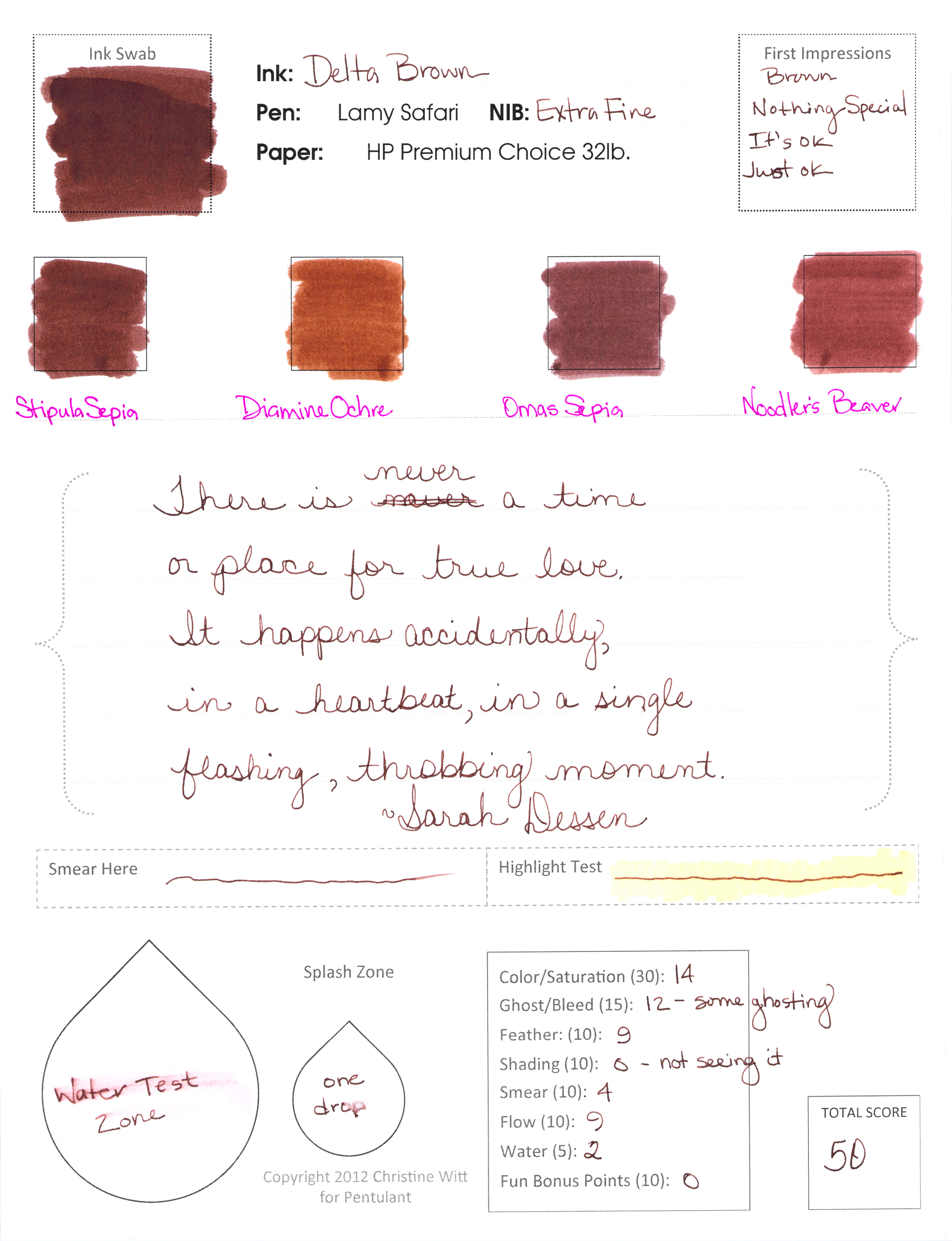
That pretty much sums up my review. And coincidentally, the final score is 50 – right in the middle of the pack.

It’s nice looking, well-behaved in the pen. Not water-resistant (not a surprise).

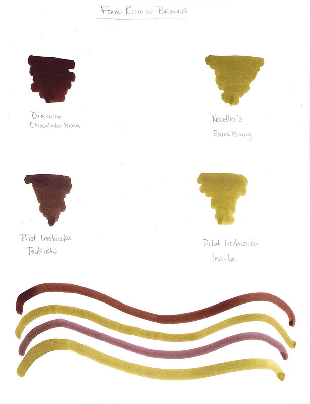
The remarkable thing about the browns in the Compare Squares? Delta Brown, Stipula Sepia, and Omas Sepia are all kinda the same.

If you’re looking for a good solid brown, this could be your ink. I can see using it in a professional setting as easily as some blues or grays. I could really see drawing with it. If you’re into matching your inks to your pens, you might love brown. But I won’t be buying a full-sized bottle.

Dear Brown,

I’m just not that into you.

Love,
Pentulant

P.S. You do know the song Delta Dawn, yes? Here’s a link to it on iTunes if you’re in the mood to get your 1970s on.