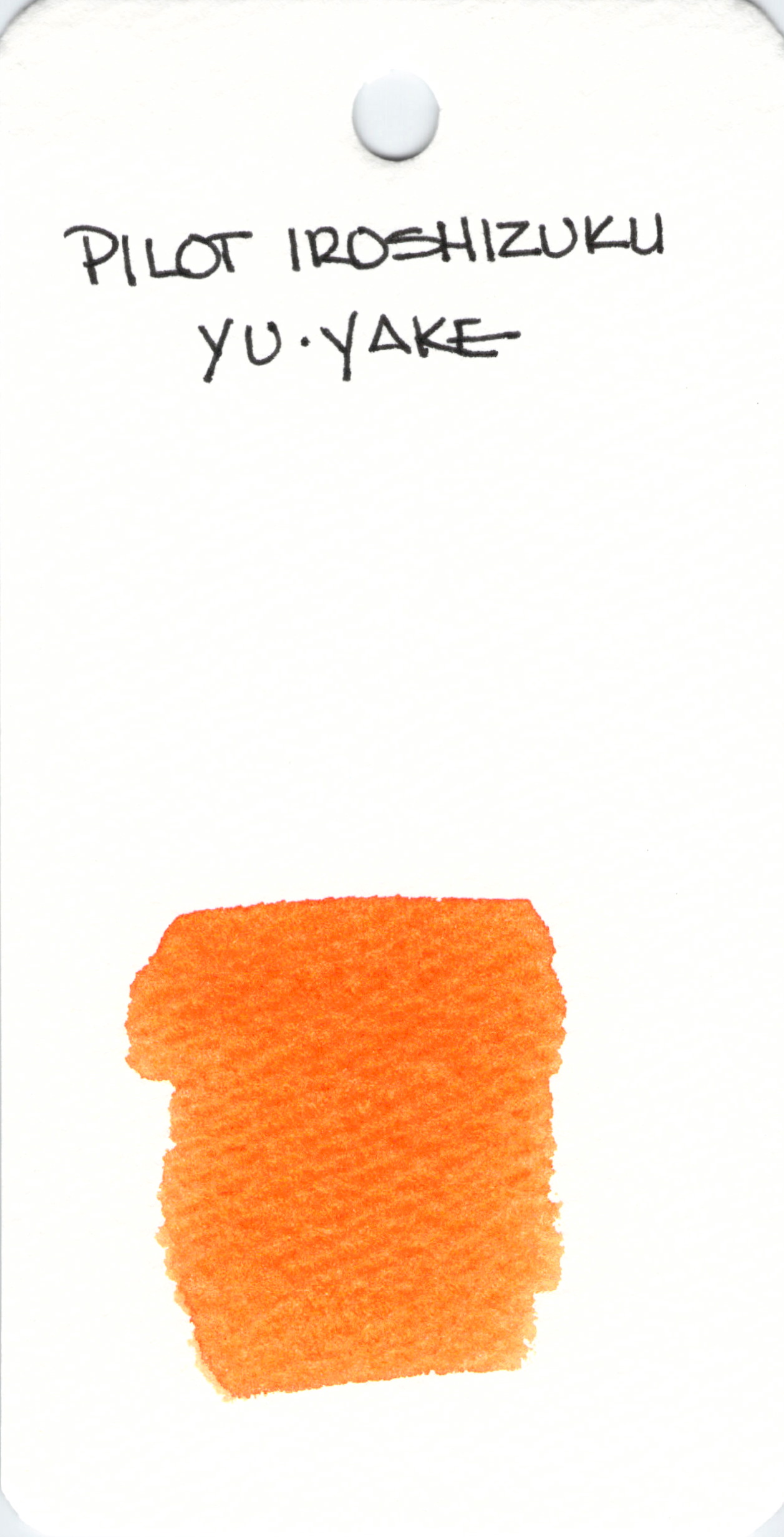
 Pilot Iroshizuku is a well-respected brand of fountain pen ink. Yu-yake performs well, but is not my favorite orange ink because the color is a wee bit too muddied for me.

Pilot Iroshizuku is a well-respected brand of fountain pen ink. Yu-yake performs well, but is not my favorite orange ink because the color is a wee bit too muddied for me.
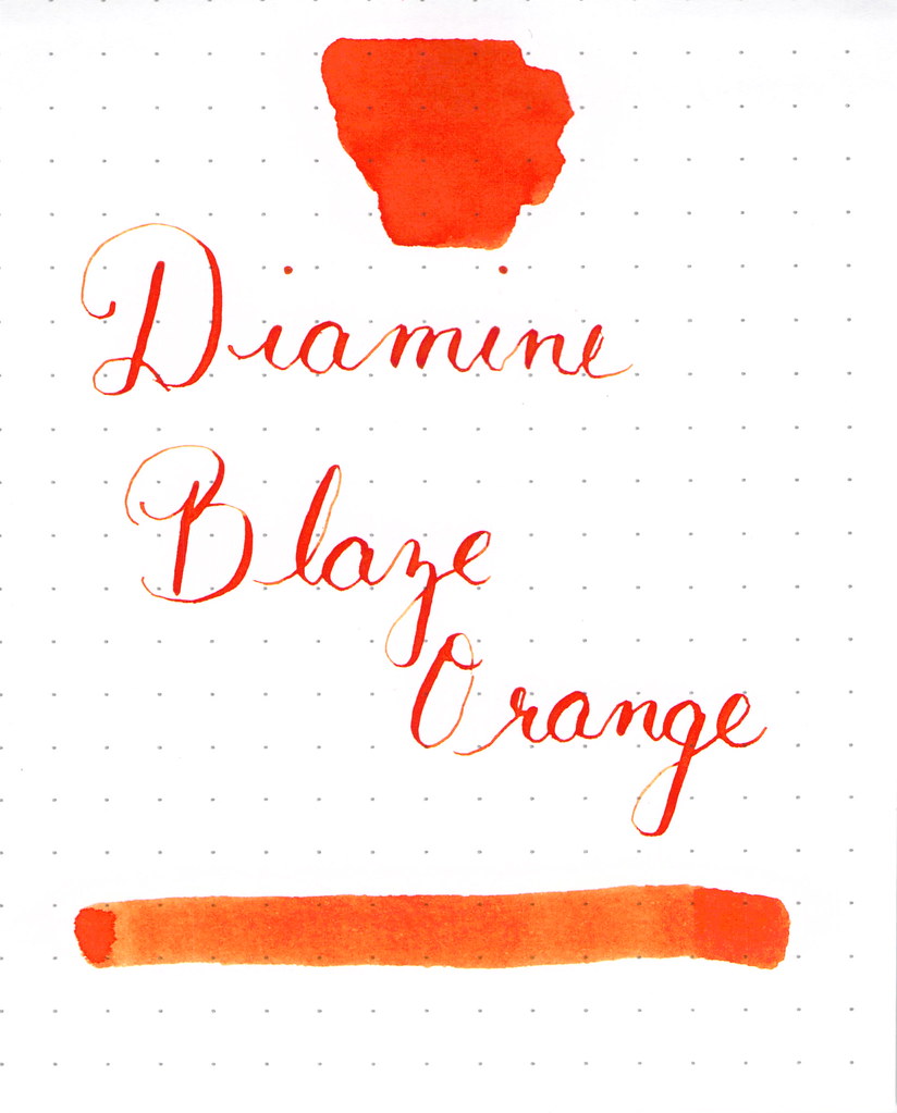
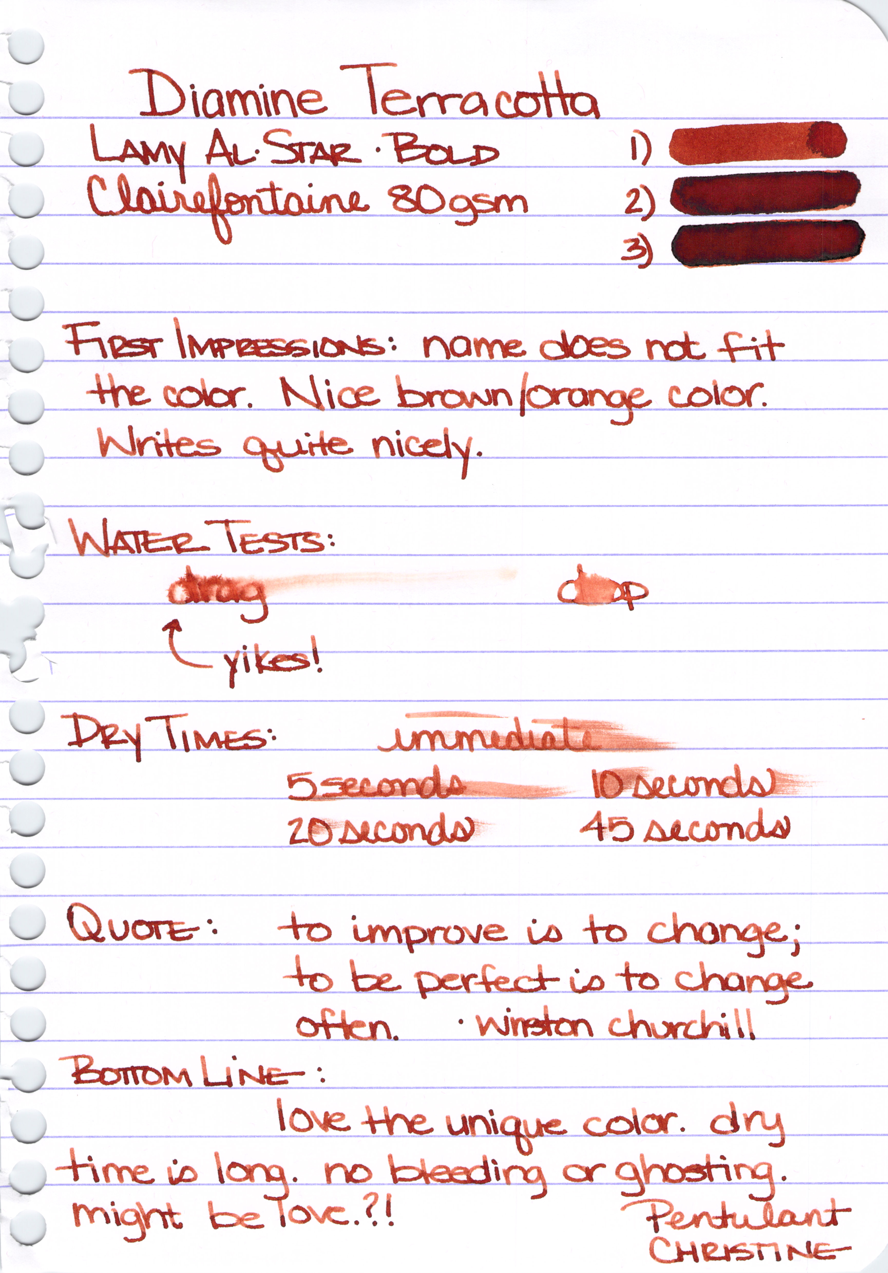 Diamine Terracotta
Terracotta was released late last year as one of eight inks Diamine created to celebrate the 150th anniversary of the brand.
Over the past couple of years, Diamine released a couple of limited edition sets of inks, but they had to be purchased as a complete set. It’s nice to see that each of the eight inks in this Anniversary Collection may be purchased separately.
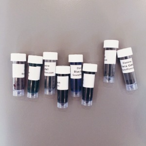
Here’s a picture of the arranged bottles (and swabs – always swabs!) I posted on Instagram awhile back. I love that they remind me of Trivial Pursuit wedges – collect them all!
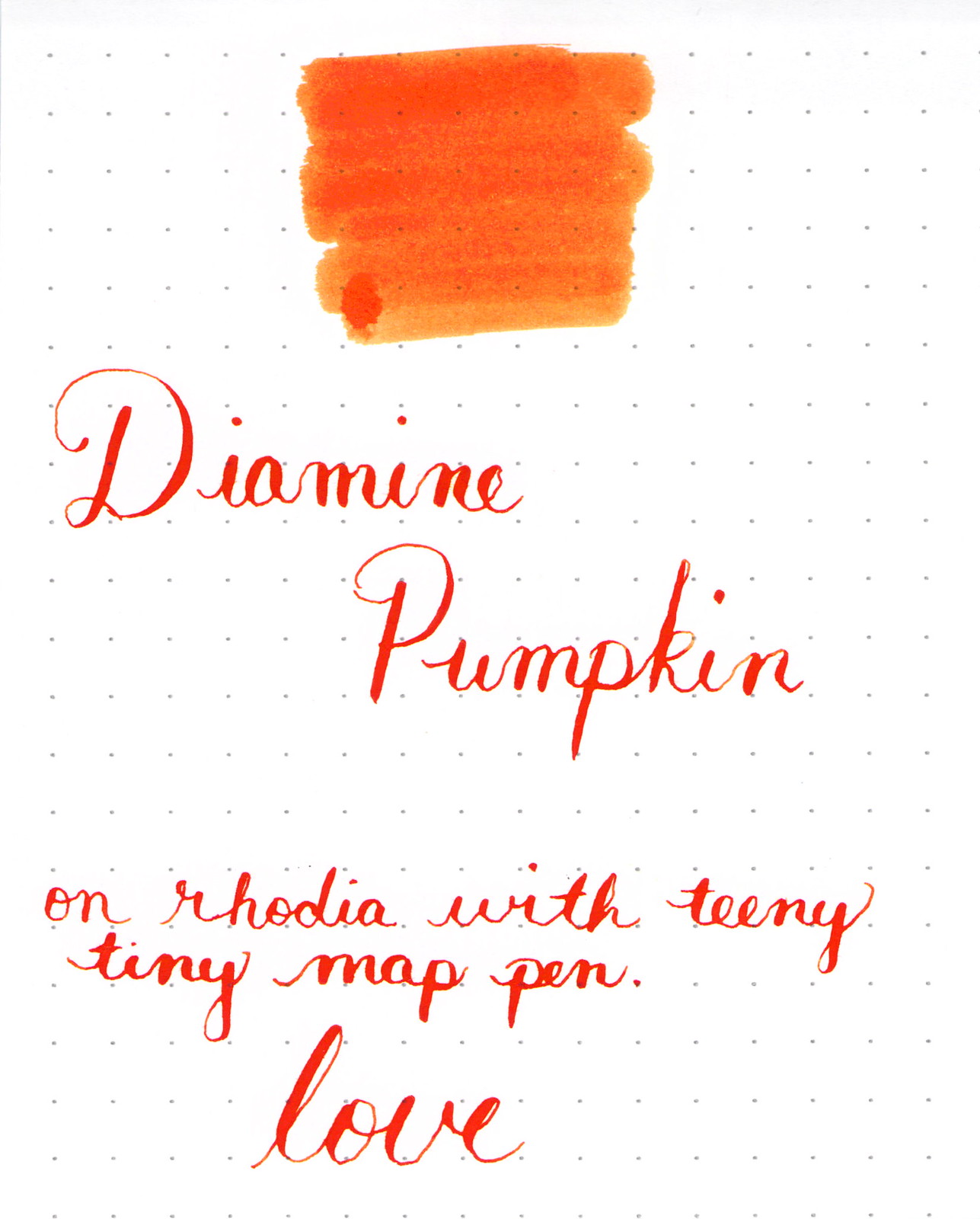
I Love This Ink
The color is a unique and pleasing brownish-reddish-orange that doesn’t remind me too much of terra-cotta pots and their traditional chalky band-aid color.
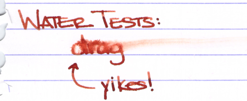
Terracotta is well-saturated and it shades beautifully – just enough to give it some character. Flow is good from the pen and I’d say it’s on the wet side of average, but definitely not wet. There was no significant ghosting and no bleeding. All very good things.
There are two “features” of this ink that may be a deal breaker for some people . . .
I can live with both of the downsides of this ink quite easily and am finding myself using it every day for various notes.
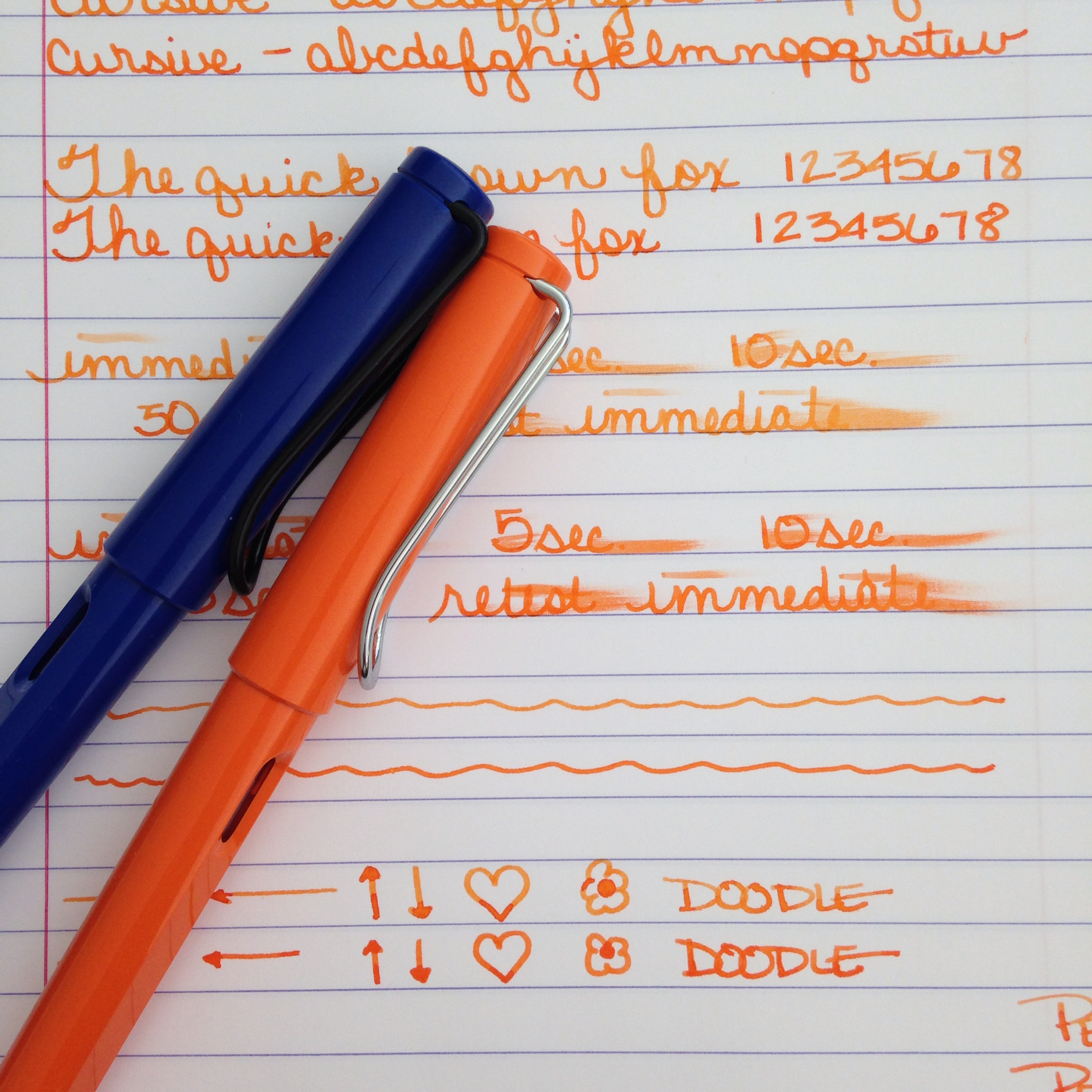
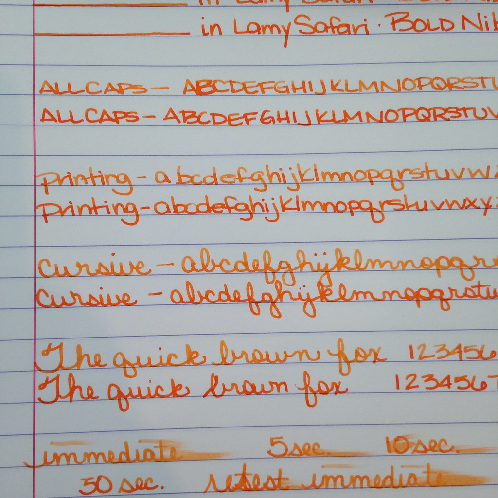
Here’s the entire handwritten review of Diamine Terracotta.
If you’ve tried Terracotta, I’d love to know your thoughts. Or maybe you’ve tried another one of the Anniversary inks?

Oh, how I love this ink. Sadly, it has been discontinued. Here’s my review from a long long time ago.
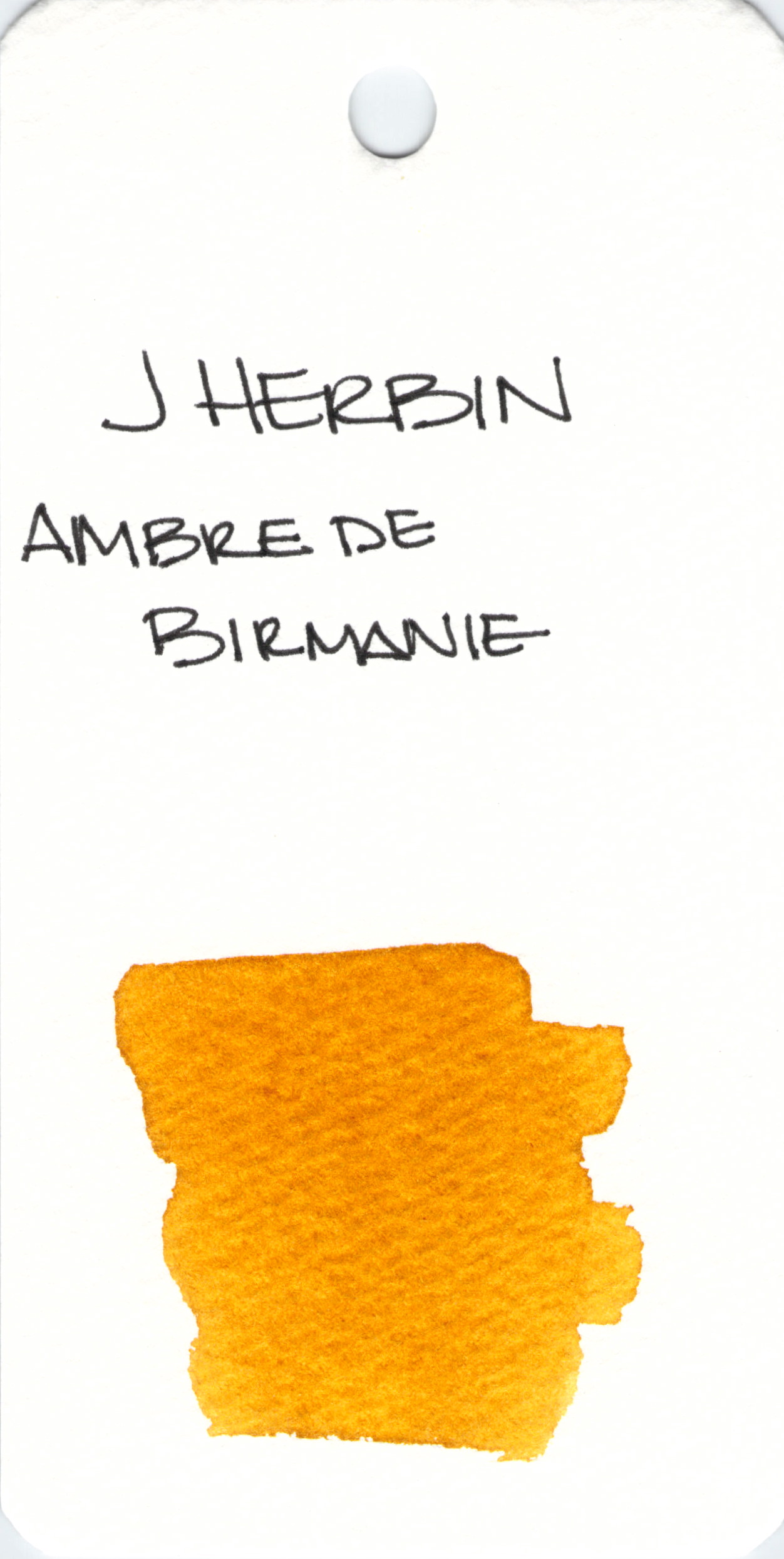 I’ve not written with J Herbin’s Ambre de Birmanie, but I’m going to – and soon! Love the way it looks in this swab.
If you’ve tried it, please let me know what you think in the comments section below. I’m hoping you loved it.

Oh, you guys, It’s been so busy behind the scenes over here.
While everything hasn’t been moved over yet and some of the links are empty, I’m really happy to present the brand new Pentulant website. As part of the new look, I’ve moved everything over to WordPress and I’m feeling confident that this is the correct platform for growth in 2015.
In other words: FUN TIMES AHEAD!
And while we’re on the topic of new things – Happy New Year! Did you stay up too late last night and are now faced with sleep lines criss-crossing your smiling face? Are you sporting the best case of bed head ever? Wait. Wait. That’s me! Happy New Year!
Finally, we have a winner! Remember way back before sleep lines and bed head? The contest was to guess the number of cotton swabs in the above pictured gallon-sized bag.
The winner gets samples of each of the eight Diamine 150th Anniversary inks!
How many swabs in the bag? A whopping 729.
And our winner? Jackie! Jackie guessed 725. I’ve already contacted Jackie about collecting the prize.
Have you tried any of the new inks? I’ve used Tropical Green (not my favorite color, but it writes really well) and Terracotta (a truly unique orange/brown with some great shading).


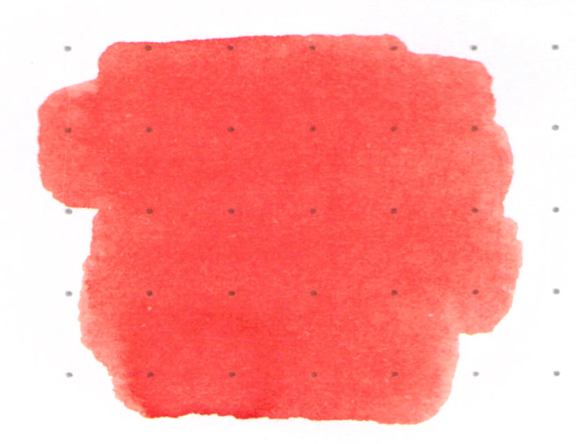
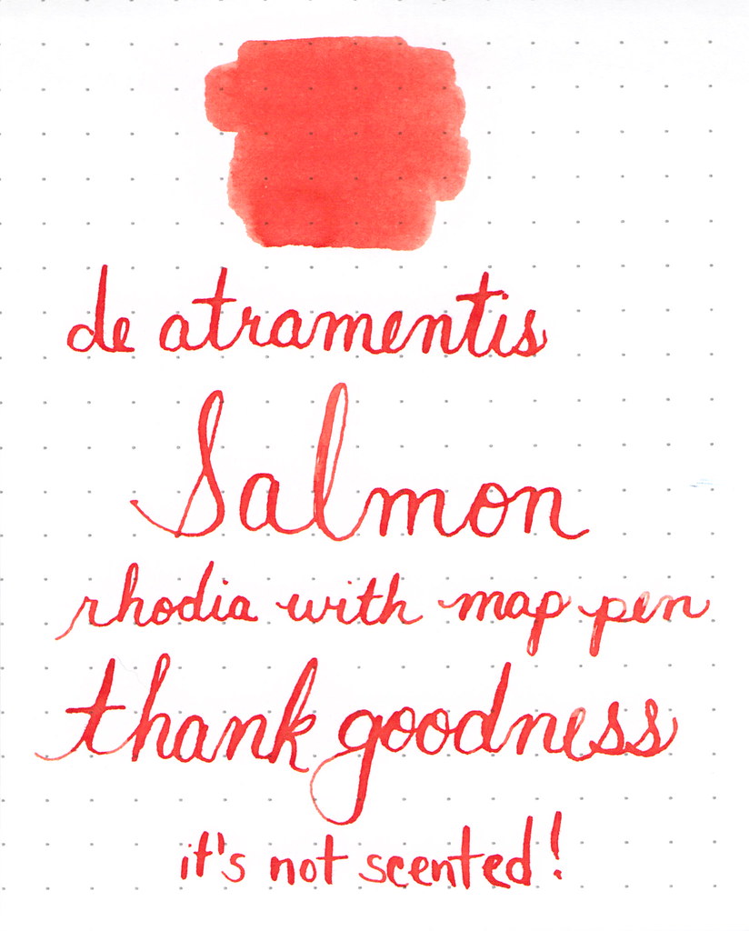
It’s pretty.
It’s not scented – thank goodness!
I’ve been on an orange kick. It all started innocently enough back in May, and then over the last few days, I’ve inked seven pens with seven different orange inks. CrAzY!
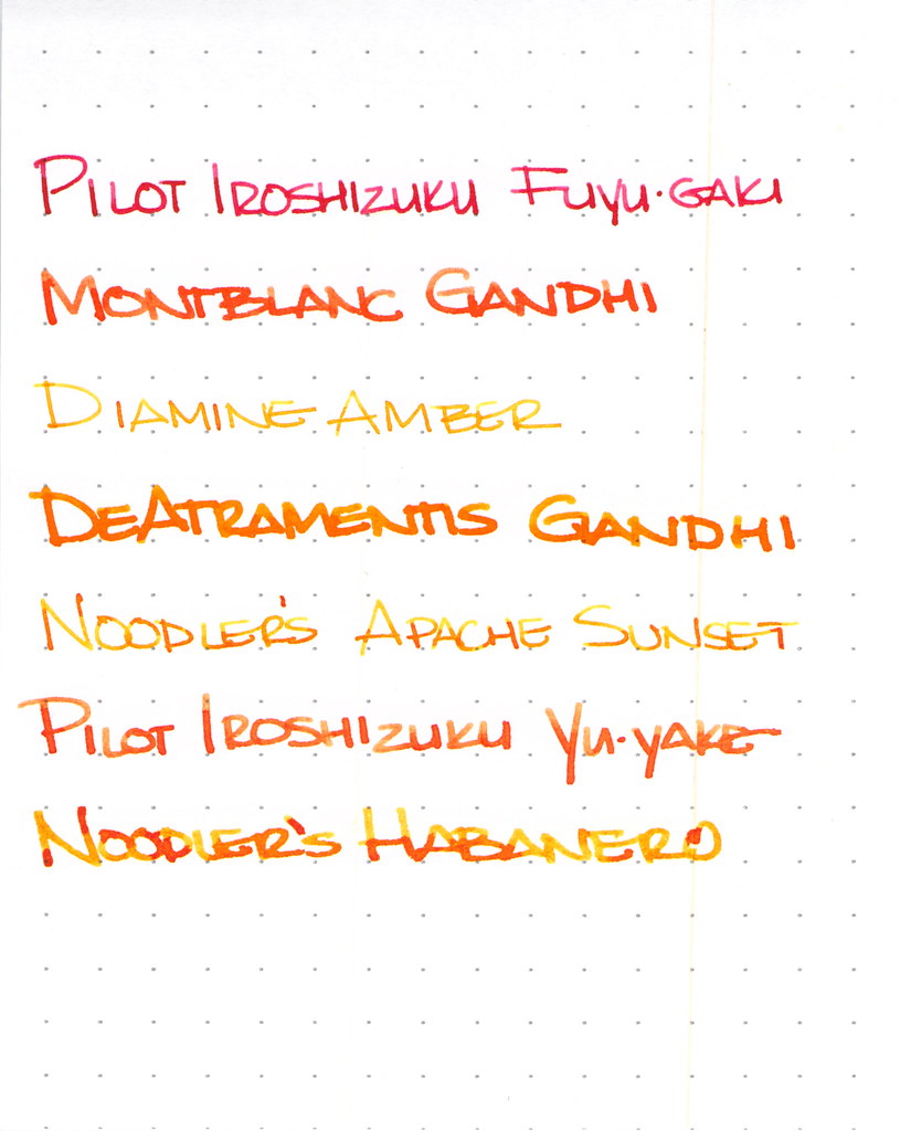
I won’t have room to go into great detail on each ink here, but let’s explore a little, shall we?
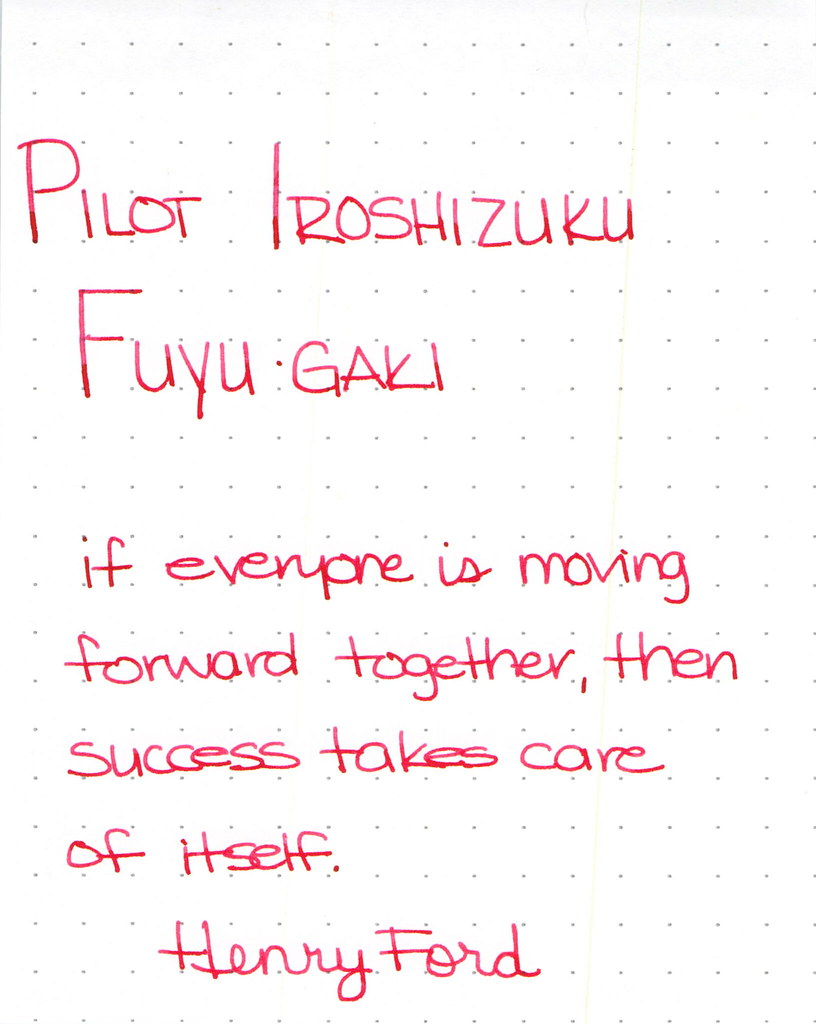 |
| Pilot Iroshizuku Fuyu-gaki Writing Sample |
Pilot Iroshizuku’s Fuyu-gaki runs a bit toward the red side of orange. It writes wonderfully, doesn’t display much shading, and is an all-around nice ink.
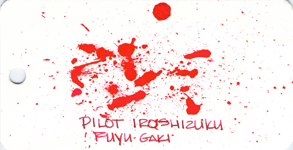
Fun with ink splatters. I did these on Word Cards that I got from Jet Pens. The paper is more like a thin watercolor paper than writing paper.
Moving on . . .
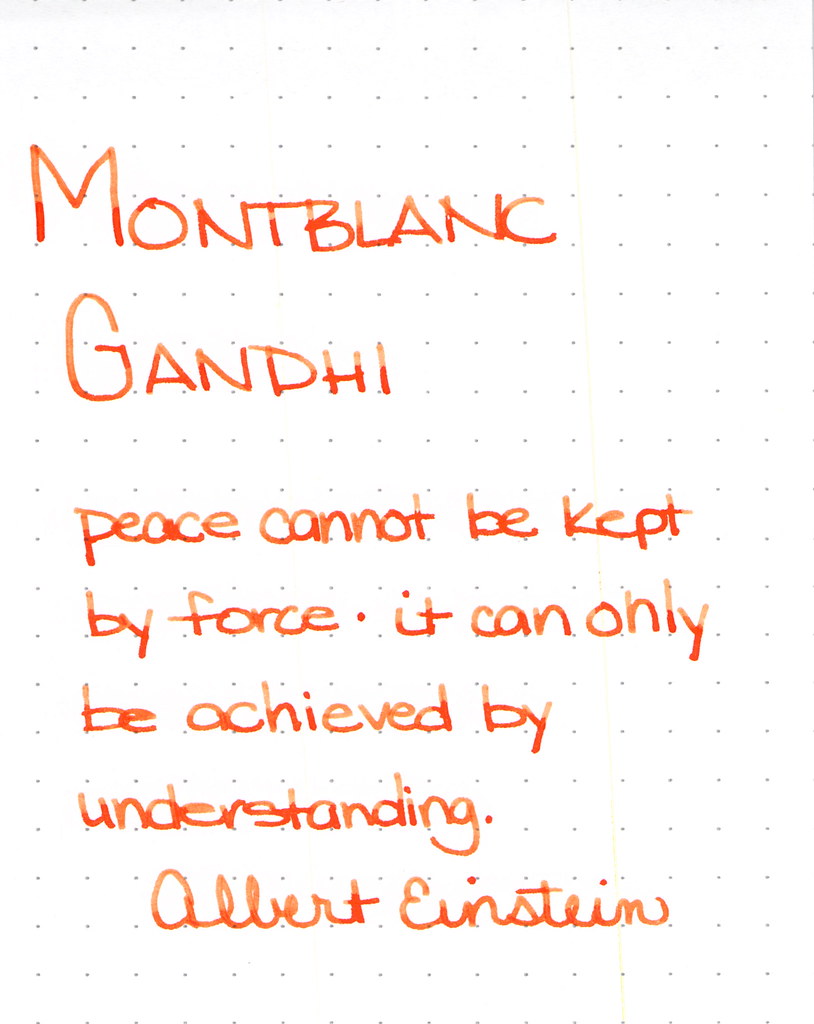 |
| Montblanc Gandhi Writing Sample |
Montblanc Gandhi fountain pen ink is no longer available. It can be found on eBay (I’ve been thinking about selling my spare bottle, but I’m not sure I want to let it go, you know?)
The ink is such a pretty pretty orange, lots of good shading, and is definitely one to try if you can find it.
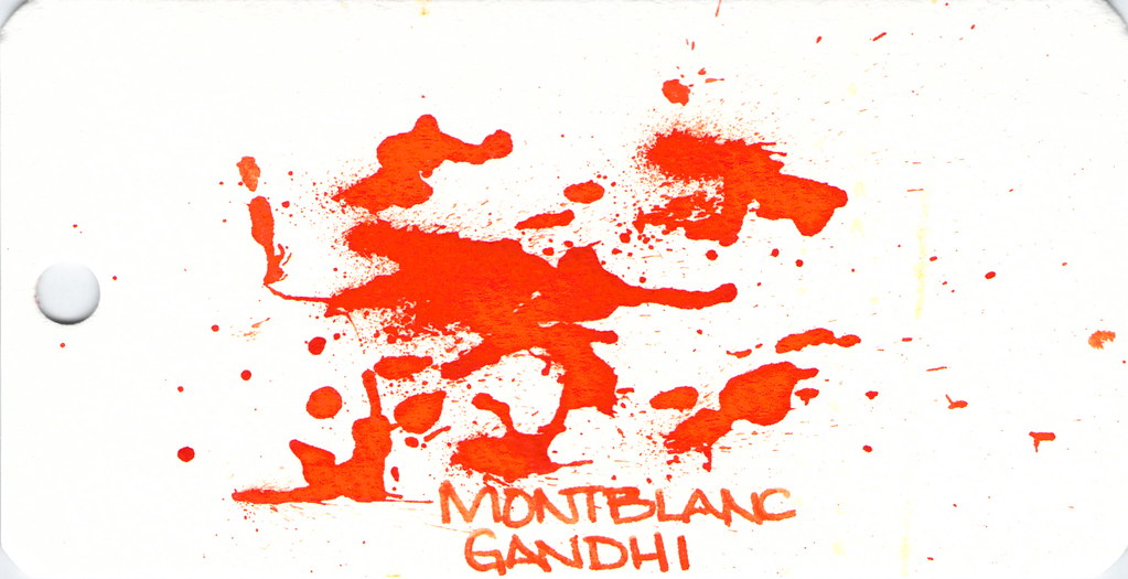
Spatters, anyone?
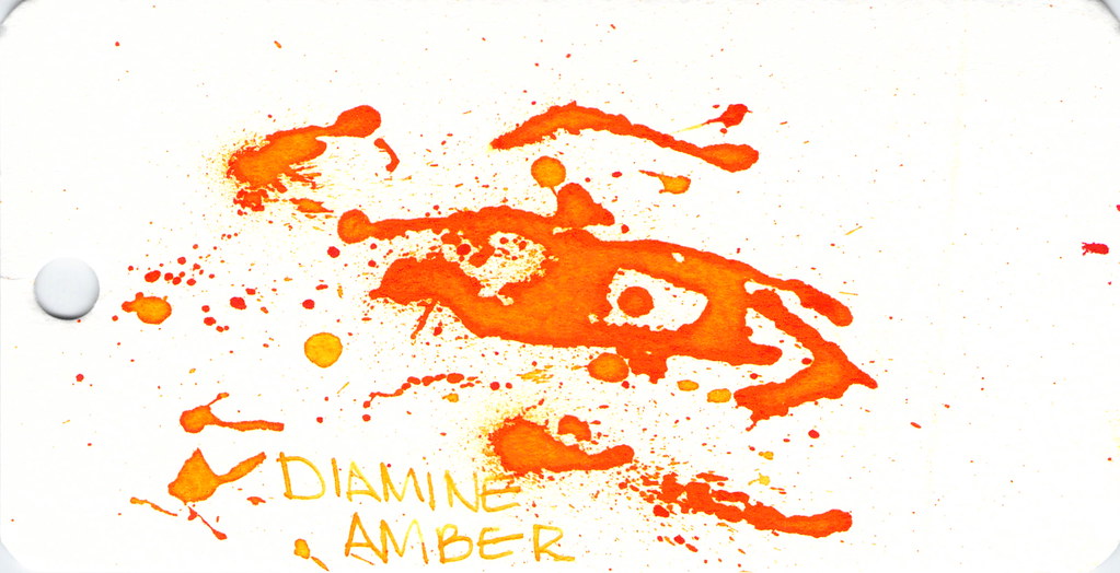
Diamine Amber is next on our hit list . . .
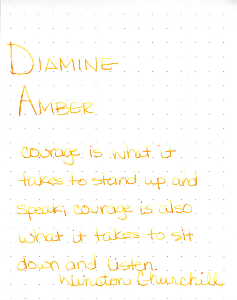 |
| Diamine Amber Writing Sample |
Diamine Amber is just so light and feels a bit dry. This ink is in a Lamy with extra-fine nib and that may be part of the issue, but I’ve had other orange inks in the same pen and they’ve not been this light. I like inks that work in all of my pens (makes life easier, you know?) and with so many orange options available, I’m not so keen on this one. Others seem to like it.
And look at the spatters – good saturation there, friends.
Montblanc Gandhi isn’t the only game in town . . .
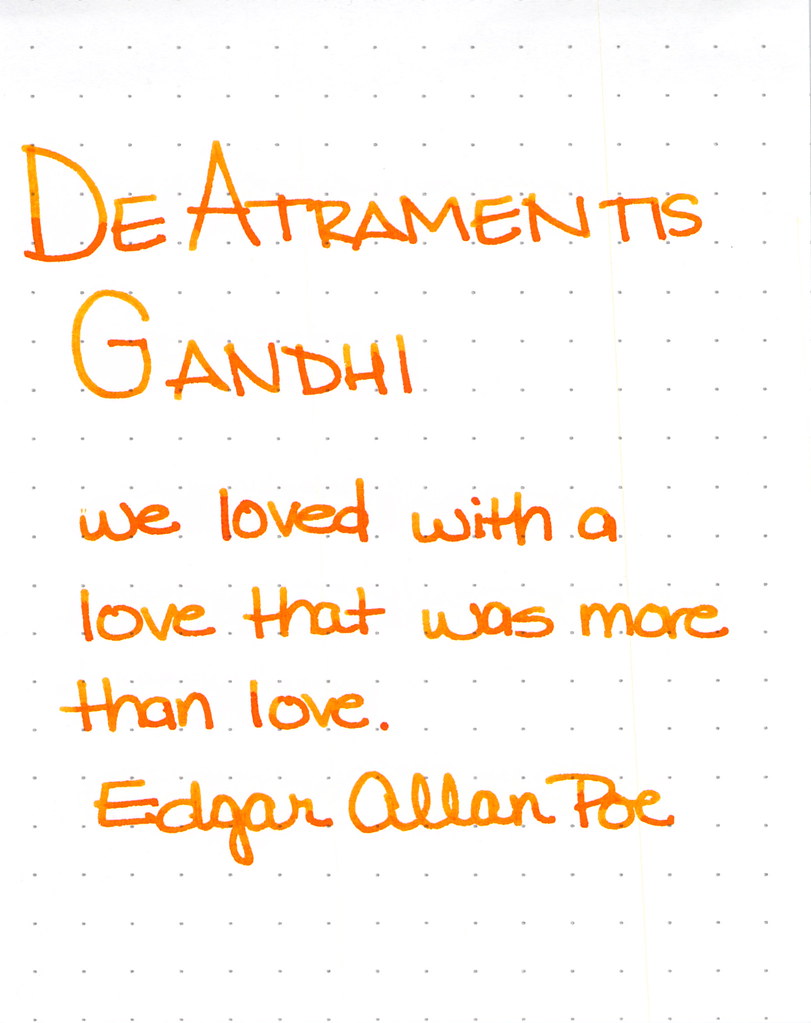 |
| De Atramentis Gandhi Writing Sample |
This was my first time using this ink and for some strange reason, I didn’t have high expectations. Silly me – it’s a perfectly fine ink. Some shading, writes quite well. No reason to be concerned. It’s really not like Montblanc Gandhi – not that it matters, I think it would be a little silly to compare the two just because they share a name. I like it.
I also think I did a pretty good job on the spatters here . . .

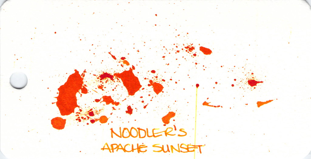
Next up . . .
 |
| Noodler’s Apache Sunset Writing Sample |
People are generally coco-crazy for Noodler’s Apache Sunset. Even using an extra-fine nib, I can see the potential here. Absolutely insane shading. The color is very orange. People who don’t like this ink seem to say that there is no practical application for it – I’m not sure I understand. Maybe they feel that way about all orange inks?
So . . . check out the spatter. See the streak? Please know that I waited a full 24 hours after creating the spatters before scanning. THE INK WAS STILL WET! Insanity. (Even more insane – you can see this streak on other images, too…arrrgh. I need to figure out how to clean my scanner.)
Anyway . . .
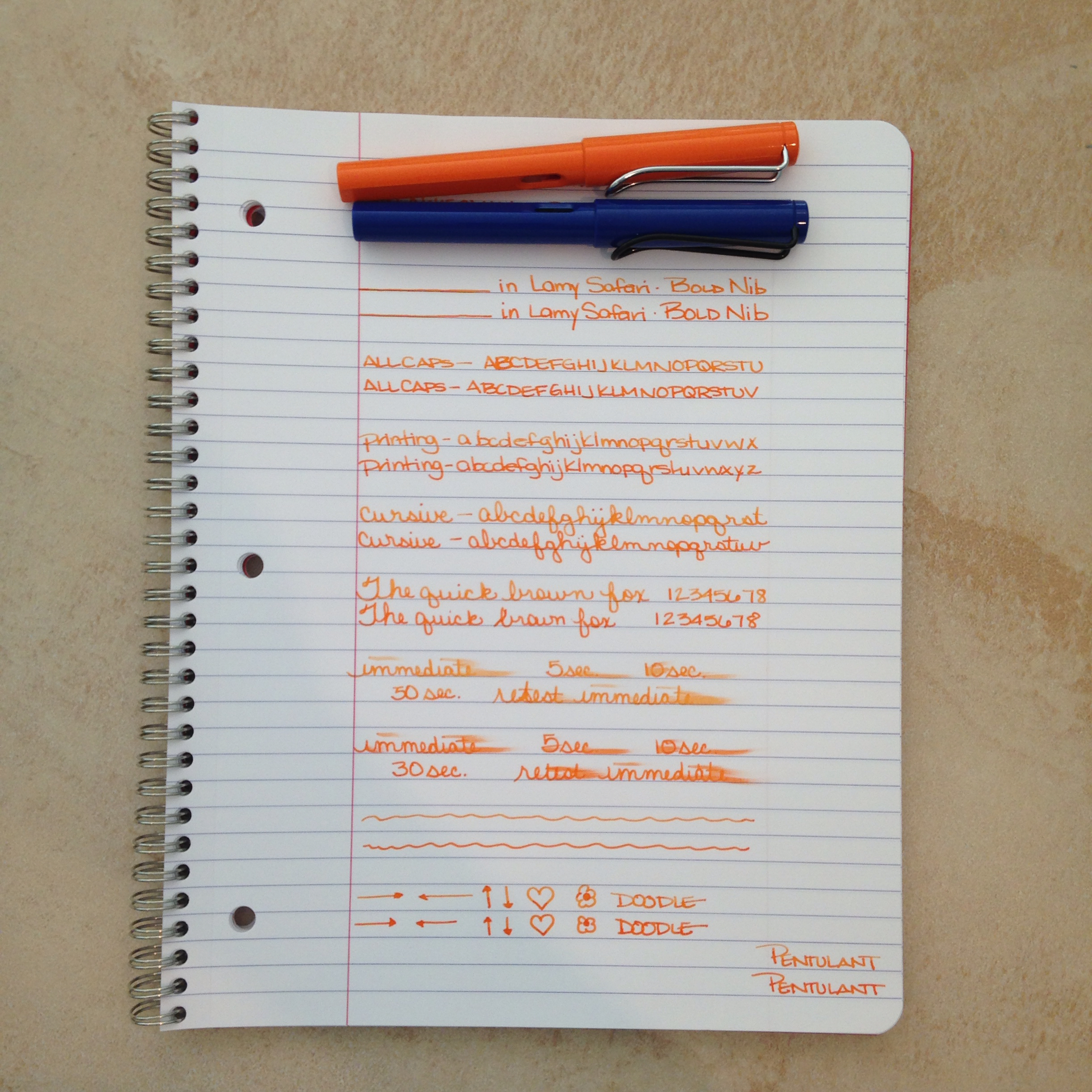
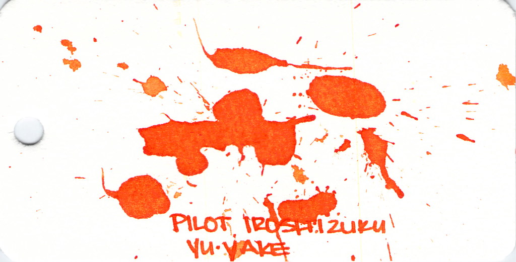
Dude. Check out Pilot Iroshizuku Yu-yake . . .
 |
| Pilot Iroshizuku Yu-yake Writing Sample |
Shading, saturation, great orange color – maybe a little red in there. Yu-yake is bright and cheerful. Writes like a dream. A new favorite of mine.
I’ve had good experiences with all Pilot Iroshizuku inks. They are a bit more expensive than other brands, but they are incomparable in terms of overall brand quality.
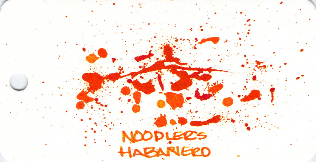
Last, and certainly not least: Noodler’s Habanero.
 |
| Noodler’s Hanbaero Writing Sample |
It’s been awhile since I’ve had Noodler’s Habanero in a pen. I’m not sure why. I fall in love with it every time. The beautiful shading, the gorgeous orange that reminds me of autumn. Yum.
The only issue is that it seems to stay wet forever. Though, apparently, not as long as Noodler’s Apache Sunset.
That’s it!
Which are your favorites?
xoxo