 |
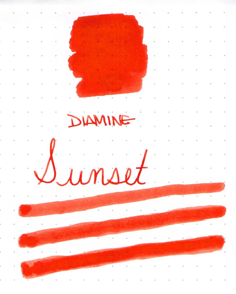
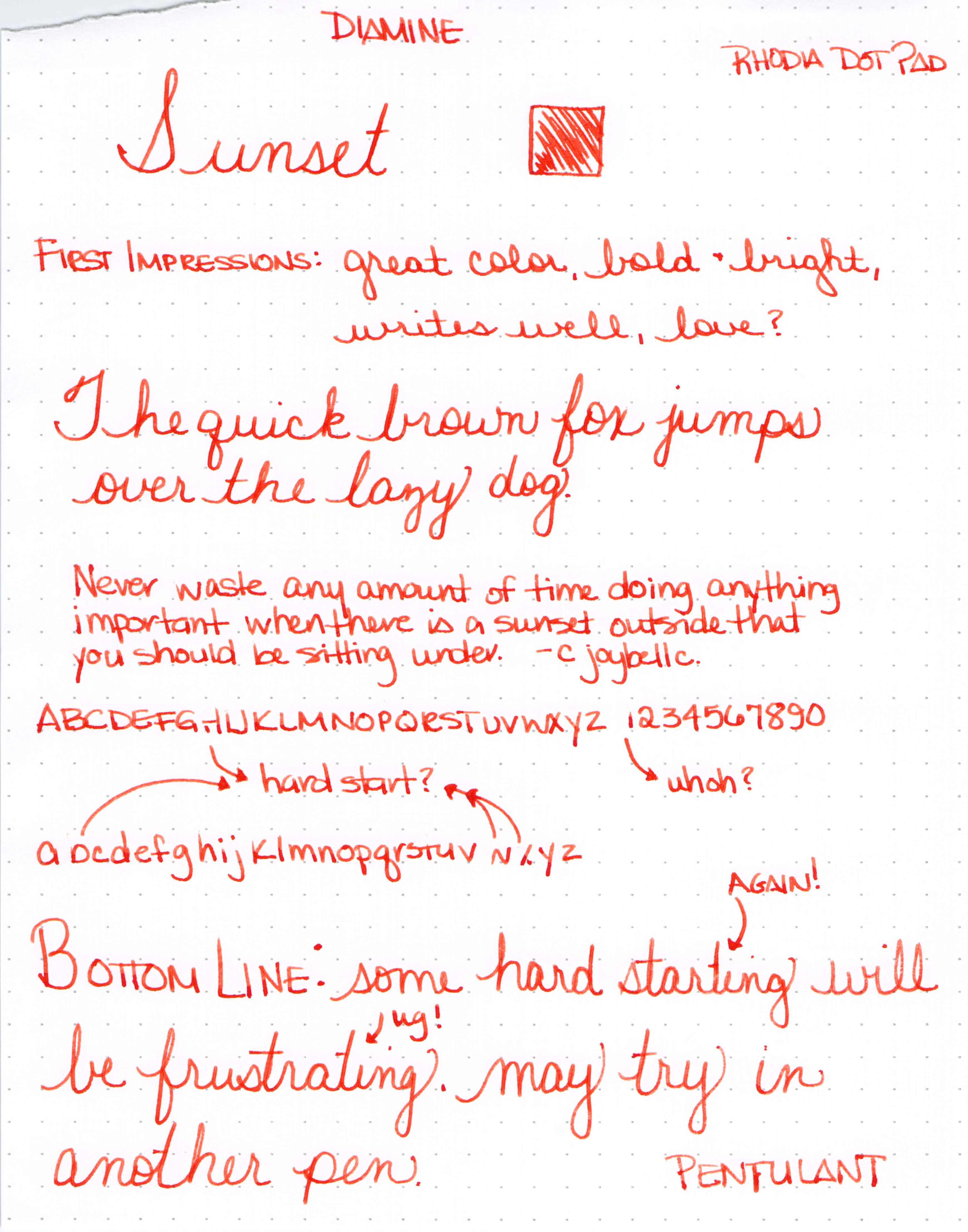
| Diamine Sunset Ink Swab |
 |
| Diamine Sunset Writing Sample with Lamy Safari (B) |
 |
| Click for Full-Size |
 |
| Click for Full-Size |

 |
| Diamine Sunset Ink Swab |
 |
| Diamine Sunset Writing Sample with Lamy Safari (B) |
 |
| Click for Full-Size |
 |
| Click for Full-Size |
 |
| Noodler’s Habanero Ink Swab on Tomoe River Paper |
It’s another edition of Throwback Thursday!
Just about a year ago, I was going on and on about Noodler’s Habanero. I’d heard so much about it and its wonderful shading abilities. I was definitely not disappointed. It was one of the inks I swabbed on to Tomoe River Paper. Gorgeous! And I wrote about it again in August.
I’ve not used it for a few months, but seeing it again definitely makes me crave.
What was everyone else talking about last year?
FPN had a review of Pilot Iroshizuku Ku-Jaku.
Notebook, Esq. wasn’t talking about a fountain pen.
Foutain Pen Geeks were looking at form and function.
Rocket? Pencil Sharpener? Take a look.
Inkdependence was sharing some ink love with us.
And, finally, Gourmet Pens had a sweet Wordless Wednesday.
Sometimes, I want to play with my pens, inks, and papers, but can think of nothing to write.
The first step is to write the name of the ink and the name of the pen (see above). I just noticed that each ink is from a different manufacturer – nice.
Apparently, the last resort is to write things that I overhear from the television (see below).
It was actually quite a bit of fun – watching and scribbling, changing pens and writing a bit more. I love the way the entire sheet of paper looks – each color is pretty amazing on its own, yes?
Let’s take a closer look . . .
Above – DeAtramentis Alexander Hamilton. I love this purple. It’s so rich and deep in color – nice saturation. I don’t see this ink discussed much on the various forums, but I think this is a purple that could be used anywhere. (more on that another day)
Below – Private Reserve Spearmint. One of my favorite green inks. It looks a bit dark here to my eye, but it is usually quite cheery.
Do you have a guess as to which show I was watching at the time?
Below – Montblanc Hitchcock. A gorgeous blood red ink if I ever did see one. Some really pretty shading in there, too. I have to confess, I have a quite a lot of this in my cabinet. Shall I keep it forever? Use it as if I’ll never run out? Or maybe even sell some?
Below – Noodler’s Habanero. A favorite. That shading. The brightness of the color. Need I say more? Mm..wait, I already did right here.
By the way, the above quote is the one that seems like the one that would tell the secret of what I was watching. Have you guessed it yet?
Above – Pilot Iroshizuku Fuyu-syogun. I wonder if I only could have one ink, if this would be it. Check out my big review here. It is crazy CrAzY to think that I, lover of bright and beautiful colors, would be so taken with a gray ink, but there you go.
Above – Diamine Majestic Blue. Easy to see why it’s one of my favorites, yes? So pretty.
And, so, there we have it – six pretty colors. All so different from one another and yet all so wonderful.
Which show was I watching? Downton Abbey, of course! Have you seen it? Highly recommended.
Seriously? I’m probably the last person to comment on the May Ink Drop color from Goulet Pen Shop.
I’ve been just a little busy. There was the wedding. And then the baby! (Not ours – bummer.)
But here they are…
Noodler’s 54th Massachusetts
De Atramentis Ocher Yellow
Roher & Klingner Alt-Goldrun
Roher & Klingner Alt-Bordeaux
De Atramentis Mint Turquoise
As for the inks? I’m not IN LOVE with any of them. Each of them falls squarely into that “not a color” area for me. Alt-Goldrun is so popular – I want to write with it very soon.
What do you think? Love ’em? Hate ’em?
I ended up using this ink for a week or so after the review and reading the review now, I don’t think I’ve done it justice here.
In fact, I ended up enjoying it so much that I bought a bottle of it back in March. It’s not perfect – those water tests are not going improve with time, are they?
I’m going to come back to this one. Create some writing samples in a variety of pens and come back to talk about it.
Have you ever had a mediocre first reaction to an ink that you later ended up loving?
 |
| clicky to make bigger |
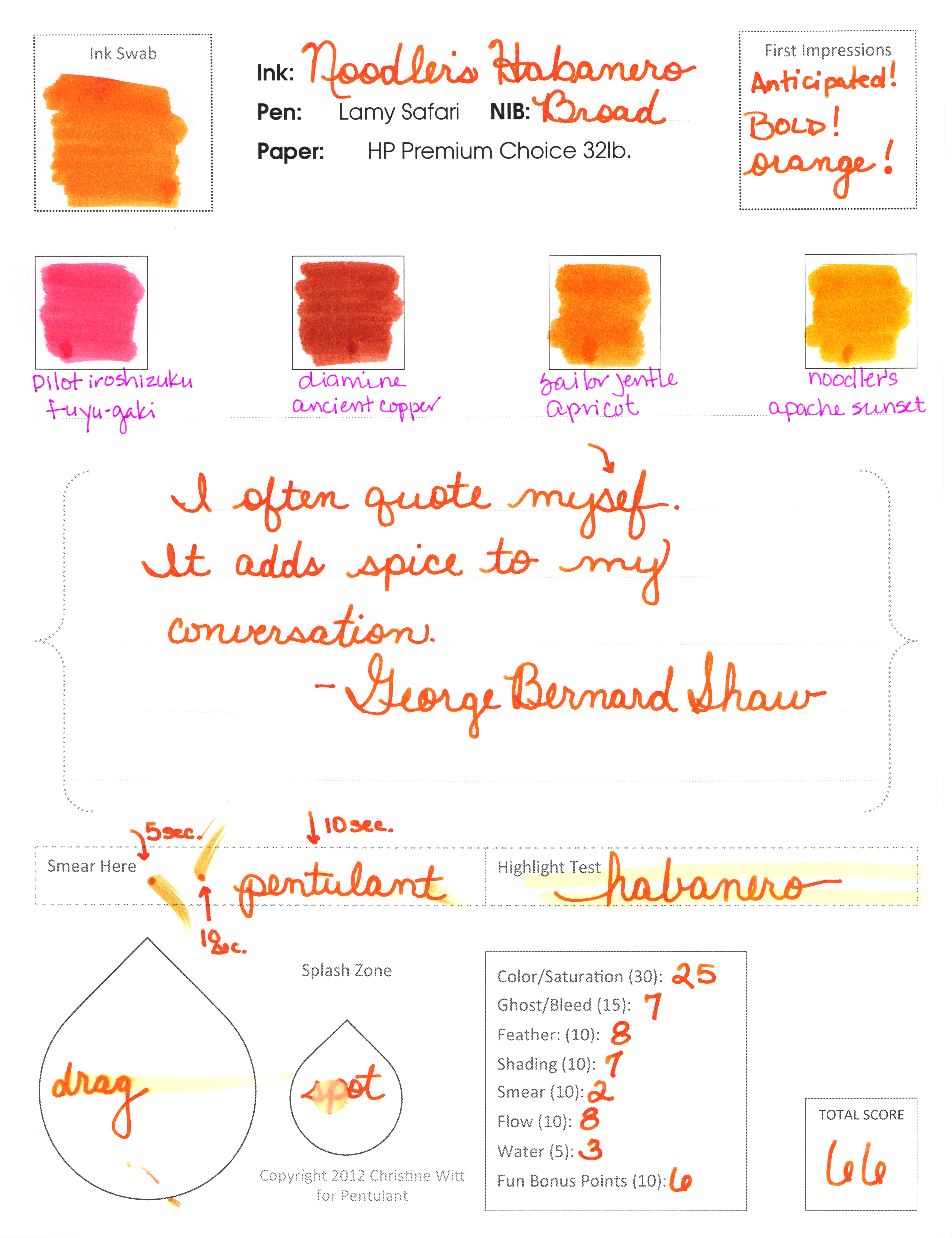
I really do love Habanero. Definitely getting a full-sized bottle of it.
Mr. P likes it, too – though he seemed to be focused on the broad nib. He calls me Chickie – isn’t that sweet?
It shades like a son-of-a-gun. Sounds like I should love it, right? Or at least like it. But no, I hate it.
Hard to believe I’m going pass by shading like this. But I am.
In fact, I wanted this to work badly enough that I tried it again another day. With another kind of paper.
Let me start by saying that this is a perfectly fine ink. It’s well-behaved with the glass dip pen and on the paper. And I probably would have loved it. Had it not been for Diamine Pumpkin getting in the way!
The color is a bit muddy for me. When I think of Orange Crush, I think of big bright screamin’ orange -and this wasn’t exactly that.
But…no smearing…no ghosting or bleeding..it’s fine. But just fine. It’s not BIG LOVE. Honestly, I wonder if any other orange ink will ever pass Diamine Pumpkin for me. Probably not in 2012, at least. Hahaaha
 |
| click the image to see more detail |
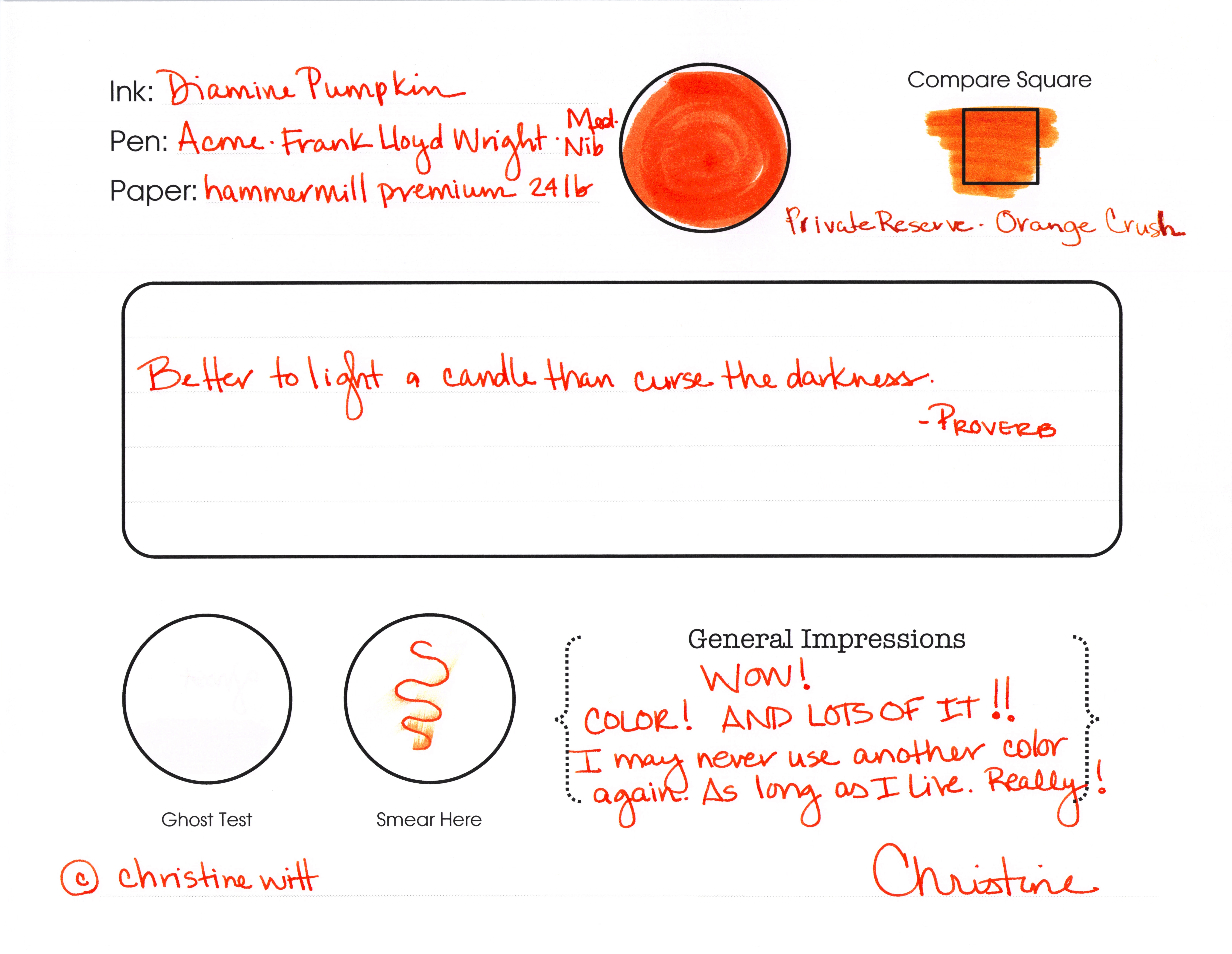
See what I said? “I may never use another color again. As long as I live. Really!”
Ha! How crazy is that? I might mean it, though.
Look at the Compare Square. I think Orange Crush from Private Reserve looks more like a shade of pumpkin than Pumpkin from Diamine. I really think I should be in charge of naming colors.
There’s some smearing, but it’s not awful. I made that squiggle, waited just a few seconds and then ran my finger along the ink.
I didn’t have any ghosting – and I wish I could come up with a better way of illustrating my ghost tests. I’ll work on that. You work on getting this ink. Today.
Check this out…
 |
| Some shading, but it’s mostly super-saturated |
There’s some slight feathering on Hammermill paper, but not much. If we were going to see terrible feathering, it would be on the swab – those are done on 3×5 index cards and the paper is so thin. (Does anyone make high quality index cards?)
Whew. That’s some ORANGE. I’m in love. Orange Jello! That’s what it reminds me of.
I almost wish I didn’t have to show you this . . .
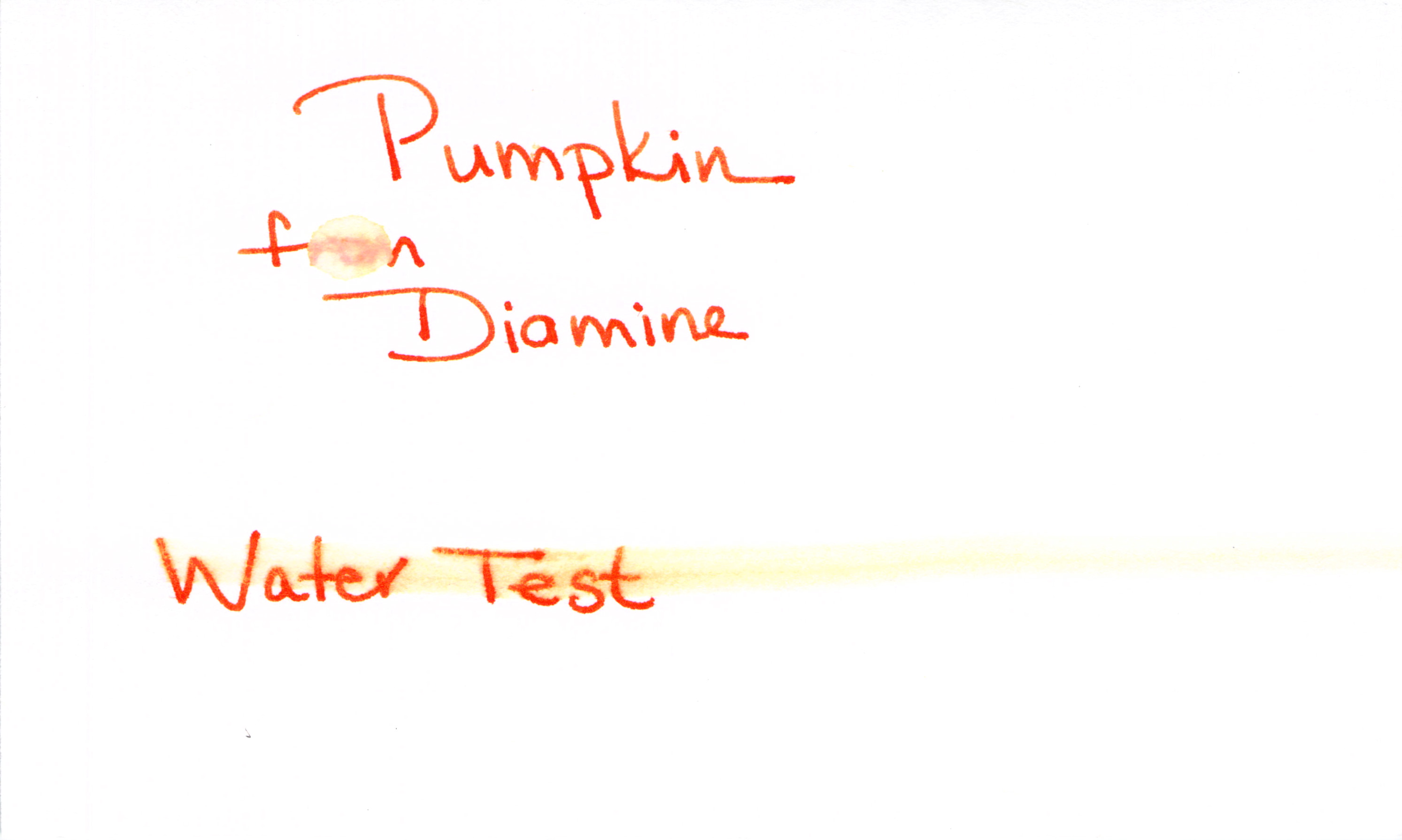 |
| Water Test – Fail |
Poo.
Here’s how I test for water resistance:
1. Write with the ink (always a good first step!)
2. Let it dry for 10+ minutes
3. Place a droplet of water on one word (“from” in this case) and let that dry naturally
4. Smear a moistened Q-Tip across the words “Water Test”
I’m bummed that the water test is a fail. I’m not surprised, though. My limited understanding is that it’s difficult to get water resistance from most mixed shades like purple, orange, green. Wah Wah.
All of this said, I (probably) will not be using this color for everrrrrrything, but I’m totally into it for some fun this fall. I’ve found it all over the place for $12-15.
Are you seasonal about your ink colors? Which are your current favorites?