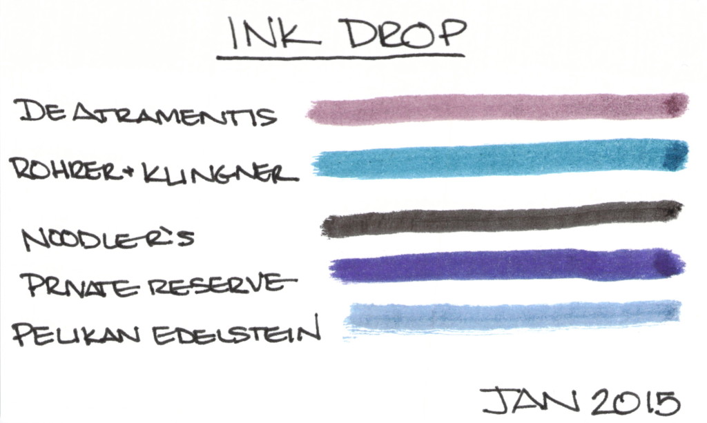
INK DROP: January 2015 (Spoilers)

PENTULANT 044January 2015 Ink Drop from Goulet Pens

I received January’s Ink Drop from Goulet Pens earlier this week.

I usually super-saturate cotton swabs with ink before swiping across the paper, but this time, I barely barely got the cotton wet with ink. I thinking maybe this gives a more accurate idea of what the ink would look like from a pen? If you have thoughts, I’d love to hear them.

I’m about to reveal the inks from top to bottom. If you don’t want to know, this is the time to look away.


  • De Atramentis Black Edition-Brown – I know, it looks kind of purply to me, too (it’s not just the scan)
  • Rohrer & Klingner Verdigris
  • Noodler’s X-Feather – this stuff is great if you’re looking for an ink that doesn’t feather or spread
  • Private Reserve Ebony Purple – another ink I adore
  • Pelikan Edelstein Tanzanite

And the theme?  Safe for Work

I like most of these inks – going to have to look at the De Atramentis a bit more, though.  What are you thinking? Safe for work?

QUICK LOOK WEDNESDAY: You call that red?

Time for another Quick Look Wednesday!

What do all of these inks have in common?  They are all samples from my bag of red inks.

Red?

 Private Reserve – Vampire Red
 Diamine – Maroon
 Pelikan Edelstein – Ruby
 Sailor Jentle – Grenade
So, yes, I sort my ink samples by color. I have so many that there has to be a system – I’ll take pictures and show you sometime soon. 
I first look at the name of the ink and sometimes it’s obvious where the ink belongs.  Delta Brown?  Not a big decision. Frankly, Pelikan Edelstein Ruby didn’t seem like a big decision either. Ruby – Red, right? Not so much. Yikes.
When the name doesn’t make it obvious, I open the sample, have a peek, and make a best guess. Sailor Jentle Grenade belongs with the purples. Oops.
I’m really liking Private Reserve Vampire Red. Perfect name for this color, yes? Can’t wait to write with it!
Maroon from Diamine is ok – nothing special to me. It’s one of those colors that isn’t really a color. Haha.
What do you think?  Do the names of inks get you all bothered, too? Ruby – ha!

INK REVIEW: Pelikan Edelstein Sapphire

Despite whatever else I say below – I like this ink. I do. 
It failed the water test. See?

It’s not really sapphire in color. I realize there are different colored sapphires out in the world, but most people think of them as blue. This is more of a purple – or even a very bright periwinkle.  I like all of those colors.

It’s bright. Love that.  It’s BOLD. Really love that.

Tiny bit of shading.
Not the driest ink in the land.

And some feathering upon close examination.

So..Pelikan Edelstein isn’t a perfect ink, but I like it. I’m not sure that I’ll get a full bottle of the stuff (this review was from a sample vial), but I like it.  No matter its issues.
Have you tried Sapphire? Maybe I need to try it again with another pen/paper.

INK REVIEW: Pelikan Edelstein – Onyx

Nice!  This ink had great flow from the pen. It was such a pleasure to write with. I wonder how much of that was the pen? (Watch for more on this topic in a future post.)
I little smearing, but I work around that fairly well – even for a lefty.
Nice color. Not as “solid” as some.
But here’s the issue. The major stinkin’ issue …
The way I look at water tests – I don’t expect all of my inks to do well when they meet water. I know they won’t. But . . . I do expect better performance from an average black – probably becuase I know it’s possible to make black with great stability.
I’m so glad I only bought the sample of this ink and not the full-size bottle.  Bummer.
Do you have rules like my black-must-do-well-with-water rule?

INK REVIEW: Pelikan Edelstein – Topaz

Aggggh…let’s start with the ugly, shall we?  The water test for Topaz from Pelikan Edelstein did not go well. But, dude, that color. That color!

Moving past the water test – I looooove the bright saturated nature of this ink. Look at how it compares to Pilot Iroshizuku’s Syo ro in the Compare Square. BIF! Bam! Boom! That’s what I need: COLOR!

Topaz almost passes the smear test – just a little wet – when not near water, that is.

You know what else I love about this ink? The name of the ink perfectly matches the color. Topaz!

Oh. So. Pretty.

Whereas so many other inks seem a bit flat, Topaz has a certain glossiness, a beautiful sheen that lasts well after the ink has dried.

As always, click to enlarge images

Check out a close-up of the color . . .

Tiny bit feathering only visible with some magnification (at least to my old eyes). Minimal shading.

This one is a winner in my big book of inks!

What are others saying?
Fountain Pen Network (very in-depth review!)
Art Brown has for $20,
Jet Pens for $21, 
and 
Goulet for $25.   
I’m getting it!