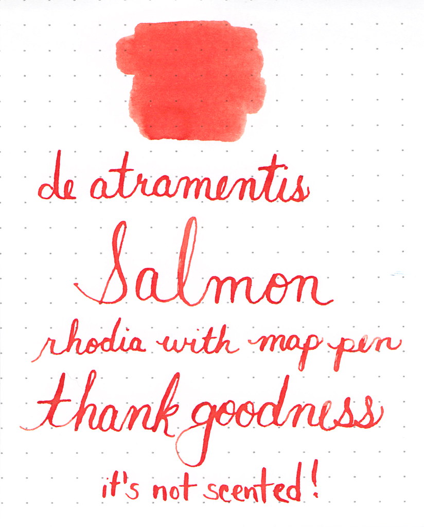
It’s pretty.
It’s not scented – thank goodness!

It’s pretty.
It’s not scented – thank goodness!
 |
| De Atramentis Antique Pink |
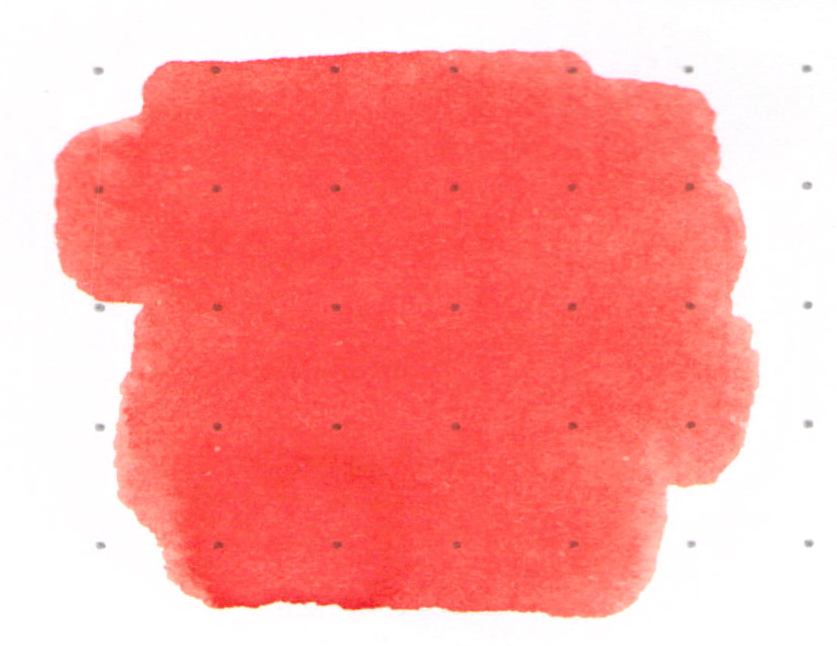
I’m not the biggest fan of pink inks. I found one that I love (Diamine Flamingo Pink), but otherwise, they are mostly a curiosity for me.
When I think of Antique Pink, the color that comes to mind is perhaps something like a ballet slipper pink. When De Atramentis thinks of Antique Pink, they think of something that is a bit more purple than I’d expect…
 |
| De Atramentis Antique Pink Writing Sample |
With that out of the way, this ink is nice. It’s ok. It writes well in the pen, looks good on the paper. There is no bleeding or feathering. Smear times are decent. (I used a Rhodia Dot Pad for this review.)
If you’re looking for a pink fountain pen ink that leans a bit toward the purple, this color could be the one for you.
There is even some shading – always nice. (I was using the Pilot Falcon for this review – the pen flexes a bit and that could account for some of the shading here, but there is potential.)

So…here’s my bottom line: it’s ok.

Pink inks – love ’em or hate ’em?
What are you writing with this week?


 |
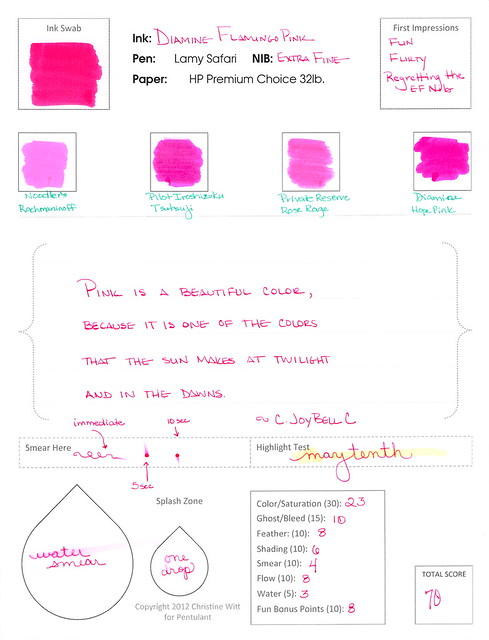
| Diamine Flamingo Pink |
Woooo!!!
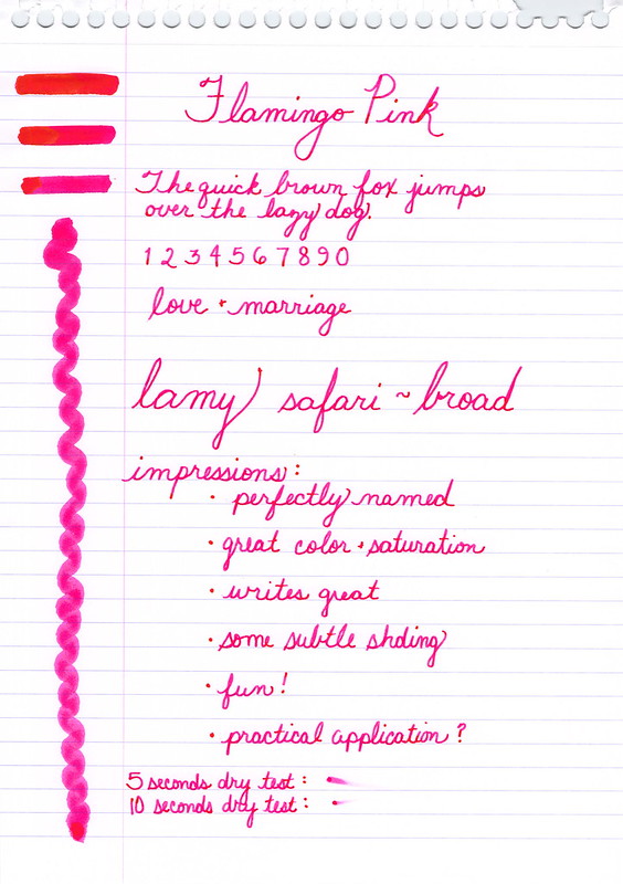
This is my second look at Diamine Flamingo Pink. Here’s my first test run of this fabulous color.
Dude.
Go buy this ink.
 |
| Flamingo Pink Ink Swabs (3, 2, 1) |
I really didn’t think I’d ever buy a pink ink. I mean, seriously? Pink?
But how could I resist this perfect color? It’s bright! Bold! OMG! Serious color. Seriously serious color.

And do you see it? That pink-to-orange shading? It may be glowing a bit in my scans, but the color is there – it’s an orange-ish pink. And it is…wow. I’m swooning over here.
 |
| Handwritten Review of Diamine Flamingo Pink Can you spot the write-o? |

Time for another Quick Look Wednesday!
What do all of these inks have in common? They are all samples from my bag of red inks.
Red?
 Private Reserve – Vampire Red
 Diamine – Maroon
 Pelikan Edelstein – Ruby
 Sailor Jentle – Grenade


All so different and I’m in love with each!
 Pilot Iroshizuku Fuyu-syogun A perfect gray. Lovely shading. Great color.
 Diamine Flamingo Boom-Boom Wow color!
 Diamine Majestic Blue True blue!

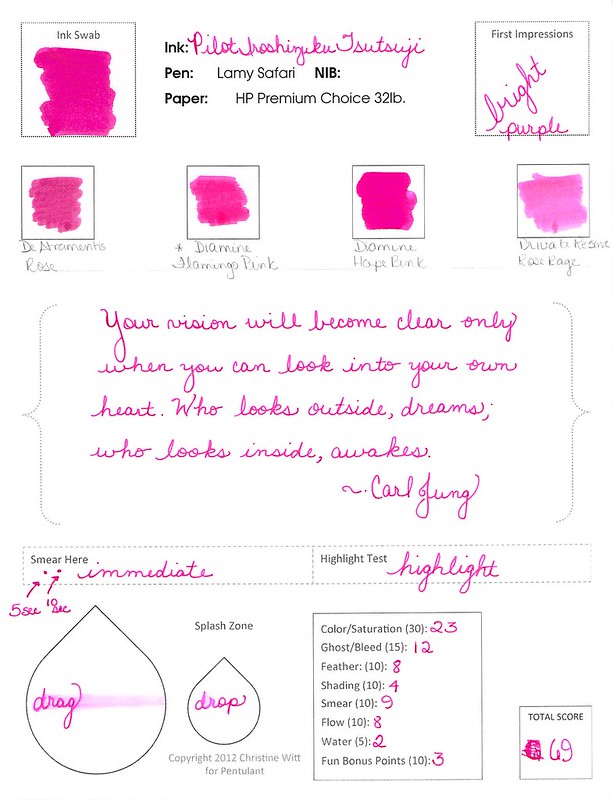
A quickie look at Pilot Iorshizuku Tsutsuji this morning.
First thing’s first – Tsutsuji means Azalea. Does anyone know how to pronounce Tsutsuji? Help.
I LOVE this color. Look at the saturation. Yow. That is some screamin’ bright IN YOUR FACE color!
It reminds me a bit of Momiji, but more purple and more saturated. And while you may not be able to tell from my scans, it’s not at all like Diamine Flamingo Pink. Flamingo has a bit of orange in it.
Tsutsuji is a great ink – the color and saturation are just part of that. It writes beautifully and is well-behaved on a variety of papers. There is zero (zero!!) smearing. It doesn’t resist water very well, but this is one of those colors that typically don’t do well with water. (I forgot to do the highlight thing – oops.)
Looking for a pink ink that leans to purple – Tsutsuji is just that. How would you use this color? I definitely have no practical use for it – but that doesn’t matter!
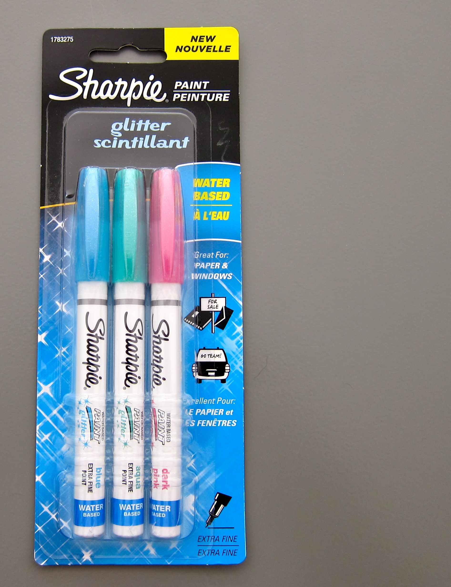
Sometimes. A girl needs a needs a little glitter.
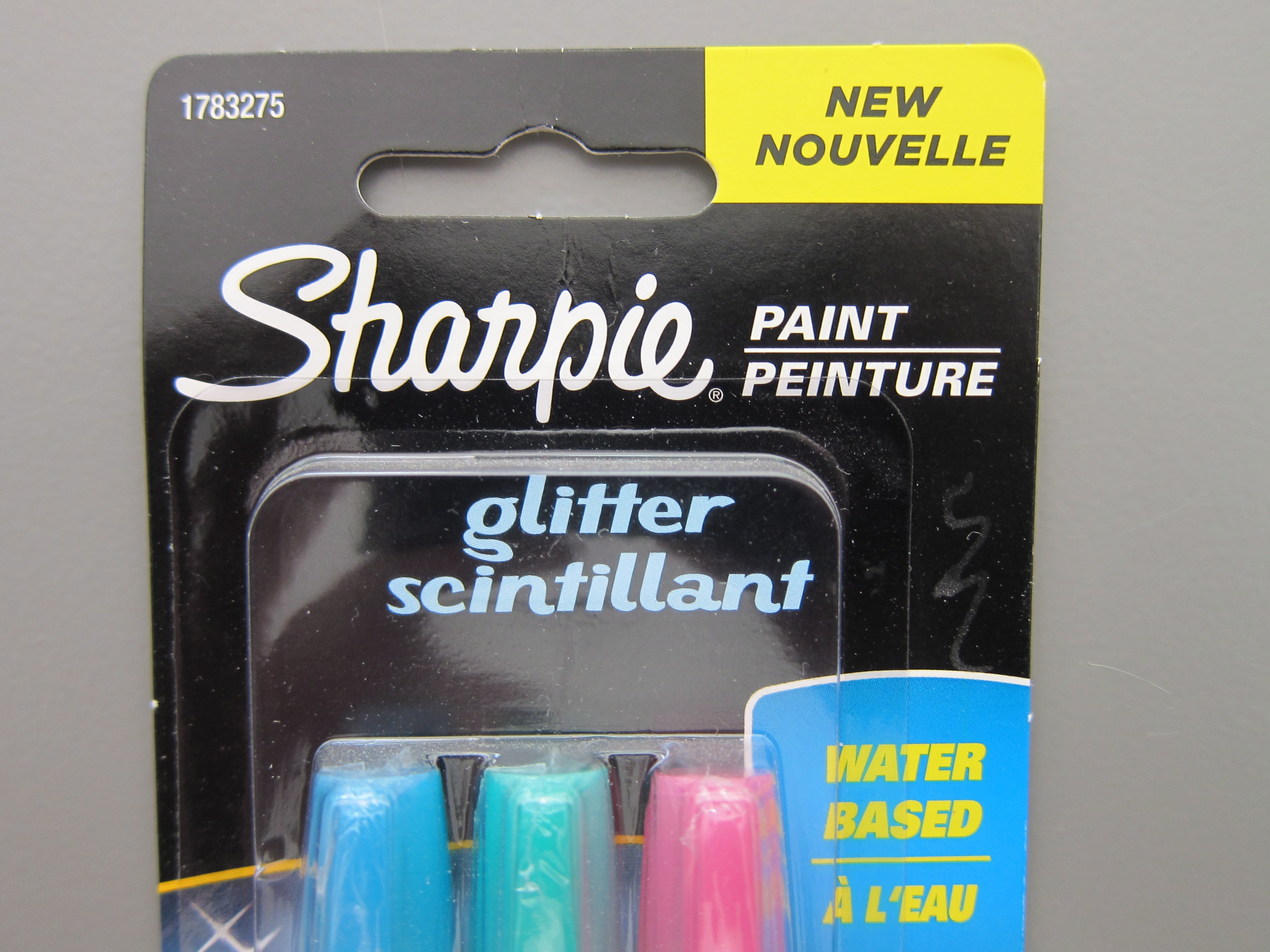
A little … scintillant.
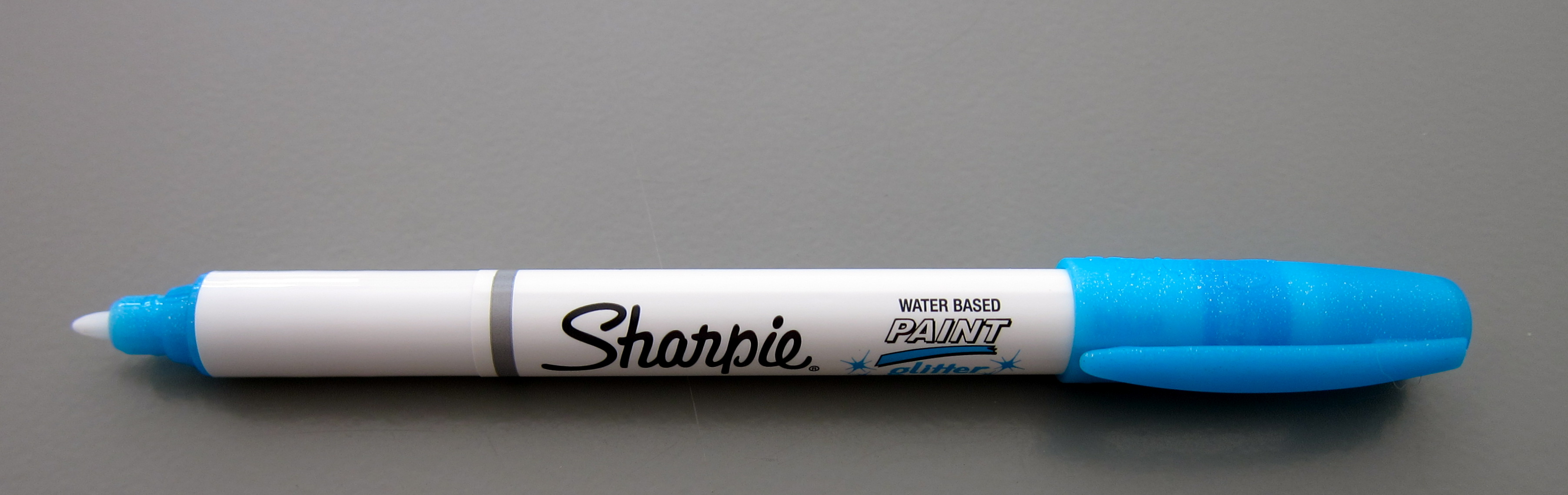
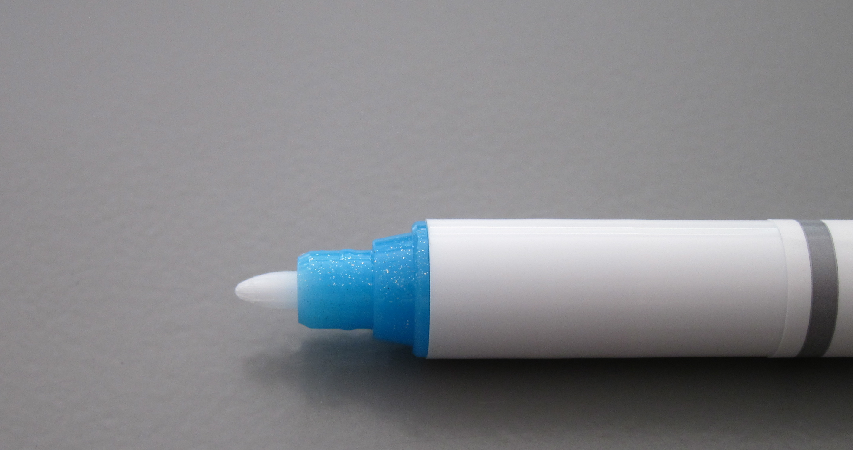
A Sharpie. (Who doesn’t love Sharpies? Use them a lot. Mostly for work. But some because of fun.)
These were fun, too. Not sure I have a real use for them.
Each came individually wrapped inside the package. Pretty sure this is for one or two reasons…
1. leak prevention
2. protection from drying up
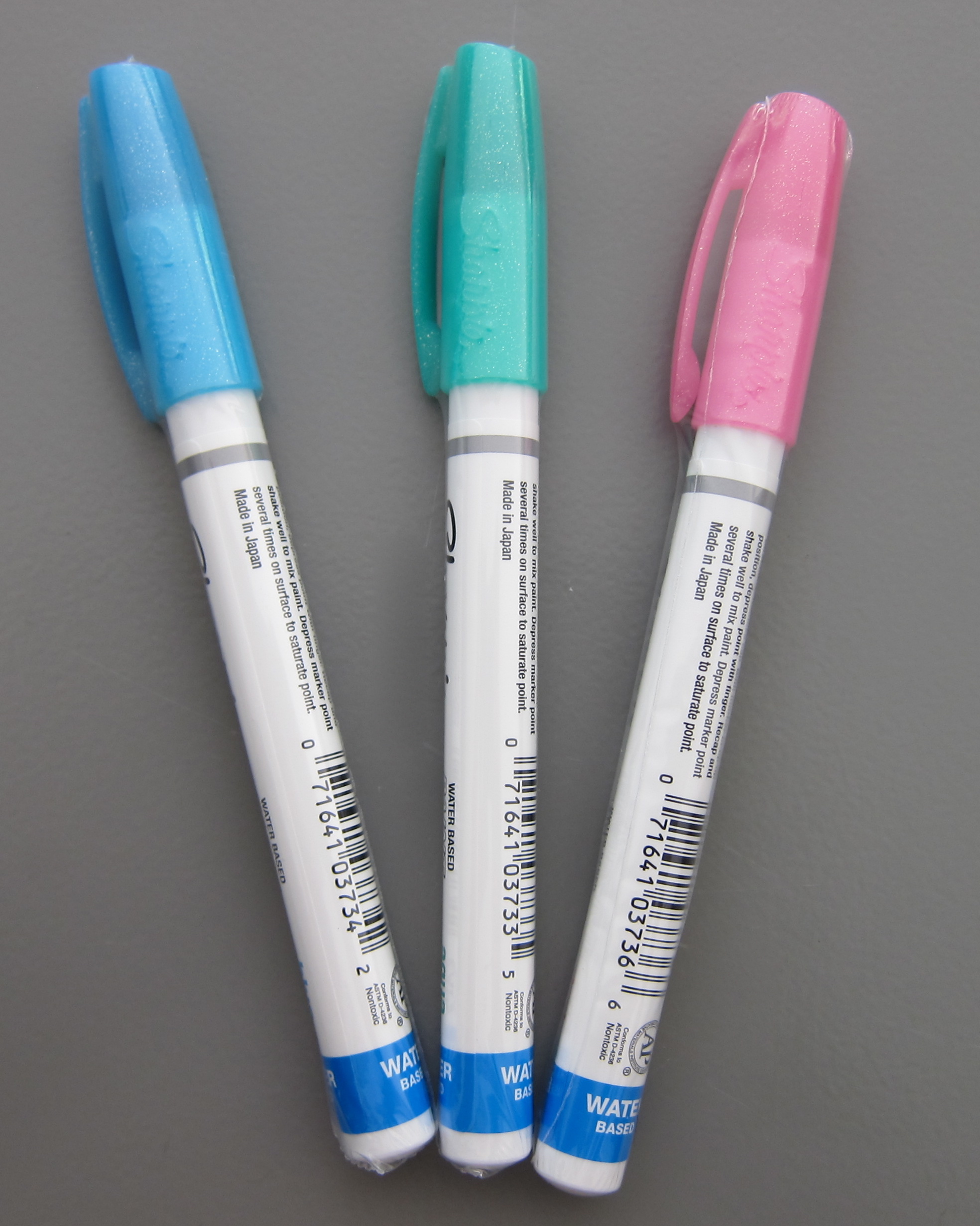
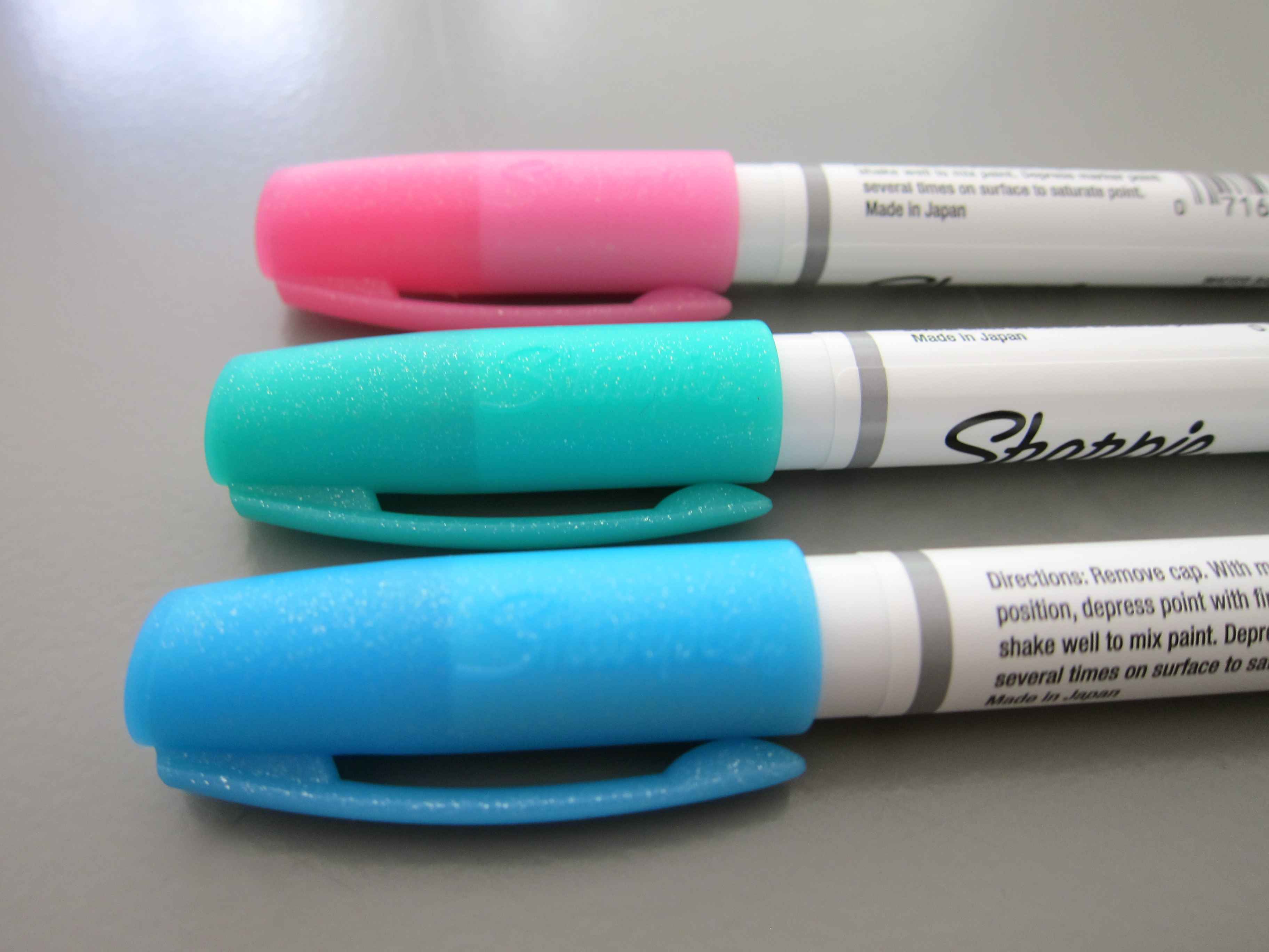

The big surprise? I thought they’d look WOW on black paper. Turns out, they are best on white. Probably a good thing considering I might be the only person around with a stash of black paper!
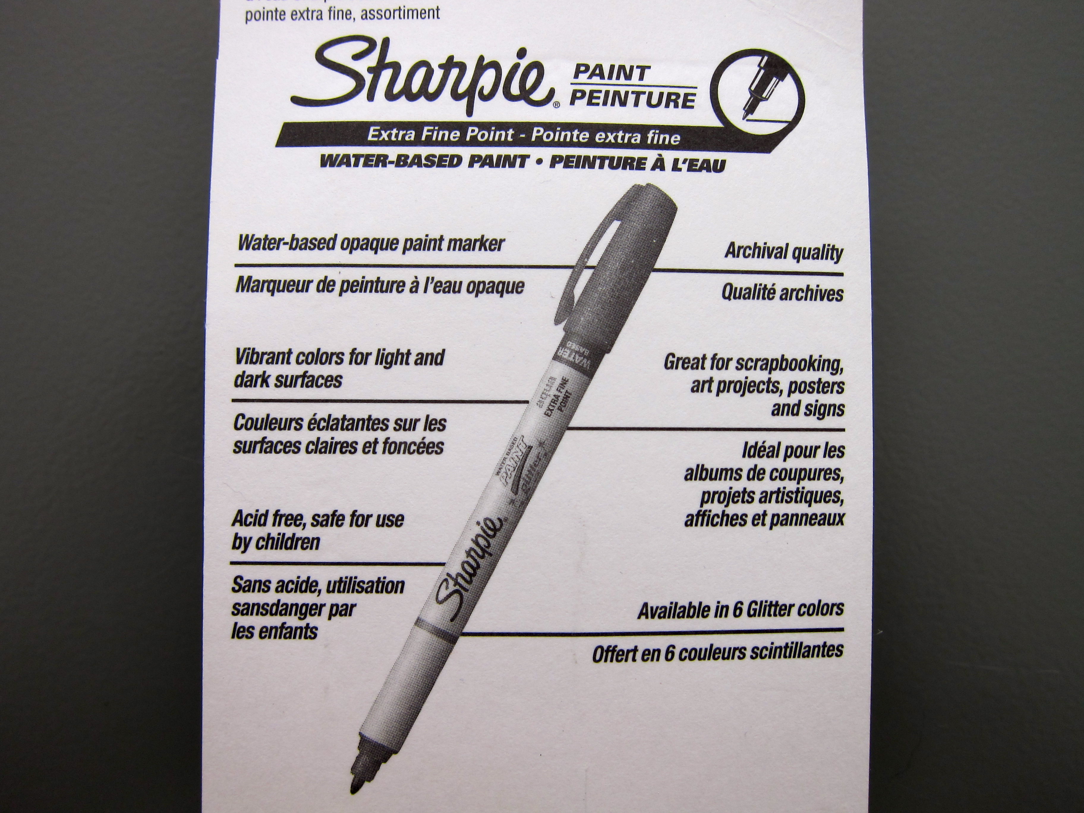
Have you tried these? The package says they’re available in six colors – I only saw the three-pack and white. What else is out there?
Are you like me and you sometimes buy cheapie things like this to try out? Even if you don’t have a real purpose for them?

 |
| See it even bigger. |


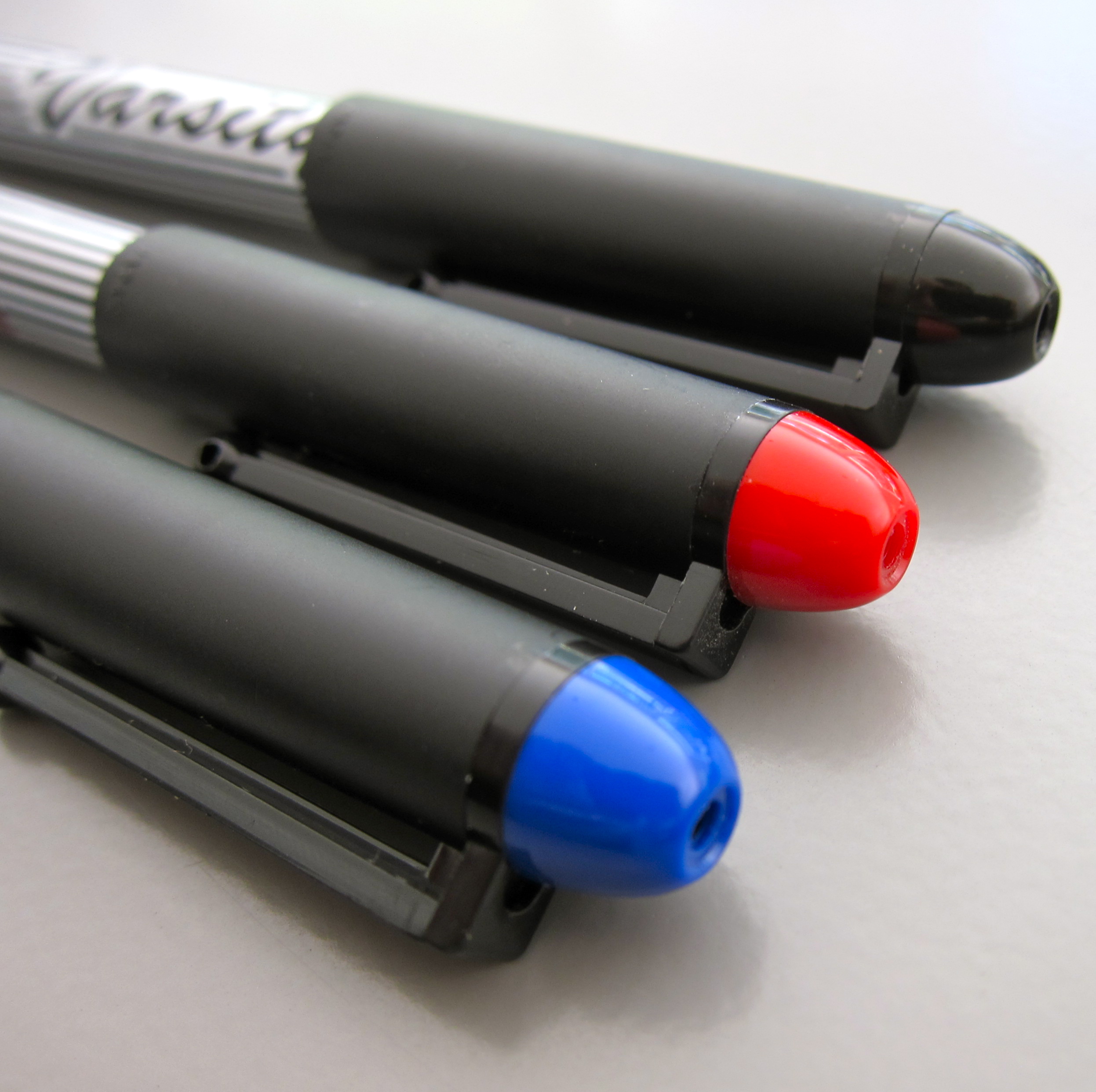
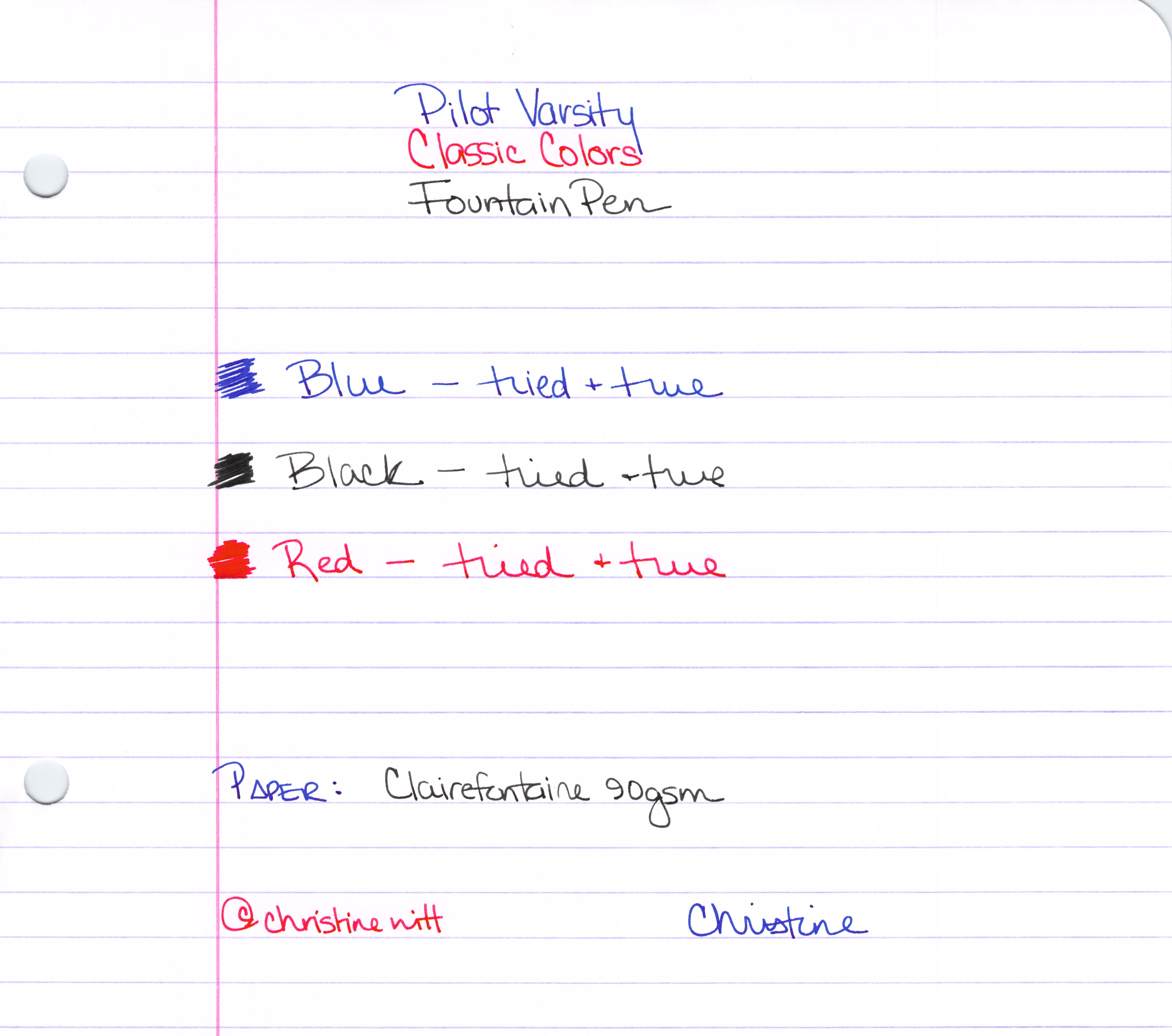
We’ve already looked at the blue – and now here are the remaining colors of the Varsity Pilot fountain pens.
 |
| The Classics |


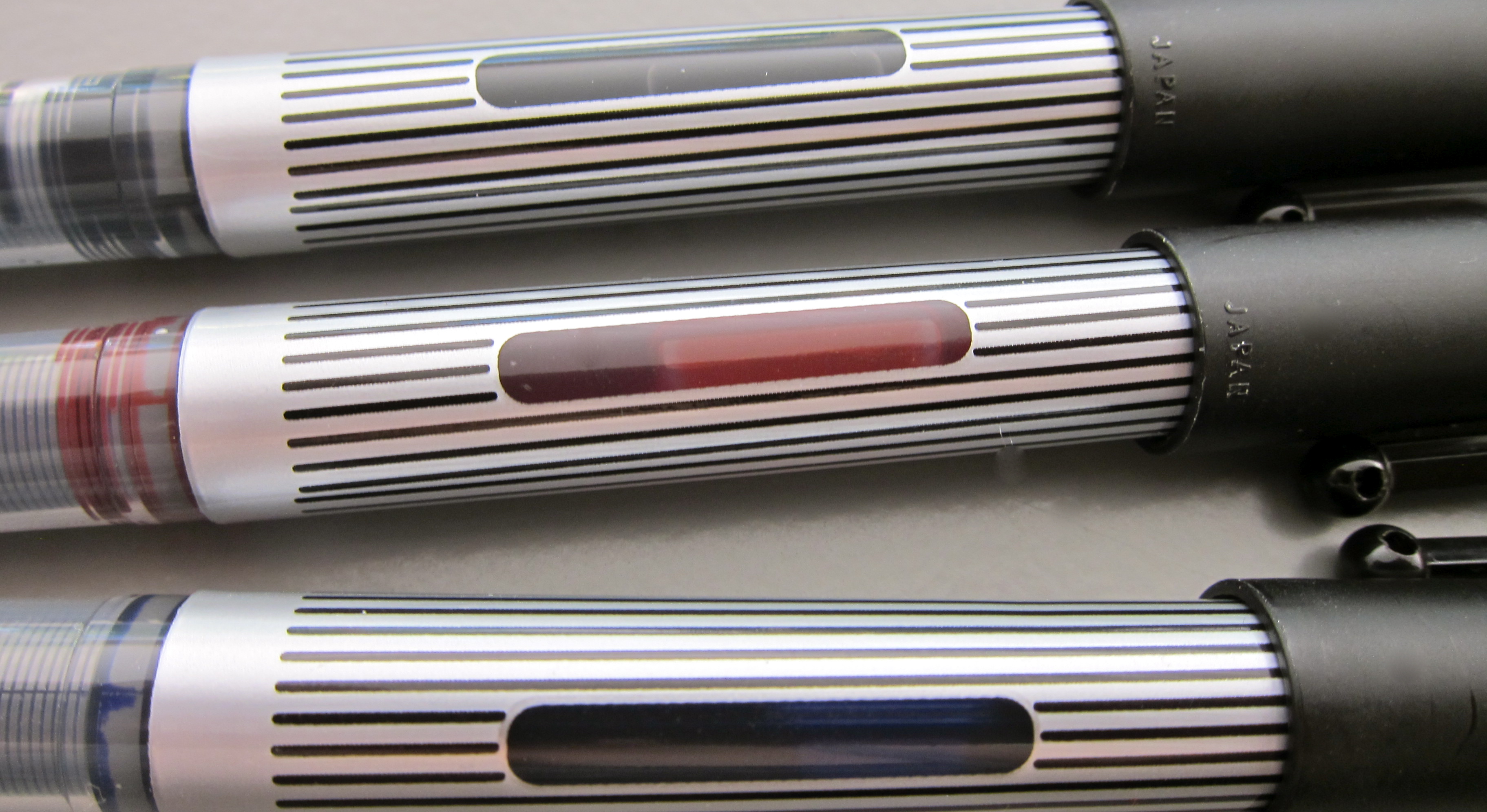 |
| Handy Ink Window |


 |
| The Whole Enchilada |