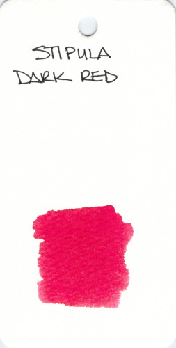
 Stipula Dark Red doesn’t seem very dark from where I’m sitting.
Stipula is another brand that doesn’t get a lot of exposure. I’ve not written with this one and would love to hear what you think of it. Which red is your favorite?

A quick look at the super-duper popular Rouge Hematite from J Herbin. This ink has gold flecks in it. I did this swab without first shaking the bottle so we can see the color of the ink and not just the gold flecks. Not that there’s anything wrong with gold flecks.
Some people avoid this and Stormy Grey because the flecks can make this a high-maintnance ink. I’m willing to put up with the extra effort for the extra omg-factor. You?
Bold and classic.
Sheaffer Red.
In case you missed it earlier, I’m giving away a great looking notebook filled with Tomoe River Paper. Here’s a link for you.
xo
I recently reviewed Diamine Poppy Red (spoiler: I loved it) and I’ve been practicing my spatter techniques with it.
Here’s a link to the full-sized image – it’s huge.
 |
| Montblanc Corn Poppy Red Ink Swabs |
Montblanc Corn Poppy Red has arrived on the scene.
My very first impression was that the ink is terribly wet. If flowed from my pen with such ease that I was sure it would take forever to dry. I was wrong and the dry times are perfectly acceptable with no smearing at all at the twenty second mark.
 |
| Montblanc Corn Poppy Red Writing Sample |
Here’s the scoop . . . delightful saturation, beautiful red color, flow is wonderful, definitely not water-resistant.
There was no ghosting and minimal show through on the HP 32 pound paper I was using. There was also the teeny tiniest bit of spread. Not enough to call it feathering, but definitely some spread. Just a touch. Maybe so little that others wouldn’t notice it? Probably not enough that it’s a deal breaker for me.
I regularly use HP 32 pound paper. I know it’s a good and consistent paper that works well with fountain pens. An then I wondered . . . how would Corn Poppy Red behave on other papers?
First I tried Apica CD 15 Notebook paper. This is their regular line, not the premium stuff.
It was not a pleasant writing experience. I felt as I needed to press just a bit harder with the pen (the MB Heritage 1912 that I adore so much) and even then, it just didn’t feel as nice.
Then, I tried my old favorite Rhodia 80 gsm . . .
And, man, that was some nice writing! Smooth with crisp lines. I approve!
I know you’re looking at the bottom line there and wondering what the heck happened. Silly me put the paper in the scanner before it was dry. Anyone know how to clean ink off of a feed scanner’s rolly bits? Oops.
Bottom line? I like pen and ink combinations that work on all papers. There’s so much fuss in the world that when I pick up a pen, I just want it to go. I like Montblanc Corn Poppy Red, but it’s not love.
Whomp Whomp.
Tell me – what are deal breakers for you with inks? Color is the big obvious thing, but are there other things that you simply will not tolerate?
It feels like it’s been awhile since I’ve been able to say this – I LOVE this ink.
Diamine Poppy Red fountain pen ink is a pure, bright red ink with a teeny tiny bit of potential for shading. The ink dries faster than average on the page and doesn’t feel dry (nor too lubricated) in the pen. There is not much water resistance, but I didn’t expect there to be. There were no hard starts, no ghosting, no bleeding, no problems. Just plain ole happy red RED saturated ink.
Check it out . . .
The swabs above are 1, 2, and 3 passes with a super-soaked cotton swab.
And here’s a close-up of some handwriting with it . . .
Seriously, I have nothing but good things to say about Poppy Red from Diamine. This review is from a sample I bought from Goulet Pens. I will have a full bottle of it in the very near future. Love, love, love.
Here’s the full review . . .
If you want to see the full-sized version of the handwritten review, here’s a link for you. (It’s huge.)
What do you think? Love it? Maybe you have another go-to favorite red ink?
How was your Thanksgiving? Mr. Pentulant and I were at the beach for the long weekend. We had a great time. So relaxing.
xoxox
 |
| Waterman Audacious Red |
Merry Christmas! Posts have been a little light over here and this will be my last post before the end of year. Happy New Year!
I have lots of exciting things planned for 2014, but let’s dive right into the review of Waterman’s Audacious Red.
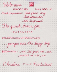
I wish I had better news for you – seems like the holidays should be full of light and cheer, but Audacious Red isn’t very exciting to me.
I test all new fountain pen inks in a Lamy Safari. I know the pen well, have several (many) of them, and they make a good standard pen for these tests.
 |
| Audacious Red Writing Sample |
It’s pretty – and I have to admit that after having written for a week or so with it, I found it more attractive as time went on. It’s not a bold, in-your-face color. It’s just red.
 |
| Waterman Audacious Red Sample Writing |
The problem I have with this ink is that it’s dry. Oh-so-dry. I used a medium nib in the Safari, but it looks more like a fine. And looking at the writing above, there appears to be some shading, but I actually think it’s where the ink flow couldn’t keep up with my normal-paced writing.
Maybe you have a pen that you’d like to slow down a bit. If so, this Audacious Red could be for you.
It’s not wet enough for me – and it’s not very saturated either. Check out the swabs below for a look at that.
 |
| Audacious Red from Waterman – ink swab tests |
I’m glad I didn’t invest in a full bottle of this ink. I ended up using it for everyday use, but went back to MontBlanc Winterglow for my holiday cards.
Here’s the full review . . .
 |
| Ink Review – Waterman Audacious Red |
What did you use for your holiday cards this season? And!…what is on your wish list this year? We’re having a not-so-spendy Christmas this year – can’t wait to see what is in my stocking.
Happy Almost Halloween!
This isn’t my red – but it is someone’s.
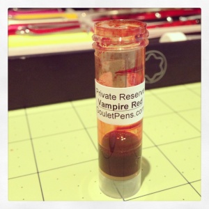
Every so often (in fact, regularly) over on FPN, the topic of blood red ink comes up. People really really crave ink that is blood red. Often, I think they are looking for something that is a bit darker than this, but really . . .
 |
| Private Reserve Vampire Red |
Blood red, right?
I like it well enough that I left it in my pen and used it for a week or so . . .
. . . but it’s not love.
It’s certainly named well – and that always gets bonus points in my book, but I’m more of a bright red kinda girl. I like (most of) my colors bright and bold.
I first tried Vampire Red on Clairefontaine paper and it really is a good ink. No complaints here at all.
And then gave it a go on Tomoe River Paper . . .
I don’t see too much difference between the two. Sometimes, Tomoe River Paper will make colors really pop.
What do you think? Bloody enough for your Halloween? Trick or Treat!