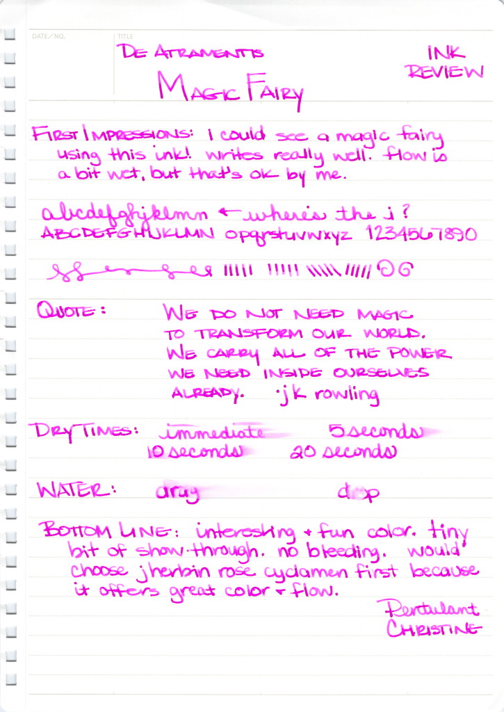
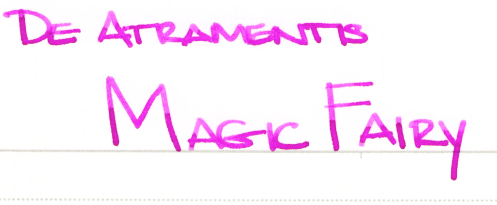
With its super-bright purple/pink hue, Magic Fairy from De Atramentis is a bold choice for fountain pen users. I’m not sure there are many practical uses for the ink, but I’m not sure that matters either. The heart wants what the heart wants, after all.
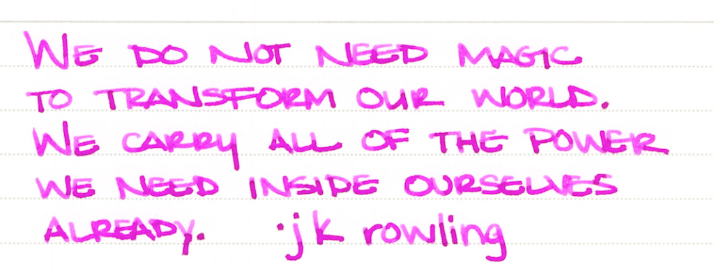
The ink performed well for me at first with no skipping, no bleeding, and no showing through. Initially, I didn’t think there was much potential for shading, but the strokes above and a closer look at some of the other writing makes it seem that with the right nib, one could expect some degree of shading.
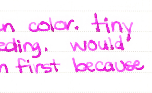
I was prepared to like Magic Fairy and then this started happening as I wrote more with the ink:
 See the spreading? It was really hit or miss. The word “tiny” above is just terrible, but the word “because” looks just fine. Look at “first,” though – the thin downstroke of the r combined with the other issues makes me think that what I’m dealing with here is inconsistent ink flow.
I’ve written with Magic Fairy a couple of times since completing the review and it definitely has a consistency issue for me. J Herbin’s Rose Cyclamen is a close color match and I’ve not had a bit of trouble with it. For this reason, I’ll not be buying a bottle of Magic Fairy anytime soon.

I bought my sample of this ink from Goulet Pens. It is either out of stock or no longer being offered by them. It is available for sale on the De Atramentis site, however.
Have you tried this one? Did you find it to be inconsistent? Are there inks that have no practical application that you just can’t stay away from?


I don’t think I’ve ever considered practicality for an ink. Ever. Or for anything in general. Practical isn’t really something I consider an important aspect to an enjoyable existence. Utility and function perhaps, yes, but not practicality.
For me pink inks have a regular spot in many of my pens and I currently have at least three inked with various pinks, not to mention the hundreds of non fountain pens. I use them for writing anything anyone else would.
The only factors that would make me not want this ink are the same ones that make any ink usable or not – flow, function, ease of use and consistency. Plus the main factor for me: is the colour appealing? Will using it make me happy and make writing pleasurable?
And of course the biggest issue is availability. Can I get some if I really want it? ^_^
Thanks for the review, this isn’t a pink I knowingly own a sample of (I may, I have a LOT of untried samples), but it’s definitely not an ink I wouldn’t turn away if it showed up. I’d definitely try it in different pens, on different paper before making a final judgement. J. Herbin regular line inks as of late have been behaving far more erratically (dreaded sitb) than I’m comfortable with. I’ve less experience with De Atramentis, but that’s why I stock up on Preppy pens.
Thank you for the review! (and the opportunity to share my thoughts on the concept of practicality when it comes to inks. I believe you’ve mentioned it before as have a couple other ink reviewers over the months, and I never got around to sharing my thoughts on how practicality probably isn’t so terribly important when it comes to complicated fussy hobbies such as fountain pens and inks.)
I’m with you, Kelly! Practicality rarely comes into play with my ink choices. I’m much more concerned about the behavior of the ink in a variety of pens and on a variety of papers.
Of course, there are some yellow inks that are just not readable.
xoxo
Regarding the yellow/readability of an ink… isn’t that still just a functionality issue? Yellow inks seem to be for highlighting, art or novelty. What about Blue Ghost? That is definitely NOT “readable” or practical, but it had a specific function that may not be someone’s preference, and it’s not imminently useful, but as the card exchange on Instagram proves, lots of people buy it with little expectation of use, it’s novel and the concept is too fun. Then some great folks created a way to make it “useful”.
For me ink is an expression of myself and colour and I buy and use it solely for my own pleasure and use. I don’t use it for anyone else. It’s potentially selfish, but we live the rest of our lives accommodating others and for me it’s a pleasure hobby that *can* be put to use as a functional tool, but primarily exists as an enjoyable pastime. If I wrote for a living or used inks for signing important documents, then function would affect my choices of inks, but since I’m a disabled artist, for me ink doesn’t have to be that.
Which is the nice thing about it. It can be a permanent mark on history, or it can be a fun toy.
I really should get my own blog running for these thoughts. ^_^ Thank you for prompting them, though! (A similar question that gets me riled up about convention and doing things for others over yourself is the “age appropriate” cosmetics concept created by companies to sell more products by making you feel inferior or childish if you don’t dump all your “young” cosmetics for new stuff every 2 years. It makes me mad when people censor themselves, either by not wearing colourful nail polish or red lipstick after age 30 for “age appropriate” colours or by using only “work-safe” inks. Those phrases are swears in my lexicon.) .endrant sorry! I have strong thoughts on not having limits! >.<